Azumi Setoda
design-led branding :
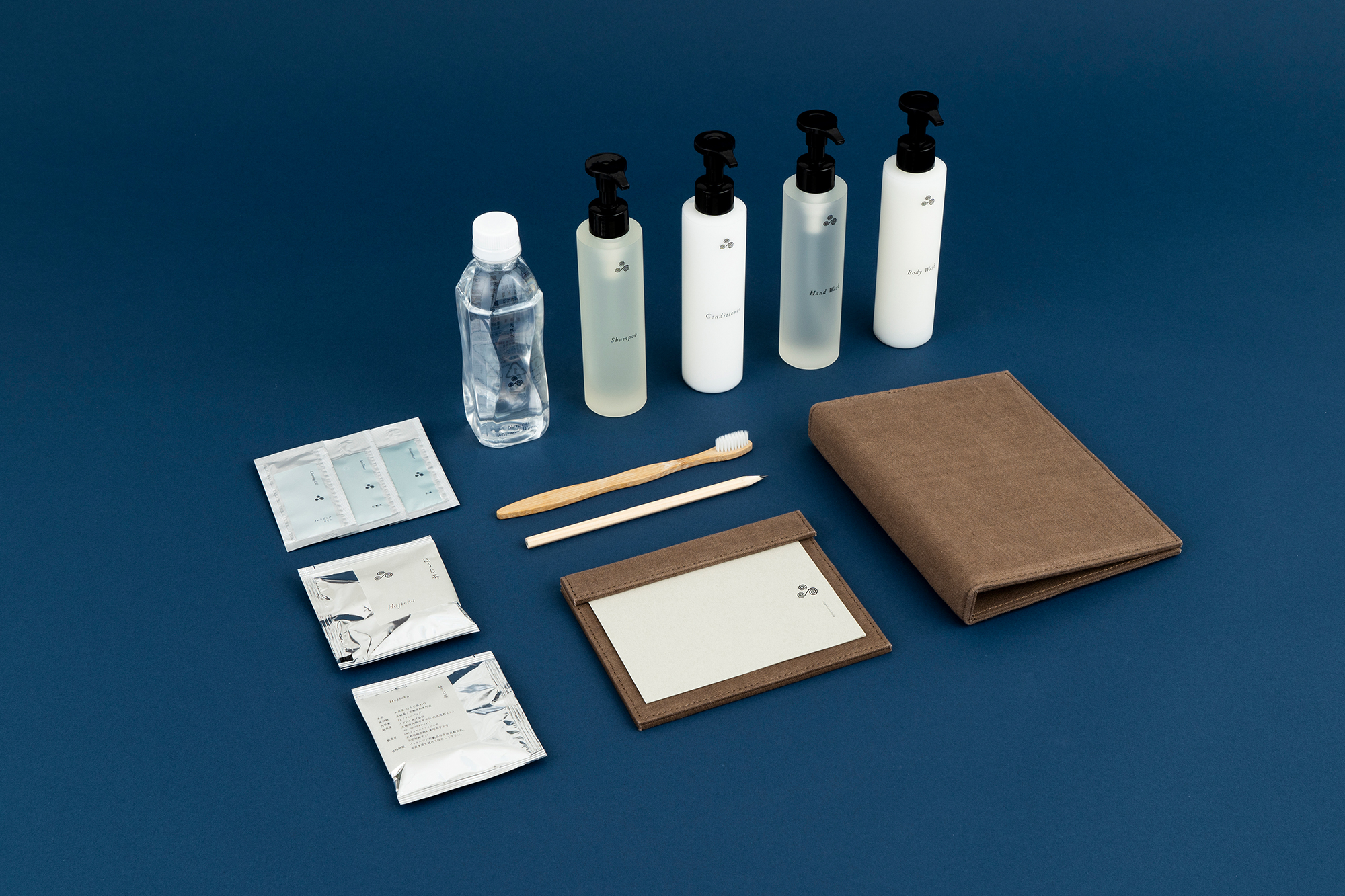
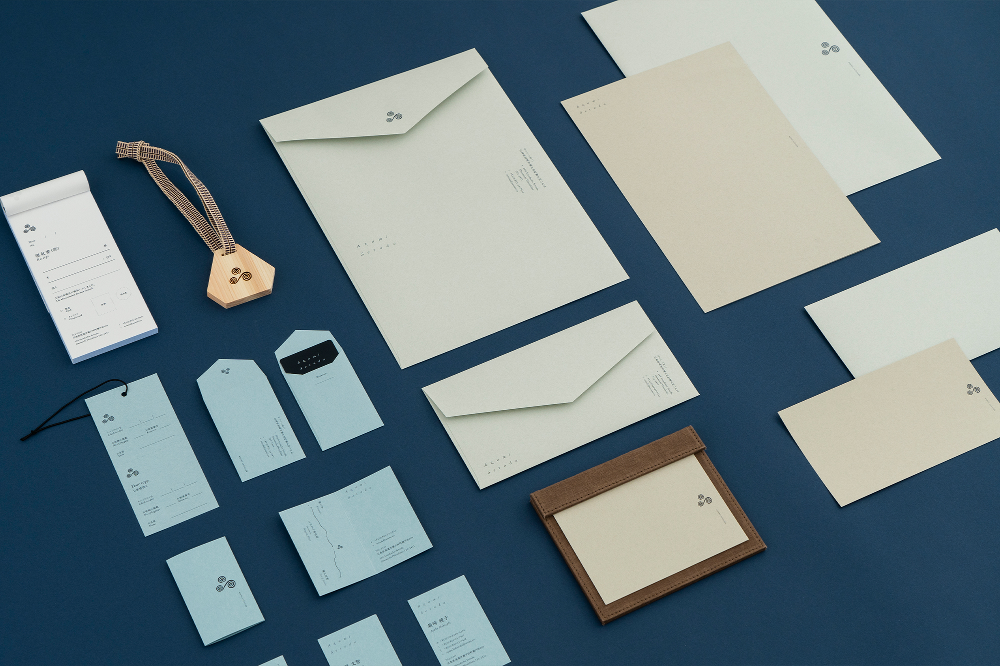
logo & visual identity, graphic & signage, hotel amenities, goods & items, web.
architectures: Shiro Miura, Rokukaku-ya co,ltd & Azumi Setoda architectural design team
construction: Daiwa Kensetsu Co., Ltd
branding: Terasu
brand design: artless inc.
creative direction & art direction: shun kawakami, artless inc.
design: hsieh yin & aoi fujikawa & yafa koseko, artless inc.
project management: moeko tamakawa, artless inc.
photography: yuna yagi & max houtzager
signage & item photography: yuu kawakami, artless inc.
client: Azumi Japan Inc. & Naru Developments
Adrian Zecha and Japanese hospitality group Naru Developments launched Azumi Setoda and yubune―a pair of adjacent ryokans in March 2021.
Despite being perceived as primarily focusing on the luxury sector, Adrian Zecha has always intended for his projects to highlight the local culture, community, art and food. With the Azumi brand, Adrian Zecha seeks to highlight this intent through modernizing the unique and cosy Japanese ryokan; a traditionally family run inn. Azumi welcomes guests with an open mind, seeking to not only capture the feelings of home, but cultivate the warmth of the local community of Azumi Setoda.
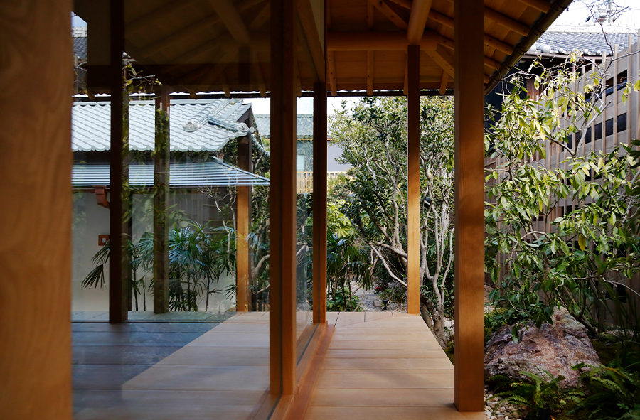
We were in charge of the branding and art direction, including logo, v.i., signage, stationery, amenity, and web design. We worked closely with Kyoto-based architect, Shiro Miura of Rokkakuya. Shiro Miura is an expert in private residences and trained in the sukiya style of Japanese architecture. He balances the elements of a cosy atmosphere with aesthetics rooted in Japanese tea ceremony, dating back to the 16th century.
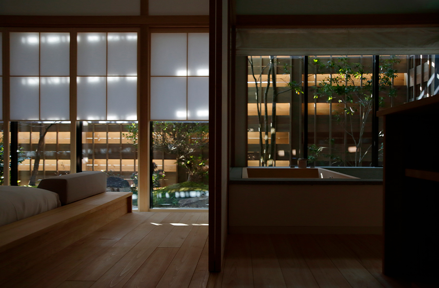
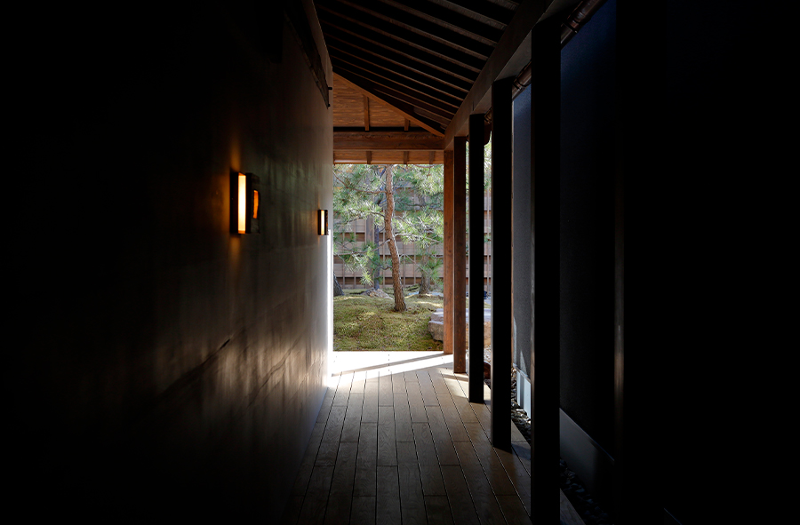
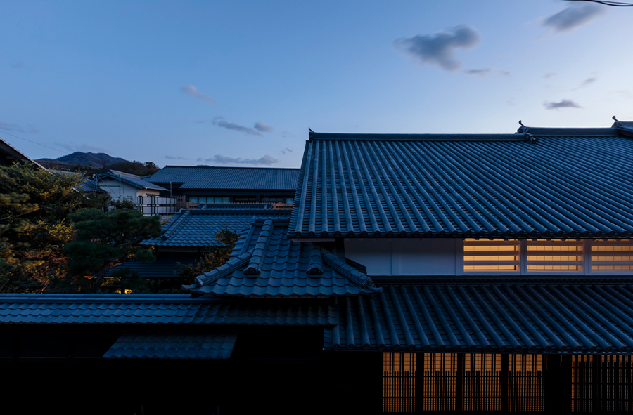
Constructed over 140 years ago, the architecture was renovated to interpret the traditional sukiya style architecture with a modern touch. With our concept, ”historical revival”, we believe that integrating the people of today with the inherited traditions of the architecture and the region can create a harmony that opens new perceptions.
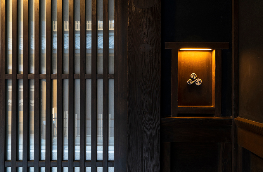
The logo mark constructed of whirlpools expresses the creation of the Japanese archipelago. The three whirlpools illustrate the many layers of history and culture of the communities that coexisted across Asia, meeting to form one island. The continuous movement of the whirlpools symbolizes the birth of new life and creation through circulation. While the triangle shape was inspired by the balance between the host and the guest, who are always welcome as family.
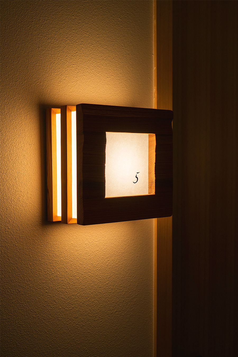
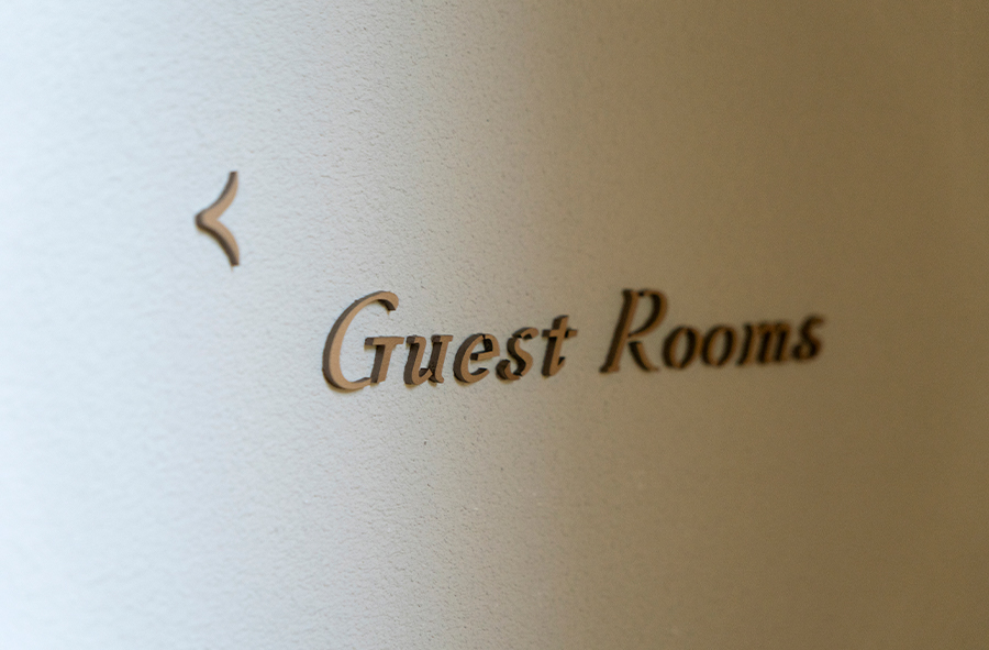
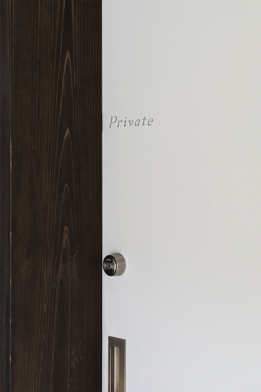
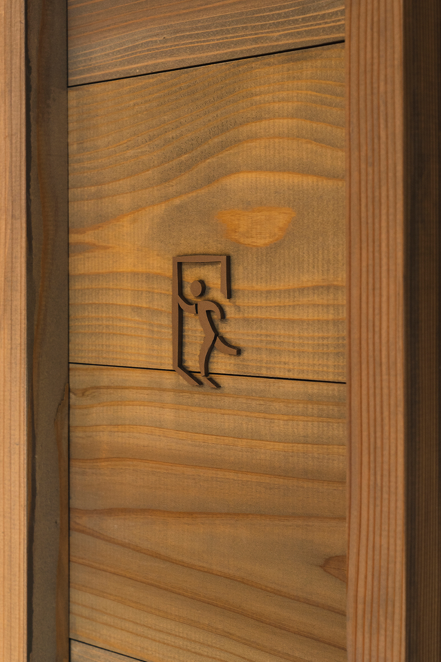
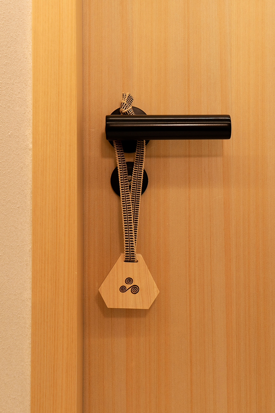
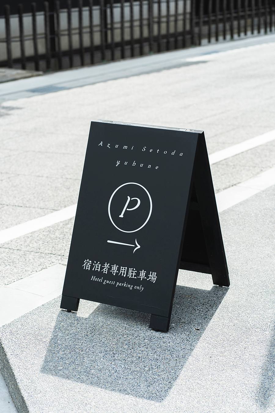
Inspired by the Setouchi Sea, the brand color, asagi blue, was chosen to represent the calm and serene sea. For the signage, we created an original typeface that represents the gentle movement of the waves through their various heights and delicate strokes. Within the traditional atmosphere, the essence of friendliness can be found in the signage and item design. An example of this playfulness is the restroom icons designed with the salt workers’ uniforms, representing Setouchi’s salt farming industry, as well as the do not disturb signs that utilize locally woven ribbons―showing the interaction between guests and the local community.
Authentic, traditional, and modern, Azumi Setoda is located on a small island, Ikuchijima, in the Setouchi Sea at the mouth of the Shiomachi shopping alley. Once known as “The Door to the Island”, the shopping alley used to draw daily crowds of over 10,000 people. One of the main goals of the project was to contribute to the revitalization of the town.
Surrounded by the clear blue sea and pristine fresh air, come and enjoy the scenery of the Shimanami Sea route and feel the warm welcome of Azumi Setoda.
世界的なホテリエAdrian Zecha(エイドリアン・ゼッカ)と株式会社ナル・デベロップメンツ(京都府京都市)によって新しく立ち上げられた旅館ブランド「Azumi(アズミ)」が、2021年3月「Azumi Setoda」を開業。また旅館の別棟となる「yubune」も同時に開業しました。
Adrian Zechaは、今までてがけてきたプロジェクトを、その客層や価格帯からラグジュアリーに限定されていると捉えられていますが、全プロジェクトの当初の意図としては、常にその土地の文化、コミュニティー、芸術、食材に光を当てることと語ります。新ブランド「Azumi」では、日本独自の家庭的な旅館の概念を、当初の意図と照合しながら変化させています。「Azumi」では場所のラグジュアリーさを追求するのではなく、家庭的なおもてなしの心と、地域との共感を生む豊かさを最優先して追求しています。
artlessでは、ロゴデザインを始めとしたV.I.の構築、グラフィック及びサインデザイン / ステーショナリー / アメニティ/ ウェブなど、包括的にブランドデザインを担当。建築デザインの監修は、京都を拠点とし伝統的な日本建築を主とする六角屋・三浦史朗氏。室町時代まで遡る茶道のルーツに基づく日本の美学と、現代の多様性ある暮らしとの絶妙なバランスを見出す建築を生み出してきた、数寄屋造り・日本建築の専門家です。
「Azumi Setoda」は築140年にもなる貴重な建築意匠に伝統的な数寄屋造りの思想を重ね合わせ、現代的な趣も兼ね備える空間を目指しました。
わたしたちは、この空間を「歴史の再生」の場として捉え、「お屋敷・地域に広がる受け継がれた伝統は現代の人々とどのように融合するのか」また、「再生する事で新しくここでなにが育まれていくのか」に焦点をあてこのプロジェクトに携わりました。
ロゴデザインは、「Azumi」 が考える島国の成り立ちを描いています。多民族が海を越え出会い、土地や文化を築いていく様子を3つの渦で表現し、三角形に回る動きは循環する事で生まれる新たな生命や創造の誕生を象徴します。均等に惹かれ合う渦は相手の存在を絶対とする相対関係を意味し、旅館とお客様の関係性もそうでありたいという創設者の思いからインスピレーションを受けています。
ブランドカラーには、静寂な瀬戸田の海を想起させるあさぎ色を。サインネージには、穏やかな波の動きを表現したオリジナルタイプフェイスを起用。繊細な曲線からなる1文字1文字が、館内に流れるゆったりとした時間に寄り添います。
また、伝統ある建築物の中で垣間見れる、素朴さや親しみやすさもエッセンスとしてデザインに加えています。塩田文化を模様したトイレサインや、地元の紐を使ったDo not disturbサインなど、館内の至る所に小さな遊び心が織り込まれているのもその1つです。
美的であり、歴史的であり、現代的でもある旅館「Azumi Setoda」。瀬戸田港から耕三寺にかけて繋がる地元の商店街「しおまち商店街」の入口に位置し、かつては島の玄関口と見なされ、毎日約10,000人を迎え入れていた時代もあったと言われています。このプロジェクトでは、その活力を街全体に取り戻すことにも貢献したいと願っています。
澄んだ青い海に囲まれ、純粋で新鮮な空気が流れす瀬戸田、生口島。しまなみ海道の景色を眺め、「Azumi Setoda」の暖かなおもてなしをぜひ肌で感じに。