branding + visual identity
( logo + signage + graphic + packaging + goods + web )
https://donuts.koe.com/
branding: artless Inc.
interior design: kengo kuma and associates
creative direction & art direction: shun kawakami
illustration: yu nagaba
project management: asami kinoshita
design: koyuki inagaki
assistant design: kanako ueno, qiwen cao
web development: adrien dufond, artless interactive
photography: masaki hamada, yuu kawakami
client: STRIPE INTERNATIONAL INC.
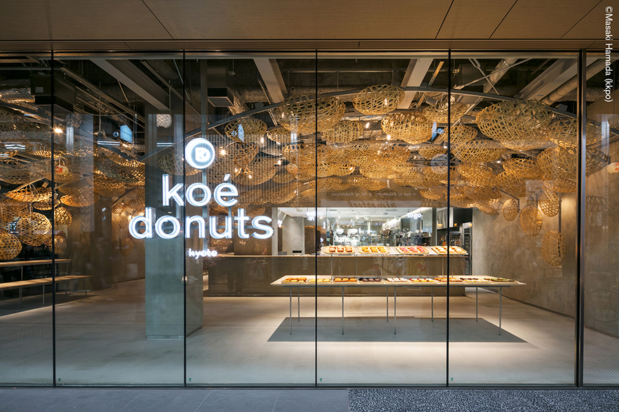
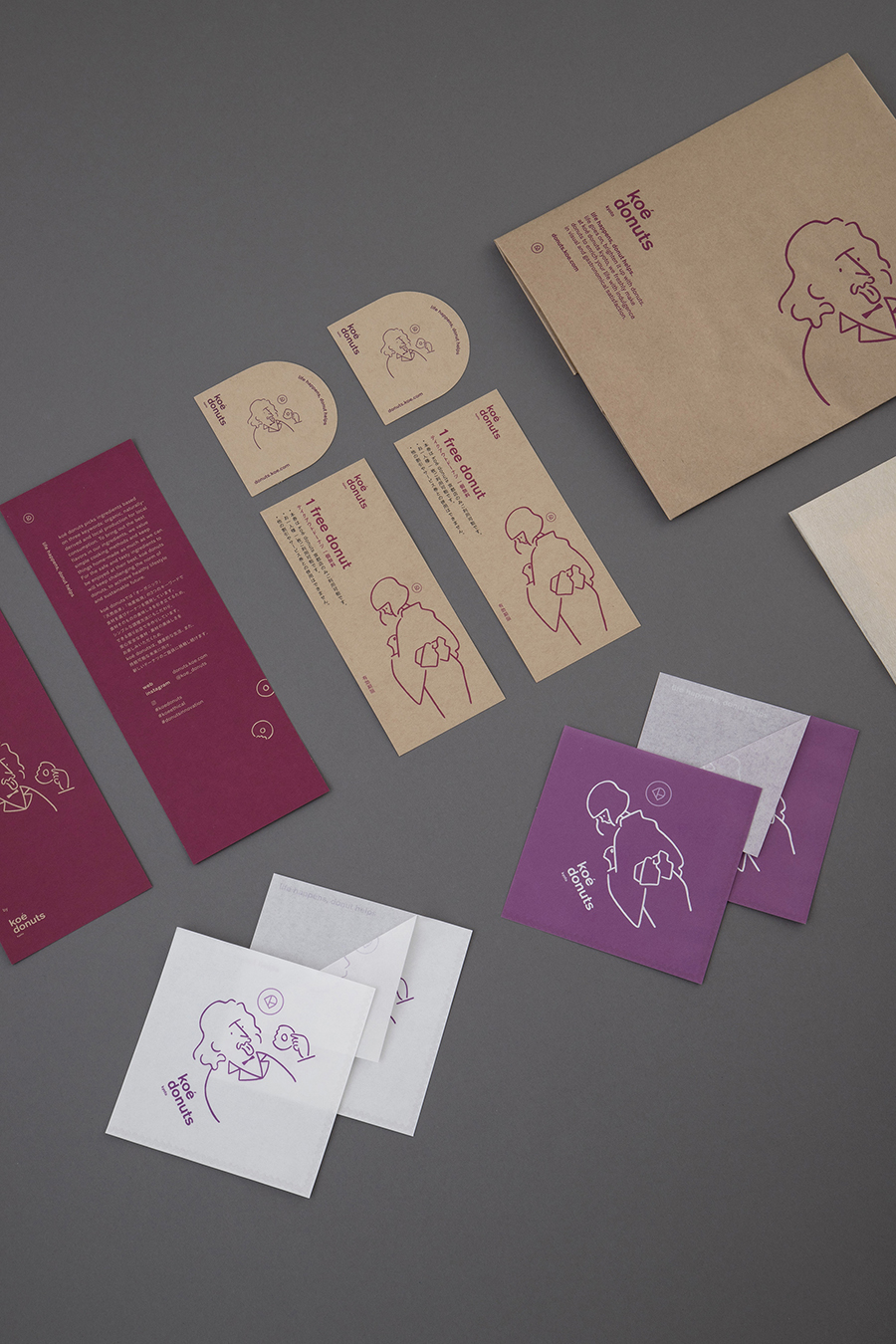
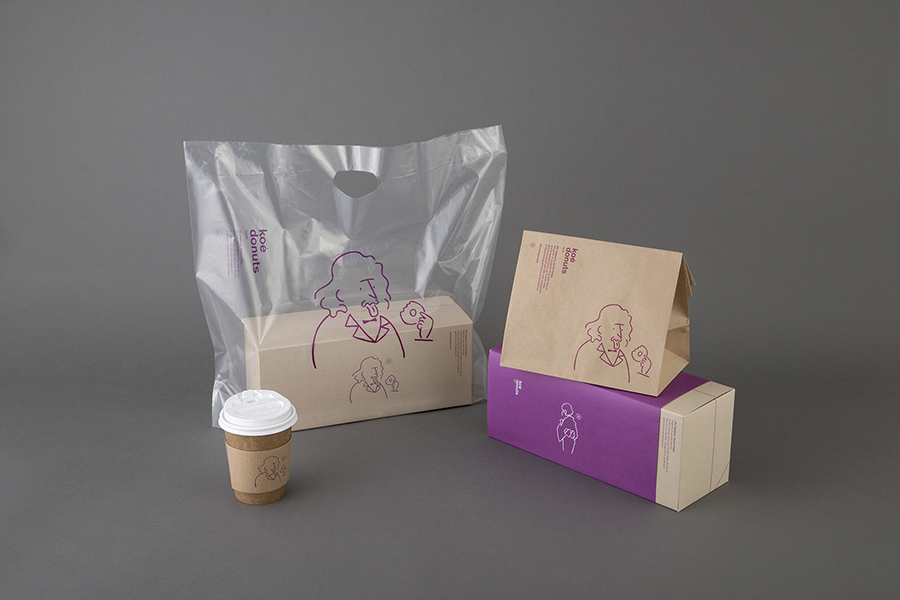
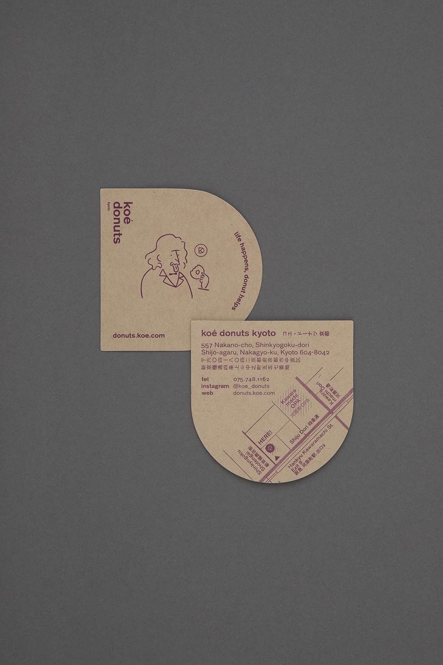
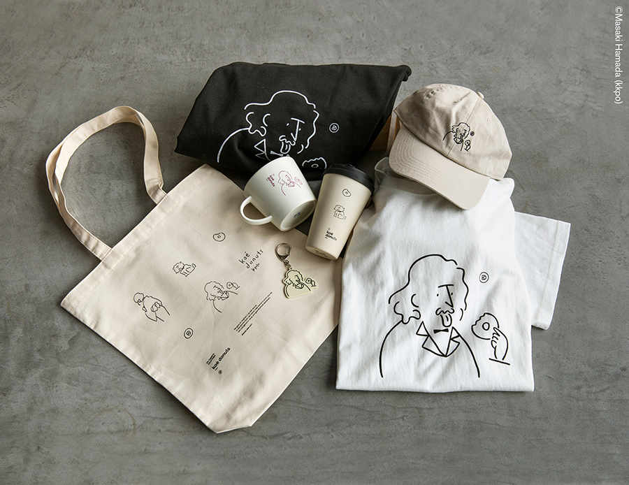
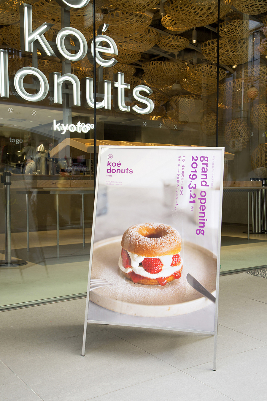
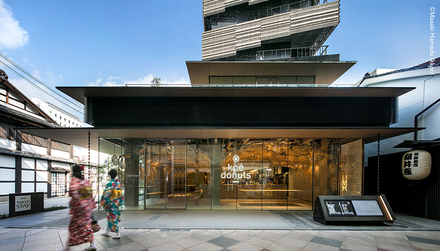
artless Inc. was responsible for designing the signage, goods, website, and total branding/identity of “koé donuts”, a donut factory opened in March of 2019 in the Shinkyogoku area of Kyoto.
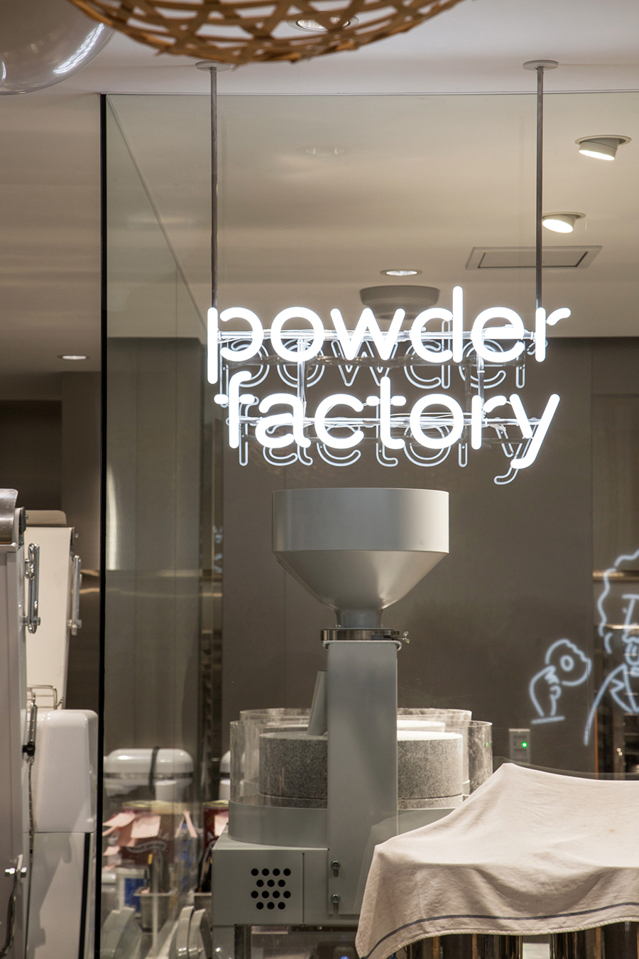
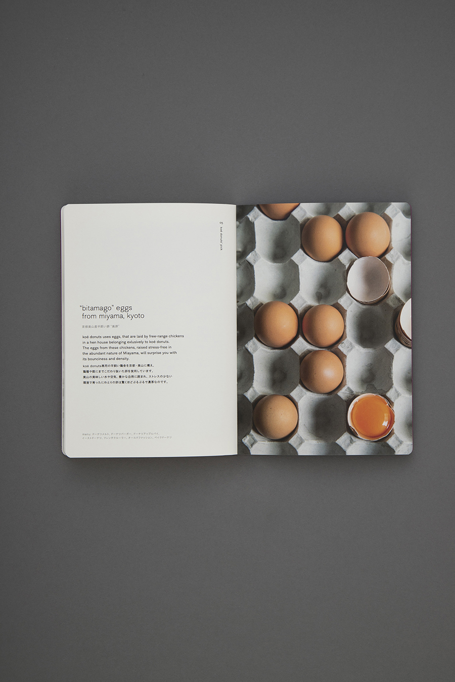
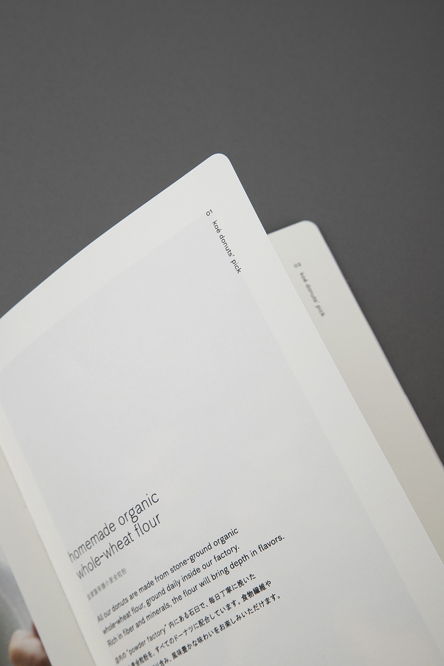
Similar to koé, which artless also conducted the branding for, koé donuts embraces the true meaning of the words “organic”, “natural”, and “locally grown”. They carefully select ingredients that are both good for the body and the environment—ethically reimagining Japanese donuts.
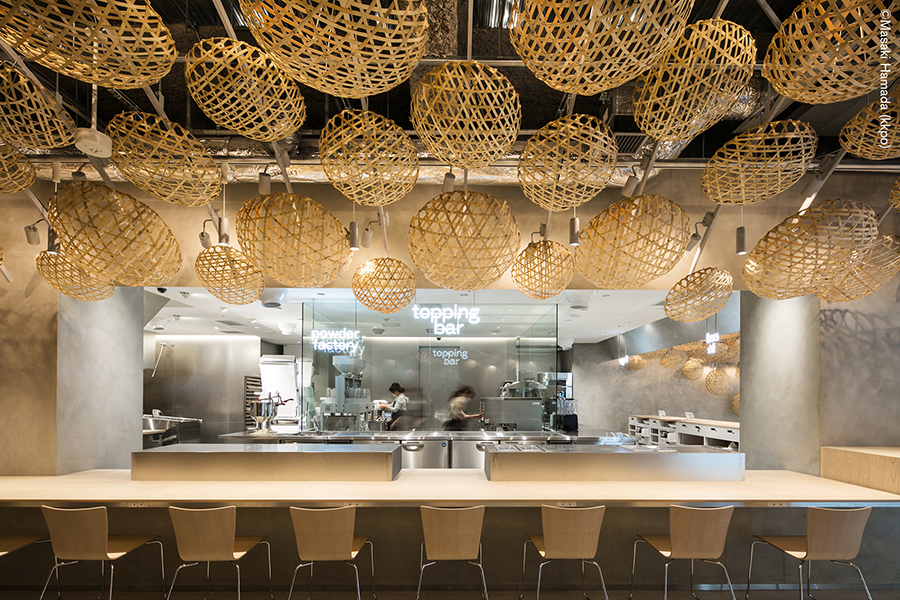
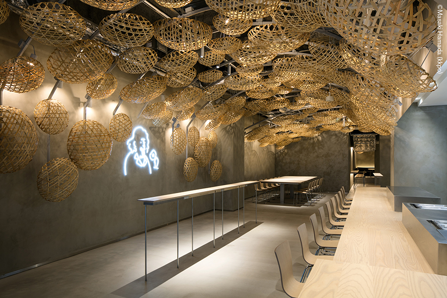
The architecture and interior design was carried out by Kengo Kuma, recipient of numerous national and international awards including the Architectural Institute of Japan Award as well as responsible for the architecture of the New National Stadium set to be complete in 2020. Kuma took an ethical and organic approach to the interior of koé donuts and spread Kyoto Arashiyama woven bamboo baskets across the ceiling, creating a warm and relaxing atmosphere.
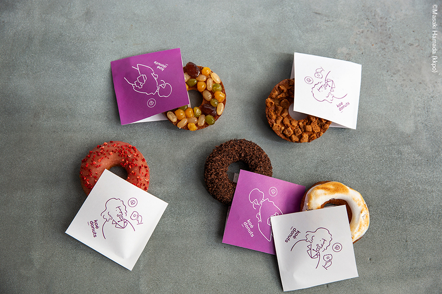
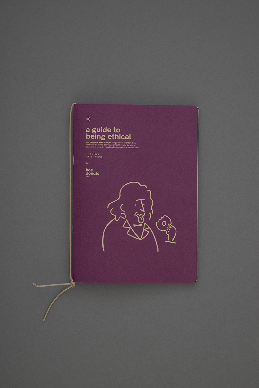
Furthermore, koé donuts’ character illustration was done by the well-known and talented illustrator, Yu Nagaba, renowned for his work in “POPEYE” magazine and numerous other publications.
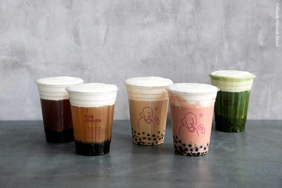
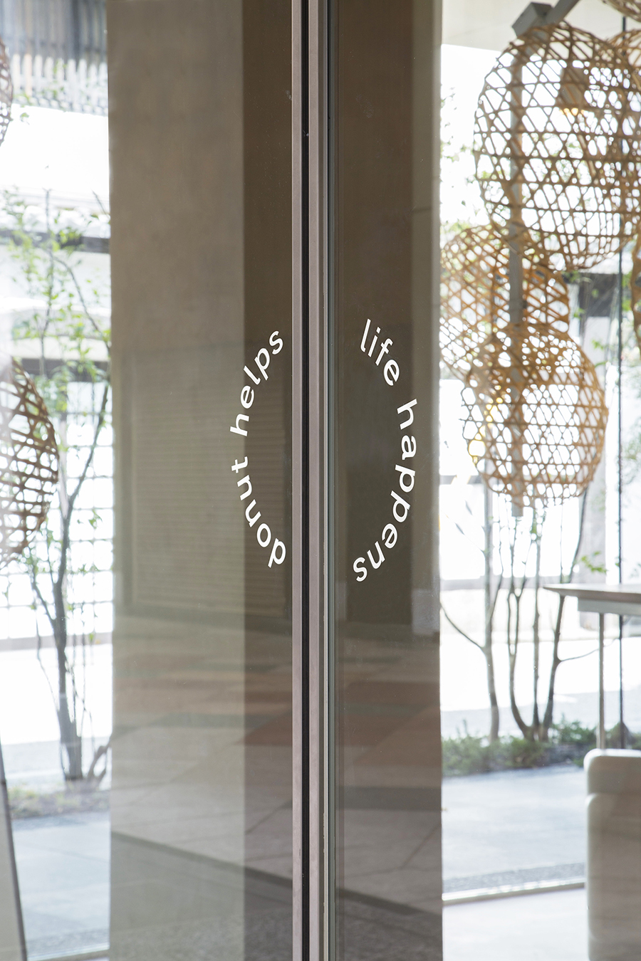
artless Inc. collaborated with architects and illustrators during the branding and design process; striving to preserve the identity of the brand established with koé while expressing the value and importance of Kyoto. Further solidifying koé’s brand identity, the same typeface was used. It was then combined with a more contemporary monogram of the K and D to give a fresh and Kyoto-like feeling to the logo. The brand color is a traditional Japanese purple, lending to the overall elegance of the identity. Lastly, coinciding with the brand philosophy of being “ethical”, the shop cards and take-out boxes are all made with environmentally conscientious craft paper.
Next time you find yourself in Kyoto, come stop by koé donuts.
_
artless Inc. は、京都・新京極にオープンしたドーナツファクトリー「koé donuts」のロゴをはじめ、グラフィック・サイン・パッケージング・グッズ・ウェブとトータルでV.I.及びブランディングを担当いたしました。「koé donuts」は同じくartless Inc. がブランディングを手がけるライフスタイルブランド「koé」により、「オーガニック」「天然由来」「地産地消」をキーワードとした、身体にも環境にも配慮した素材を厳選し、日本らしいドーナツに再編集したエシカルなドーナツを提供いたします。
インテリアデザインは、2020年完成予定の新国立競技場を手がけ、日本建築学会賞など国内外で多数の賞を受賞する隈研吾氏が手がけ、京都嵐山の伝統的な竹かごに覆われたインテリアはエシカルへの取り組みとオーガニックへのこだわりを表現すると共に、暖かで柔らかな空間となっています。 また、koé donuts のキャラクターをはじめとするイラストレーションは、雑誌や広告など様々なジャンルで知られ、幅広い層から支持を得る人気イラストレーター長場雄氏が担当しています。
artless Inc.は koé らしさを表現しつつ、建築家、イラストレーターとのコラボレーション、京都という場所を大切にしたブランディング及びデザインを行なっています。ロゴデザインは koé ブランドオリジナル書体を使用しブランドの認知を確固たるものにすると共に、コンテンポラリーな家紋をイメージした、KとDを組み合わせたマークを添えることで京都らしさや軽やかさを表現しています。ブランドカラーはポップでありながらも気品を感じさせる日本の伝統色である紫を選定。また、ブランドフィロソフィーの「エシカル」に寄り添い、ショップカードやテイクアウト用のボックスなど環境に配慮した素材を使用しています。