FUKUDAYA OUMI
brand visual design :
logo & visual identity, brand key visuals, graphic & signage, website.
visual identity development: artless inc.
art direction: shun kawakami, artless inc.
design: qiwen cao & yafa koseko, artless inc.
project management: moeko tamakawa, artless inc.
key visuals / photography: yuna yagi
branding: Terasu
client: Naru Developments
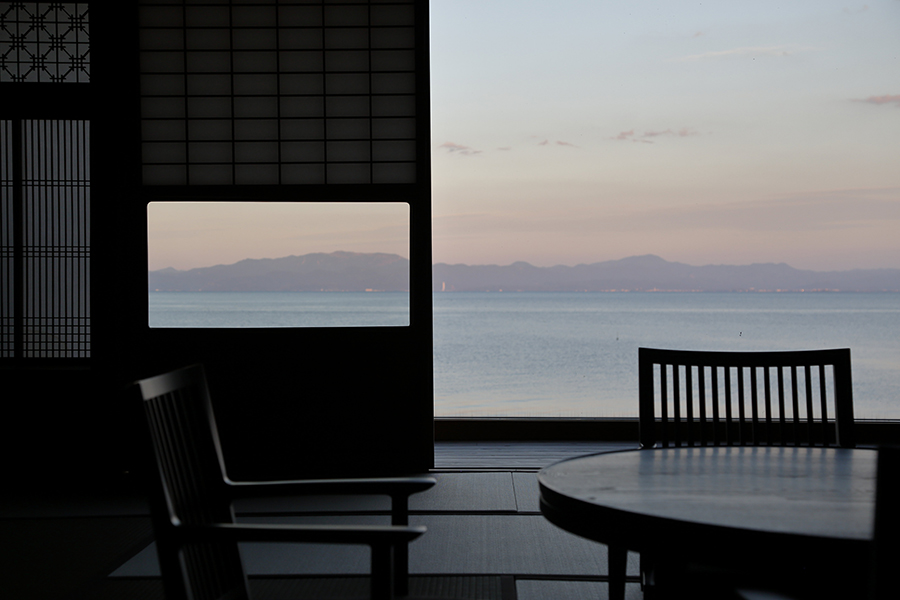
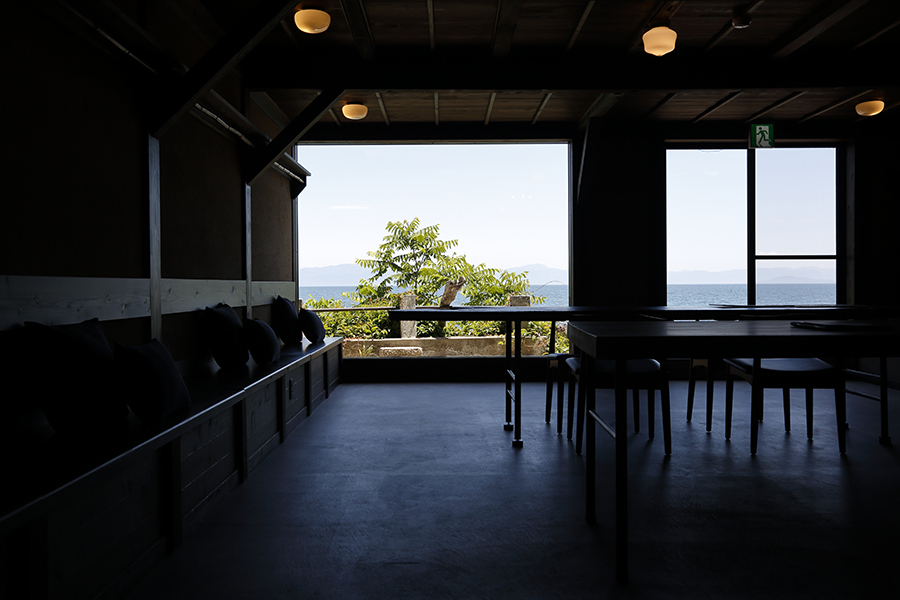
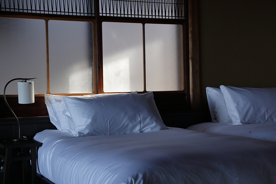
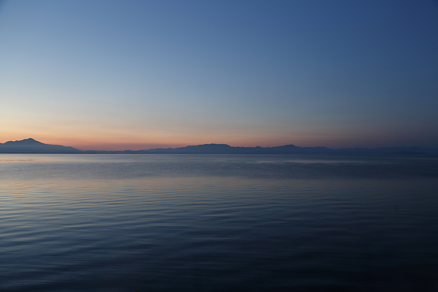
Become attuned to the ripples on the water’s surface and the shifting hues of the sky at a private lakeside inn on Lake Biwa.
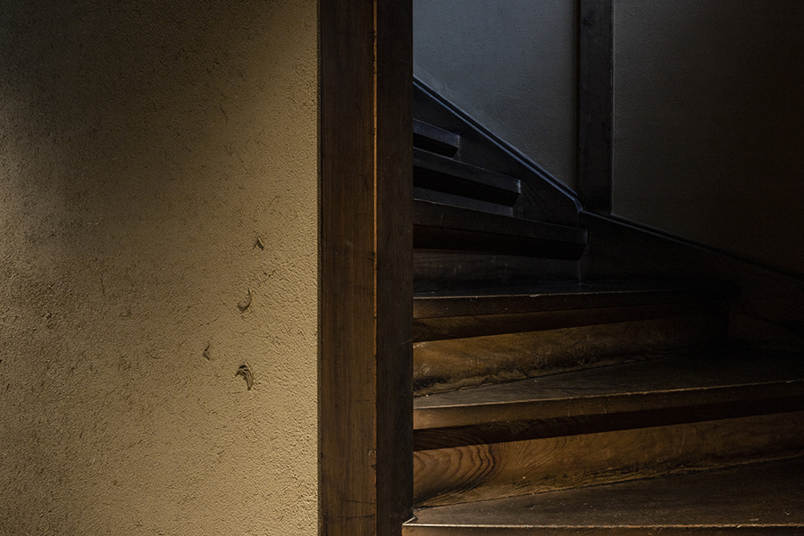
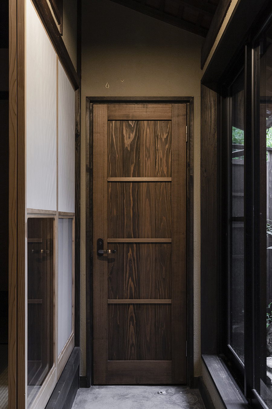
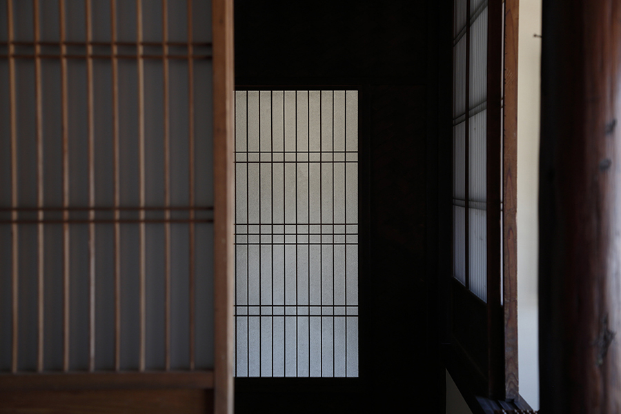
Fukudaya, an inn that flourished as a home for travelers for 140 years, was renovated as a private retreat catering to individual groups. Located on the northwest shore of Lake Biwa in Imazu, Omi, Fukudaya opened its doors in June 2020.
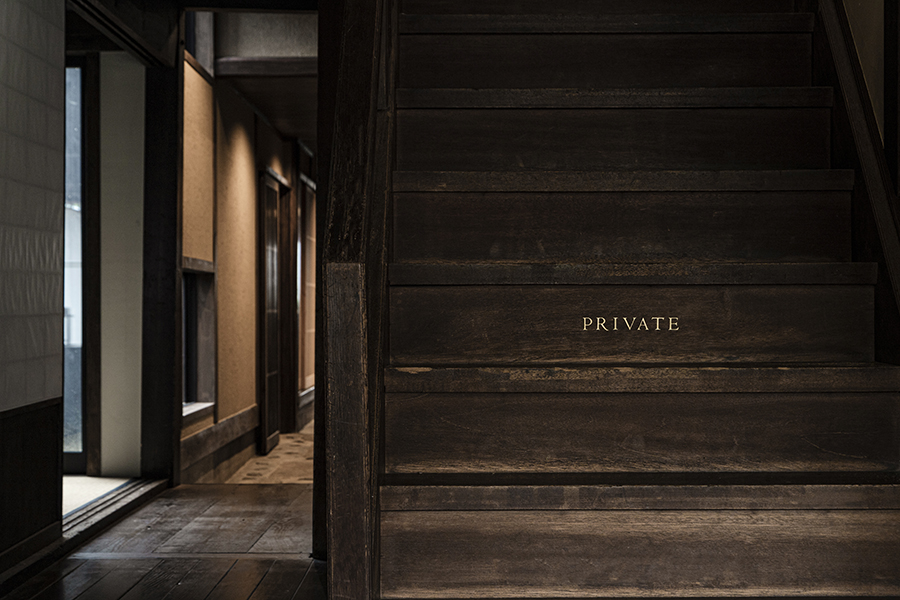
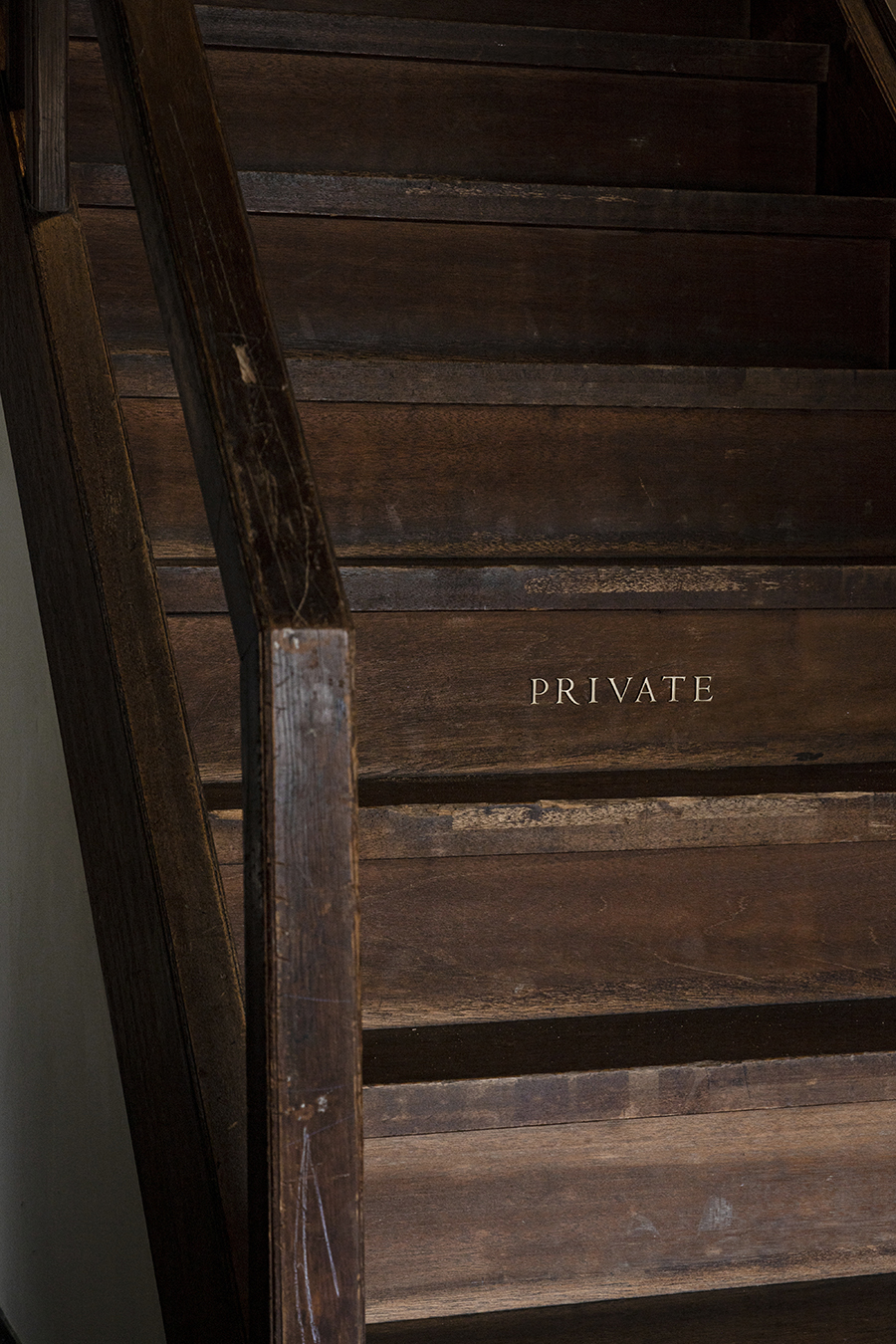
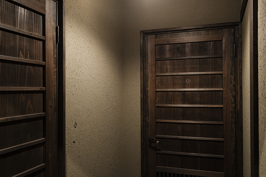
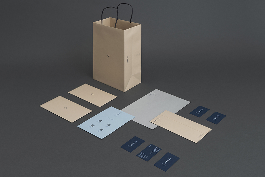
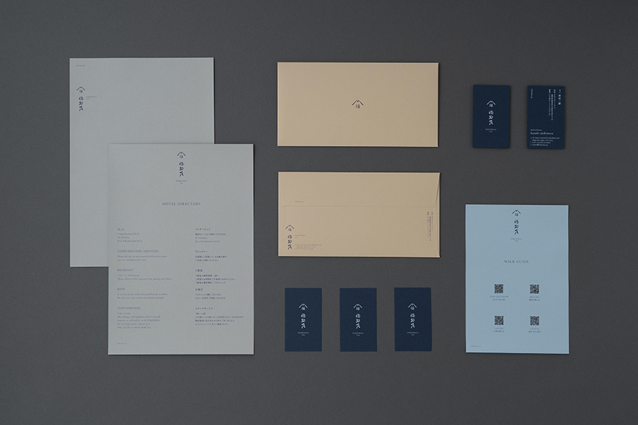
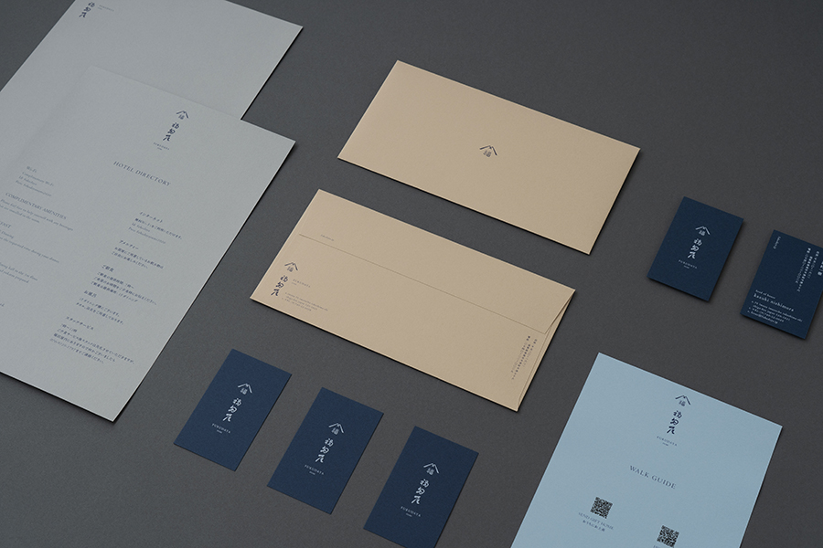
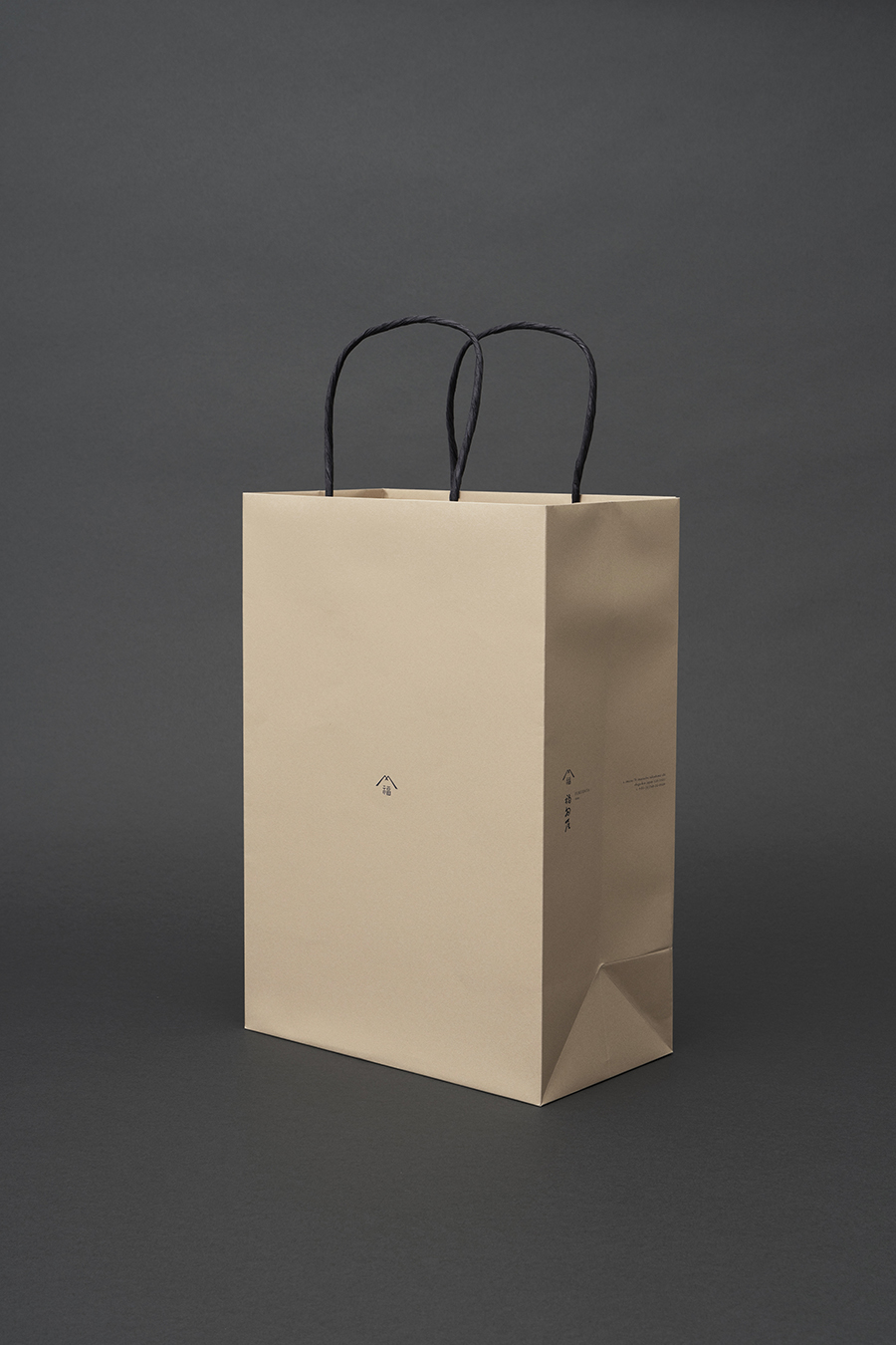
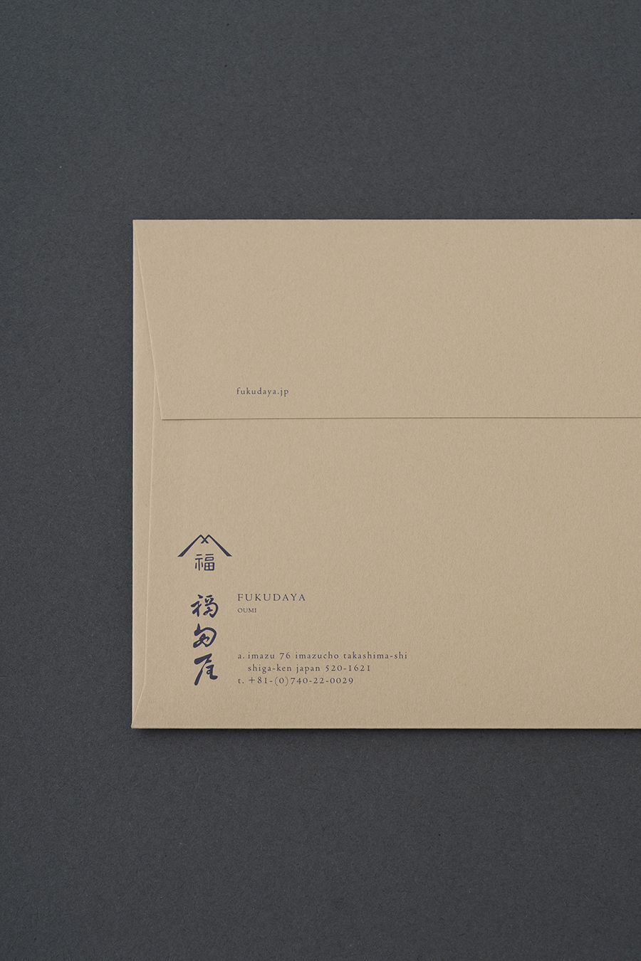
We were in charge of the comprehensive brand design, including logo design, V.I, signage design, stationery, and web design.
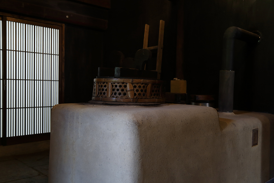
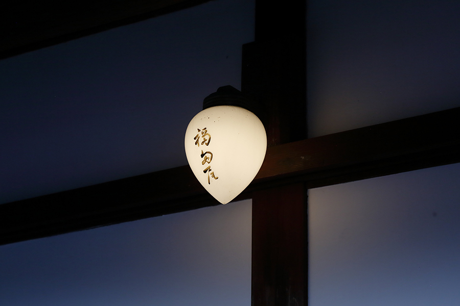
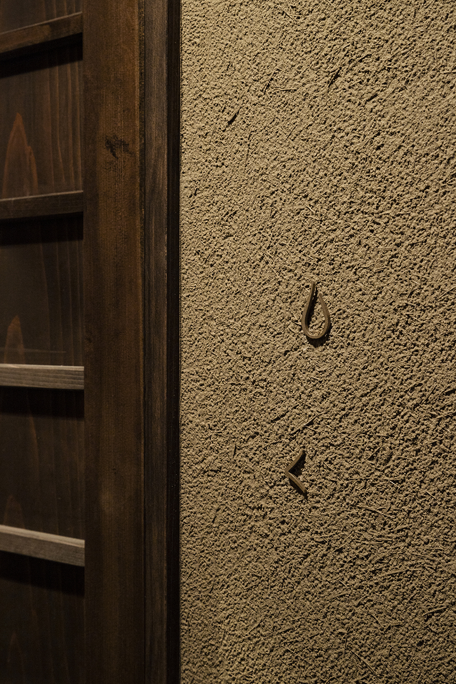
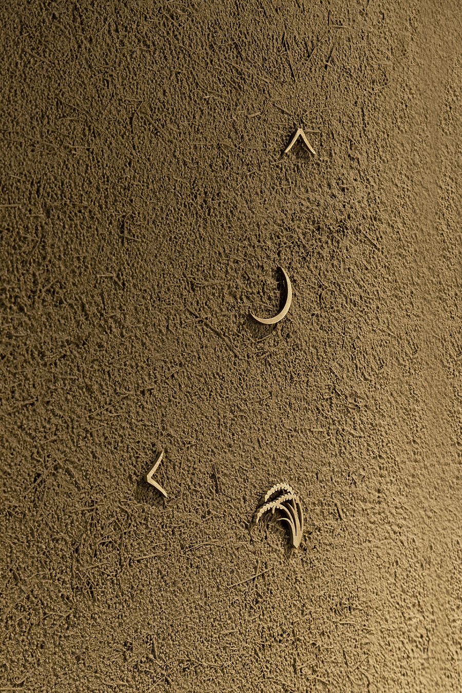
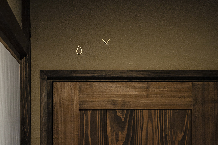
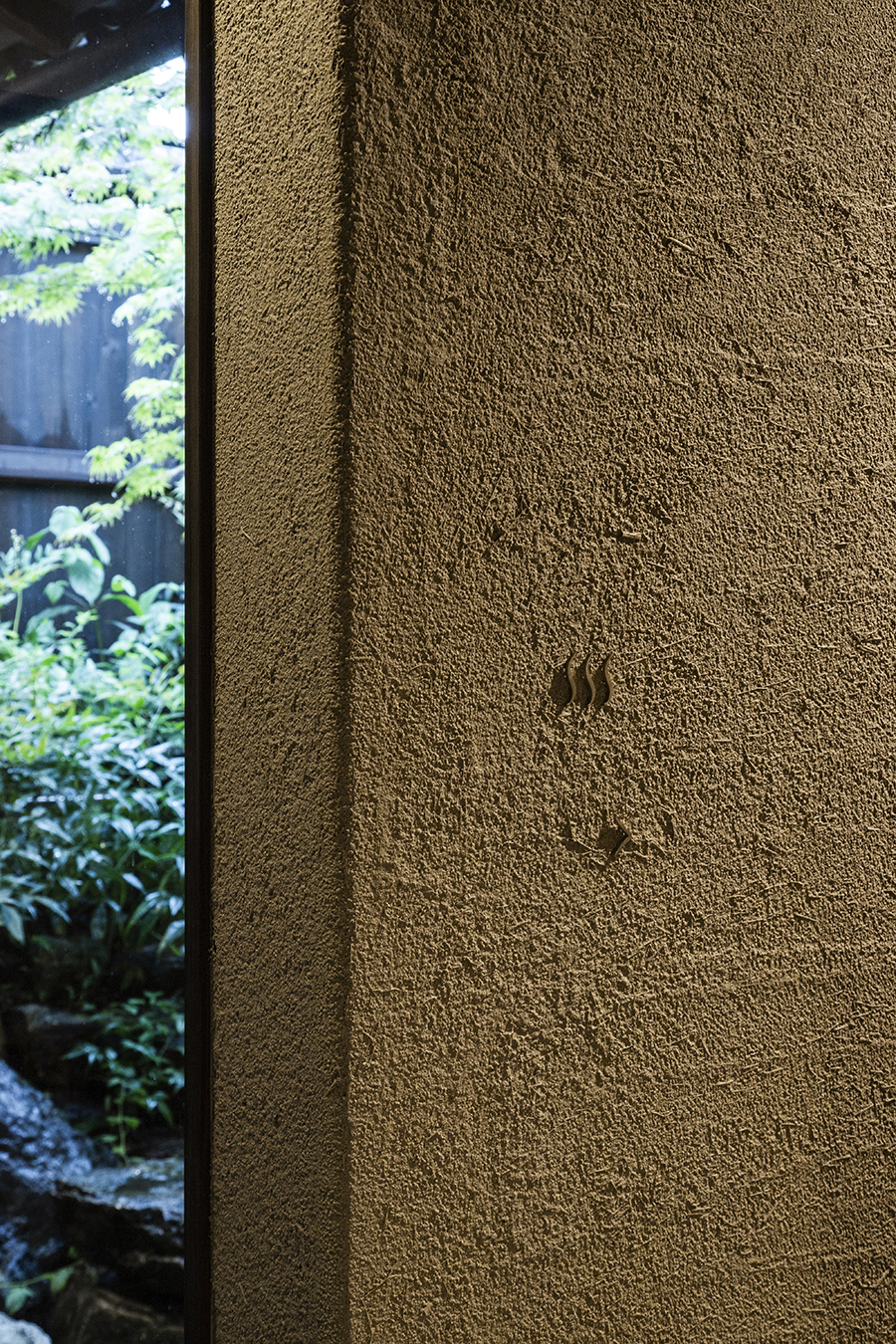
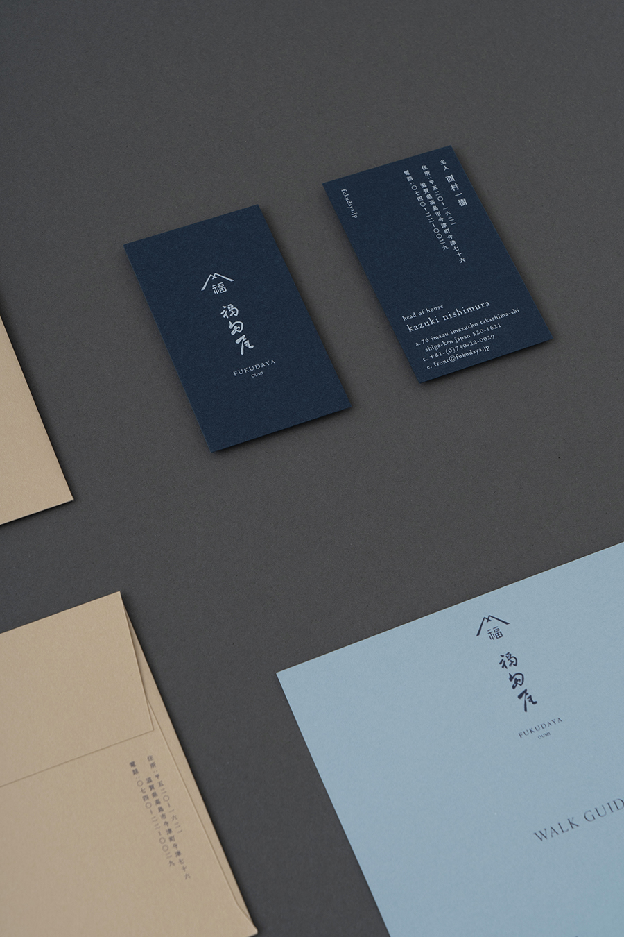
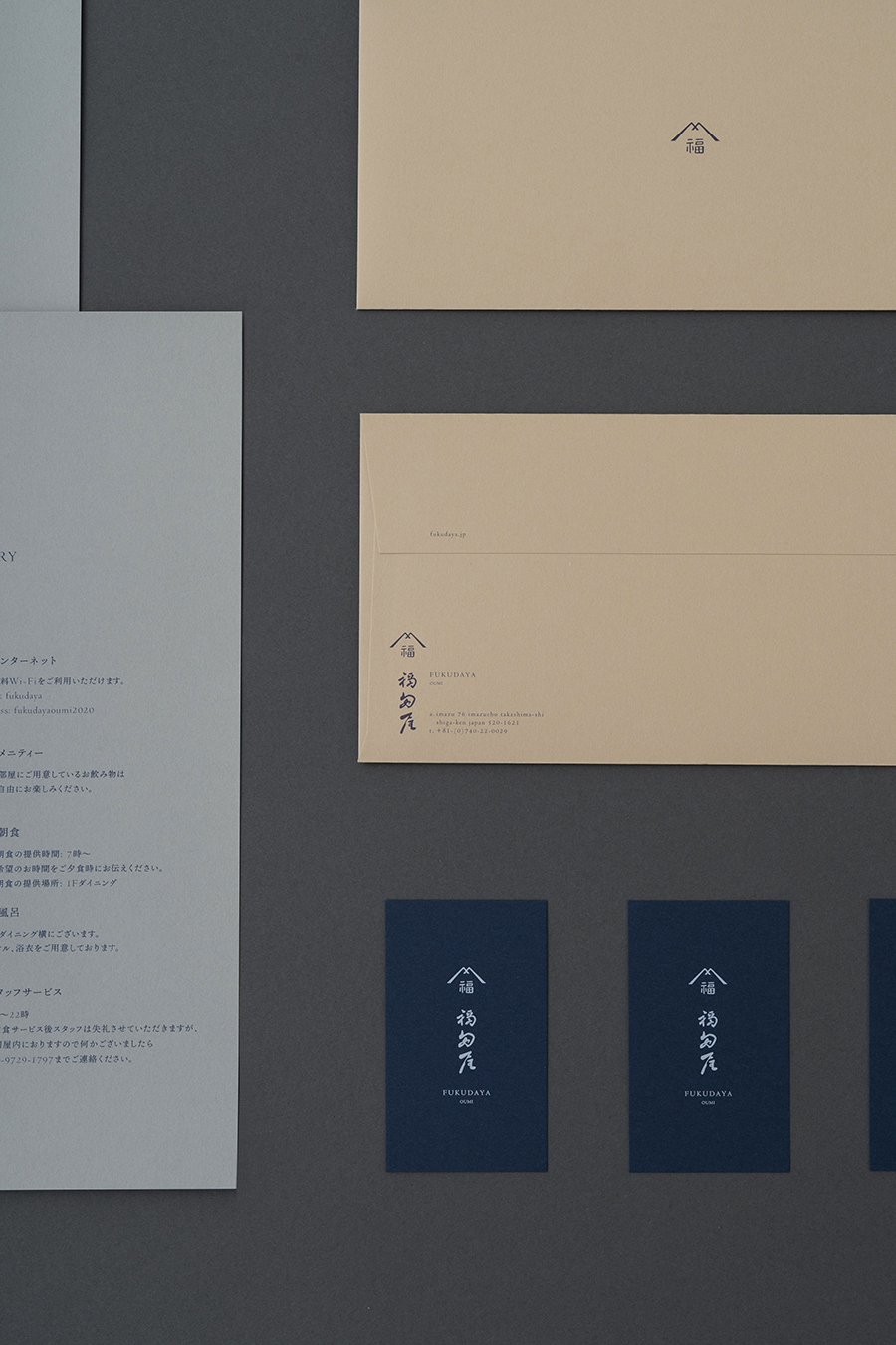
Honoring the culture and legacy of this historic institution, the logo was inspired by the mark left at the entrance of the building. The brand colors light grey and blue-grey were sampled from building materials and mud walls, while the blue hues were inspired by the shifting colors of Lake Biwa from morning to dusk.
Embracing the idea of creating a second home for travelers, we kept the number of signs to a minimum, and instead of using words, we used motifs appropriate to each space, such as “moon” for the bedroom and “rice” for the dining room.
Our core ethos was to “design the invisible”—to design like a skilled craftsman and focus on Japan’s unique sense of beauty and hidden details.
Fukudaya’s head of house visits local producers one by one to procure the season’s best harvests, which are then carefully prepared to create meals catering to each individual guest. With Lake Biwa just a step away, enjoy a tranquil time steeped in nature.
水の揺らぎと空の青、琵琶湖湖畔の旅籠、湖水料理。その昔 140 年も前から、旅人の家として栄えていた旅籠「福田屋」の建物を、1組だけの宿として改修。2020 年 6 月に琵琶湖の北西に位置する、近江今津にて開業しました。
artless では、ロゴデザインを始めとしたV.I.の構築、サインデザイン / ステーショナリー /ウェブなど、包括的にブランドデザインを担当。古くから残る旅籠「福田屋」の姿、風土および歴史的背景を尊重し、ロゴは建物の入り口に残された印から型取っています。ブランドカラーには、旅籠の建材や土壁の色味から、うす鼠と青鼠色を。そして宿から一望できる琵琶湖の朝と夕方の色である、水色と紺色を選んでいます。「琵琶湖にあるお客様のもう一つのおうちのようにおもてなしをしたい」という思いから、サインは最小限におさえ、また文字は使用せずに各場所に見合うモチーフとして、お部屋はお休み処として「月」、お食事処には「稲」などを添えました。
本プロジェクトでは、「見えないことをデザイン」することをブランデザインの軸とし、日本独自の美意識と見えない細部にこだわり、職人のようなデザインを心がけています。
–