la vigne hakuba
la vigne hakuba
brand design:
logo + visual identity
brand guide
sign design
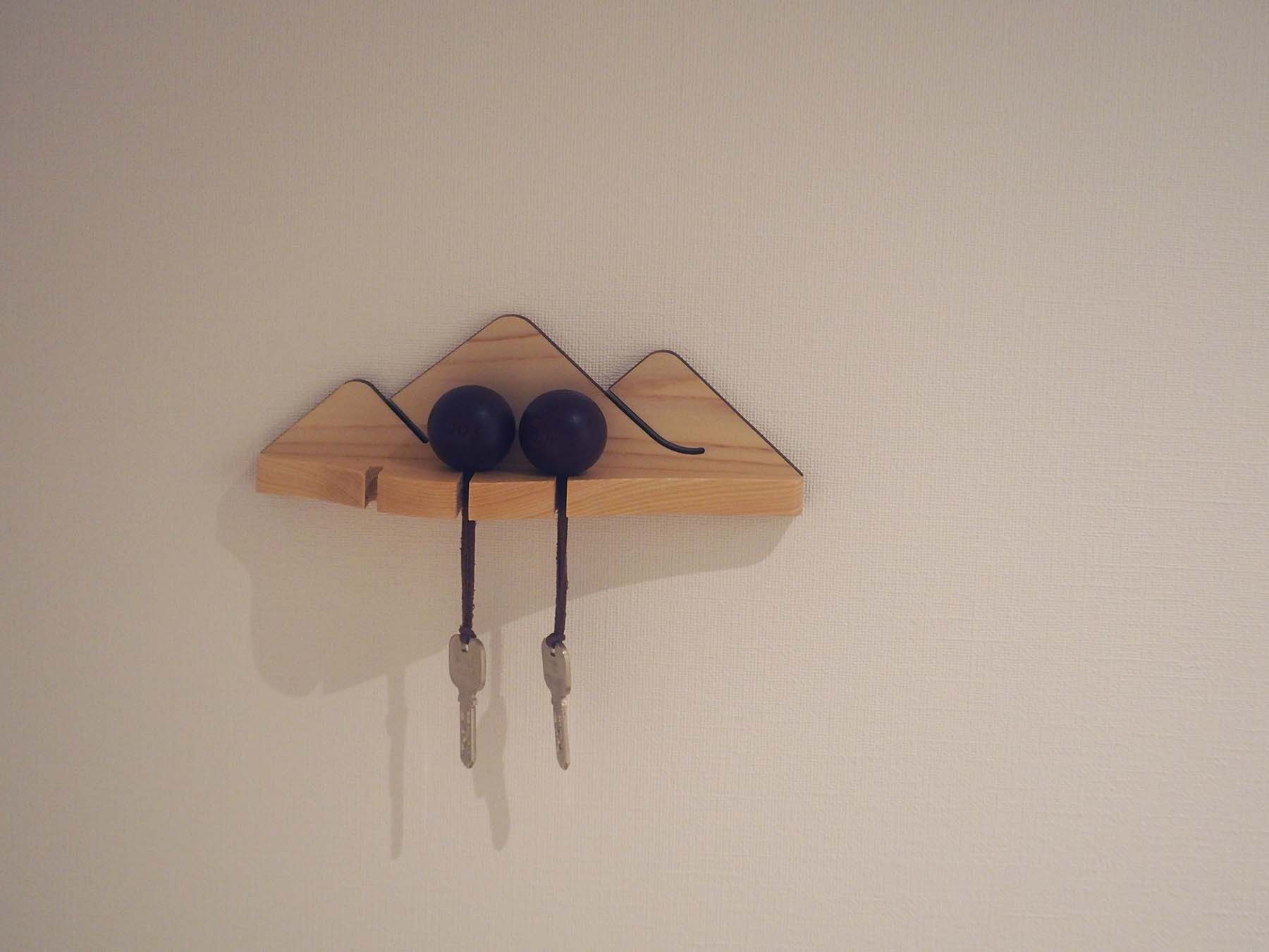
item design
–
brand design: artless inc.
creative direction & art direction: shun kawakami, artless inc.
graphic design: qiwen cao, artless inc.
assistant design: jialiang li, artless inc. kota suganuma, artless inc. alain smadja, artless inc.
project management: mimaki hata, artless inc.
client: Onko Chishin inc.

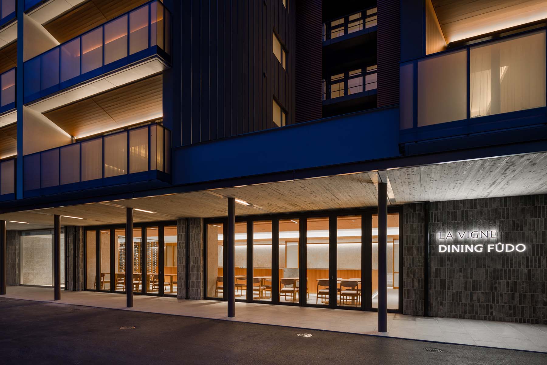
la vigne hakuba is a retreat hotel nestled in the natural surroundings of hakuba, nagano. in winter, it becomes a snow resort; in summer, quiet moments unfold amidst the mountains and forests. a place where, across all seasons, the local environment and the sojourn come together.
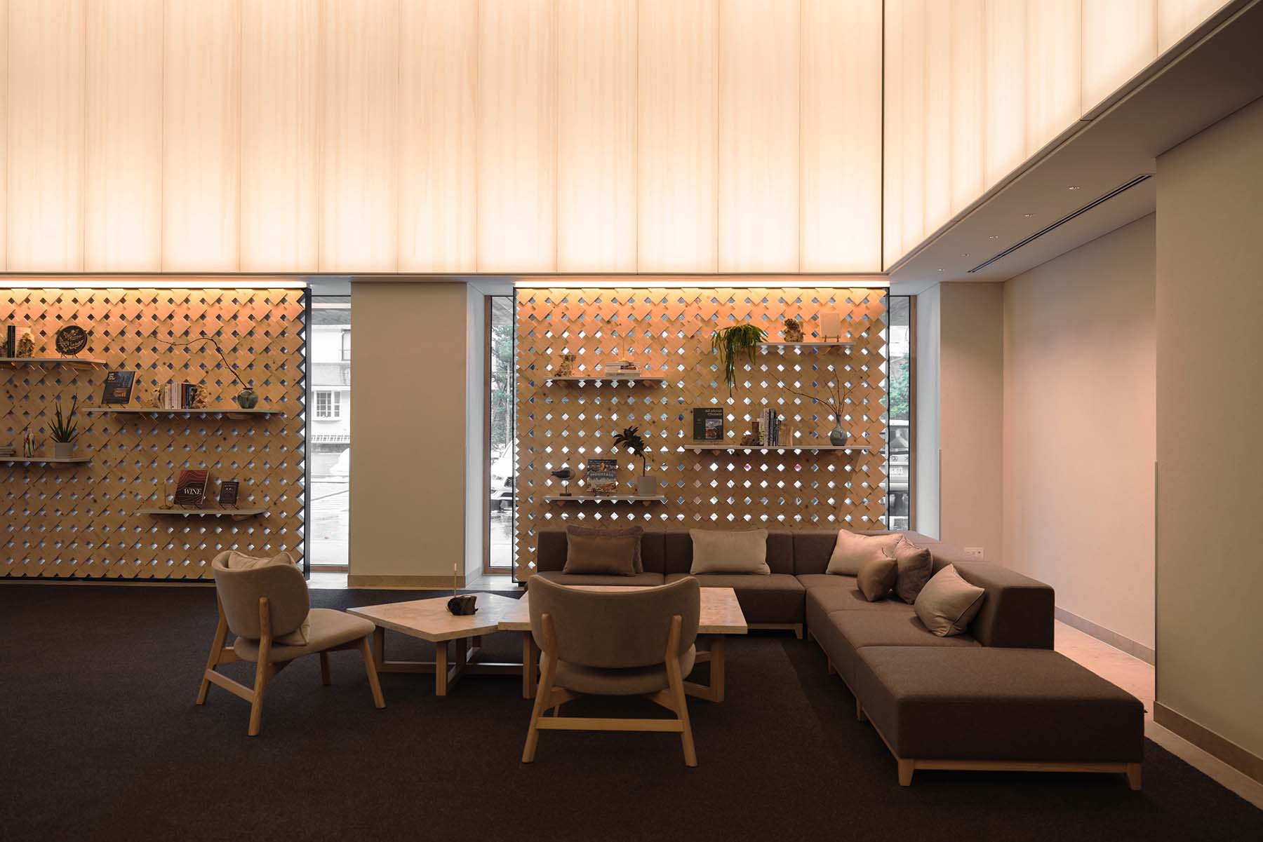
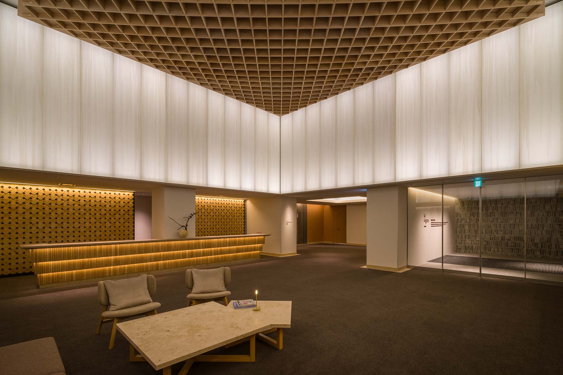
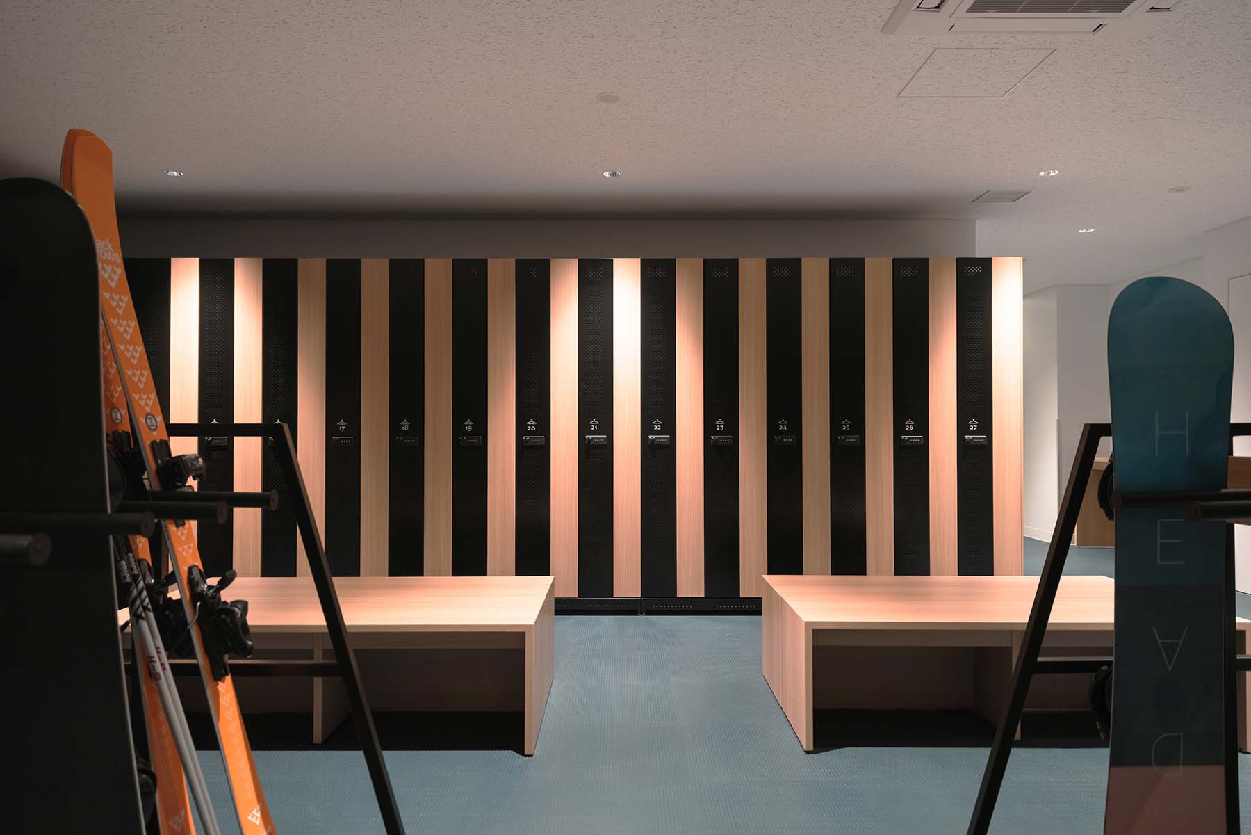
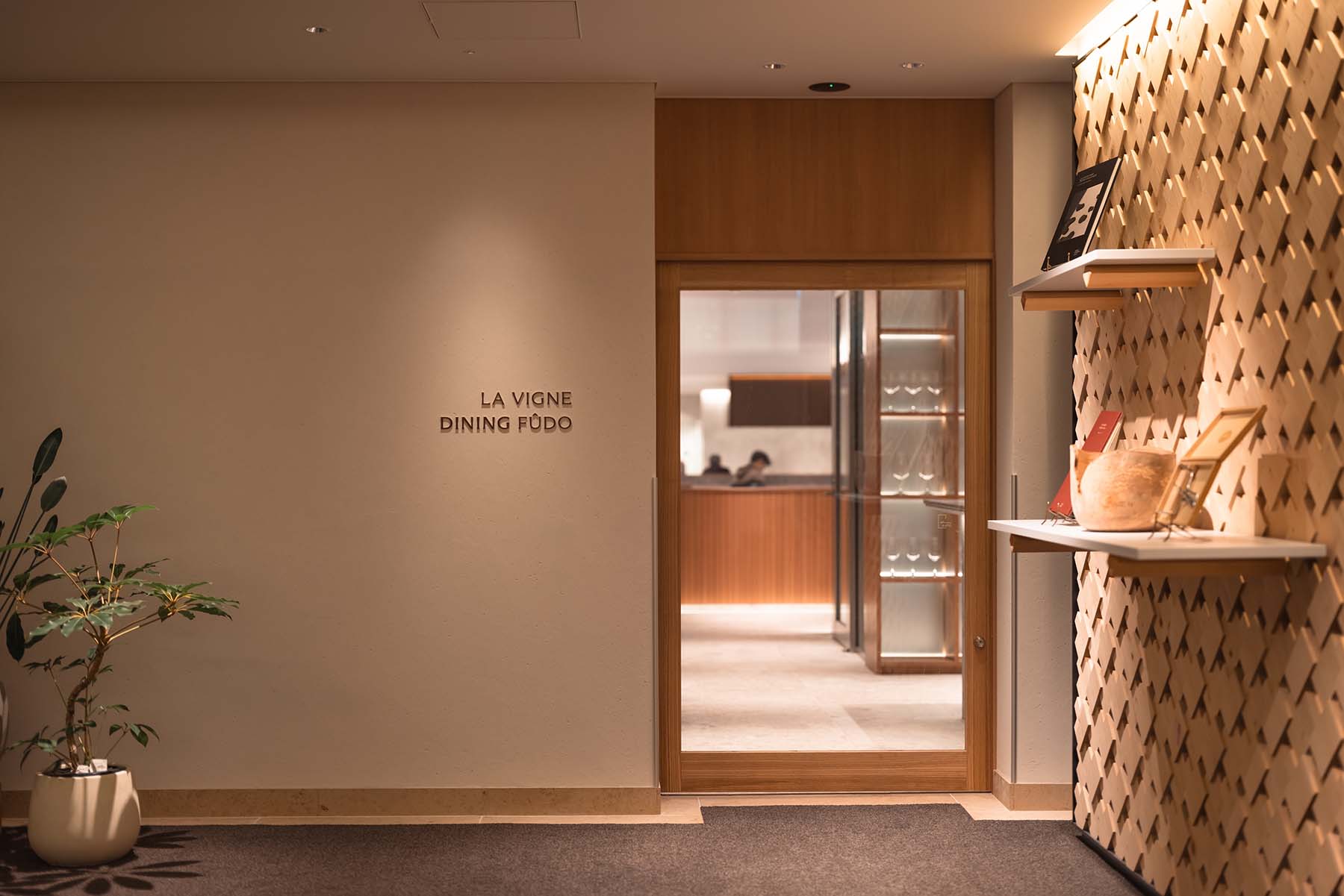
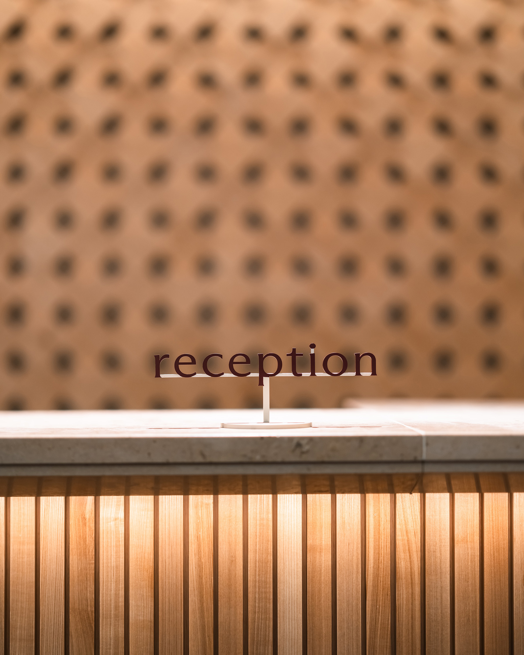
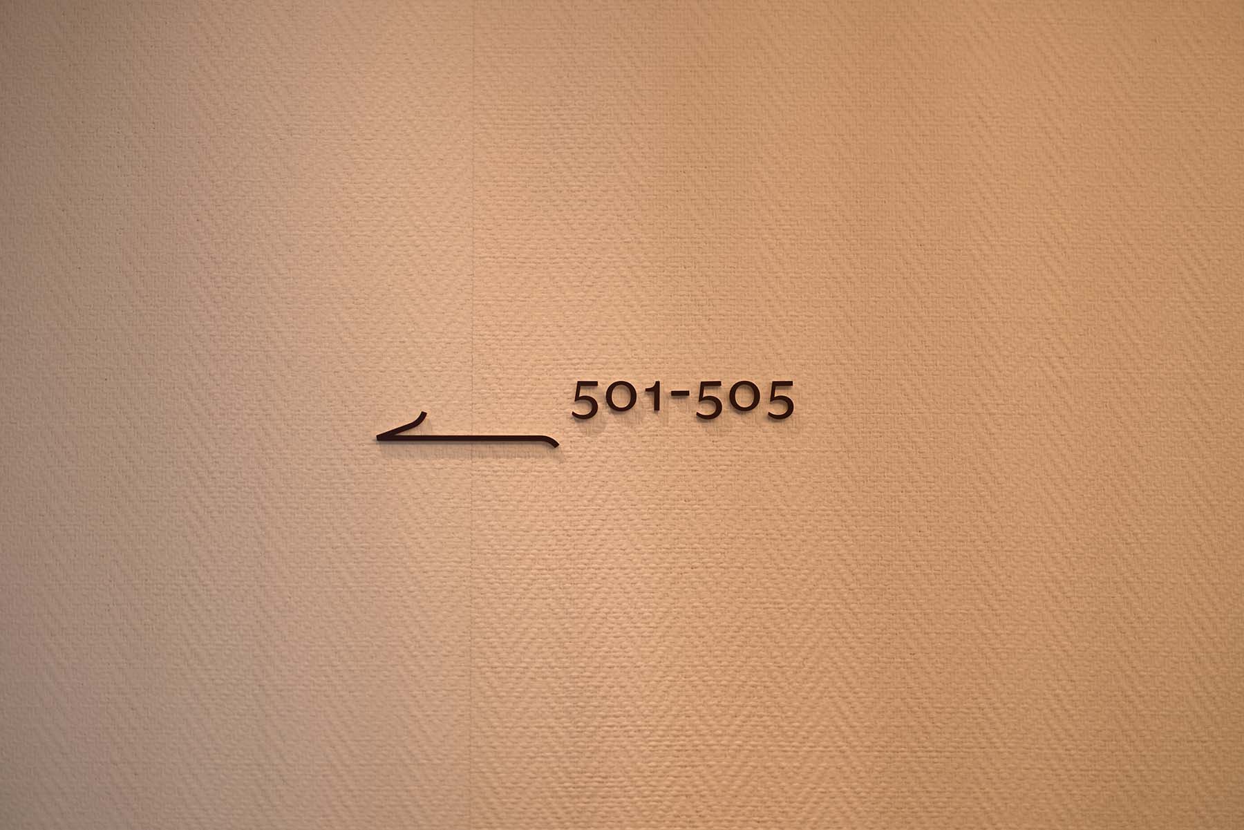
artless crafted the hotel’s entire visual identity—from the logo mark, logotype, brand colors, brand typography and design system to signage, original icons, amenities, and merchandise design.
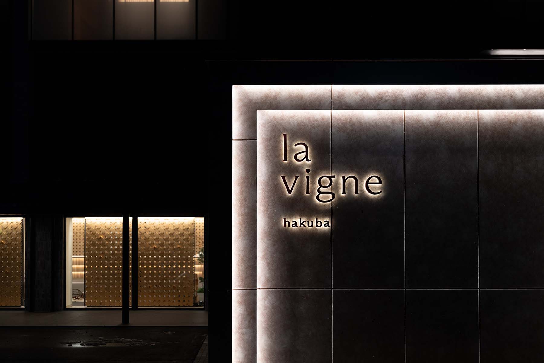
based on a serif typeface that embodies both stillness and tension, the logotype aims for a presence that seems to smear into the atmosphere and light. complementing it, the logo mark originates from “la vigne” (grapevine): a minimal symbol placing the brand’s initial within a circular form symbolizing a fruit. together, these elements quietly define the brand’s tone of voice, shifting between stillness and motion, the organic and the structured.
the brand’s color palette pairs a wine red drawn from the brand’s name with an ivory that harmonizes with surrounding materials. this pairing sets a visual tone that evokes both tranquility and warmth.
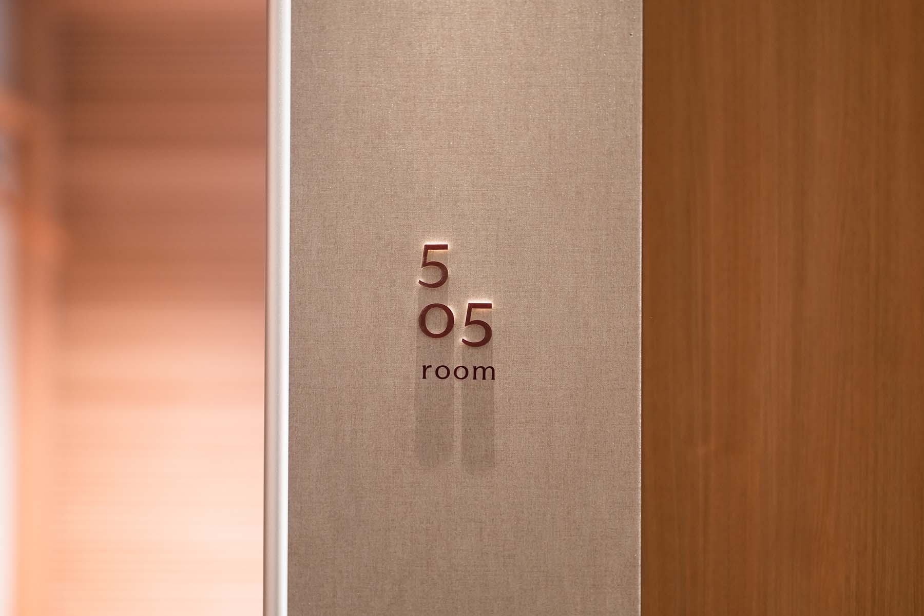
signage and icons draw on the logotype’s brushstroke rhythm and angles, expressed through lines that abstract the curved form of skis, a defining symbol of Hakuba.
pictograms and arrows, applied in two distinct styles depending on spatial context and flow of movement, achieve maximum visibility through minimal form.
these elements are designed to appear comfortably, serving not only a practical role but also as components that shape the rhythm and intervals of the space, and that function as information quietly standing in place.
embracing both the seasonal gradations of hakuba and the international sensibilities of visitors from around the world, la vigne hakuba continues to shape new culture and scenery in this land.
la vigne hakuba(ラ・ヴィーニュ 白馬)は、長野・白馬の自然に包まれたリトリートホテルです。冬はスノーリゾートとして、夏は山や森とともに過ごす静かな時間が流れます。四季を通じて、滞在と風土が重なり合う場所です。
artless は、ロゴマーク、ロゴタイプ、ブランドカラー、ブランドタイポグラフィと、デザインシステムから、サインデザイン、オリジナルアイコン、アメニティやグッズのデザインなど、ホテル全体のビジュアルアイデンティティの構築を行いました。
ロゴタイプは、静けさと緊張感を併せ持つセリフ体をベースに、空間や光に滲むような佇まいを目指しています。ロゴマークは “la vigne(葡萄の蔓)” に由来し、果実を象徴する円形の中にブランドの頭文字を配置したミニマルなシンボルです。タイポグラフィとシンボルが、静と動、有機と構成のあいだを行き来しながら、ブランドの語り口を静かにかたちづくります。
ブランドカラーは、ブランド名にちなんだワインレッドを主軸に、空間素材と調和するアイボリーを組み合わせた二色構成。静けさと温度を感じさせるビジュアルトーンを形成しています。
サインとアイコンは、ロゴタイプの筆脈や角度を手がかりに、白馬の象徴でもあるスキー板のカーブを抽象化したラインで構成。ピクトグラムや矢印は、動線や設置環境に応じて二種類のスタイルを使い分け、最小限の構成で最大限の視認性を実現しています。
静かに心地よく現れるようデザインされ、機能としてだけでなく、空間の「間」やリズムを整える存在として配置され、静かに佇む情報として機能させています。
白馬という土地がもつ四季のグラデーションや、様々な国から訪れる人々のインターナショナルな感覚の流れに寄り添いながら、la vigne hakuba は、この地に新たな文化と風景を描いていきます。