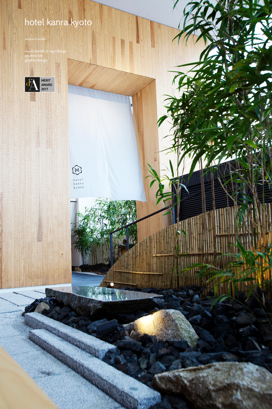
hotel kanra kyoto
 credit :
produce, brand concept, architecture and interior design: UDS Ltd.
branding and v.i., graphic & sign design: artless Inc.
–
creative direction and art direction, v.i.: shun kawakami, artless Inc.
art direction and design: kazuki kaneko, artless Inc.
design: shinsaku iwatachi, artless Inc.
symbol design: emmi narasaki, Styledesignworks
photographer: yuu kawakami, artless Inc.
client: hotel kanra kyoto, UDS Ltd.
–
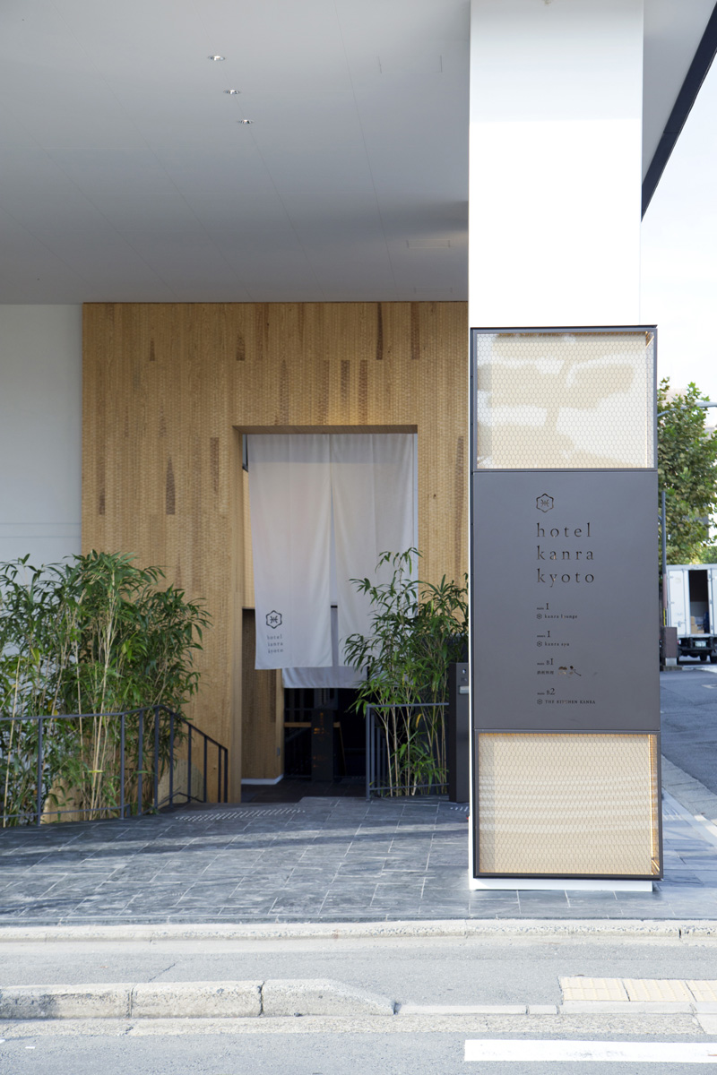
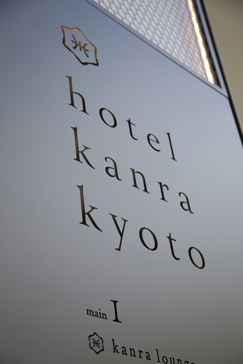
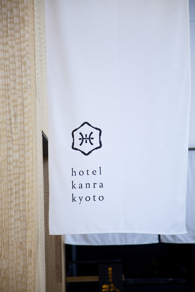
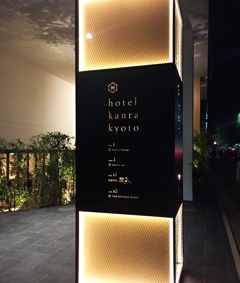
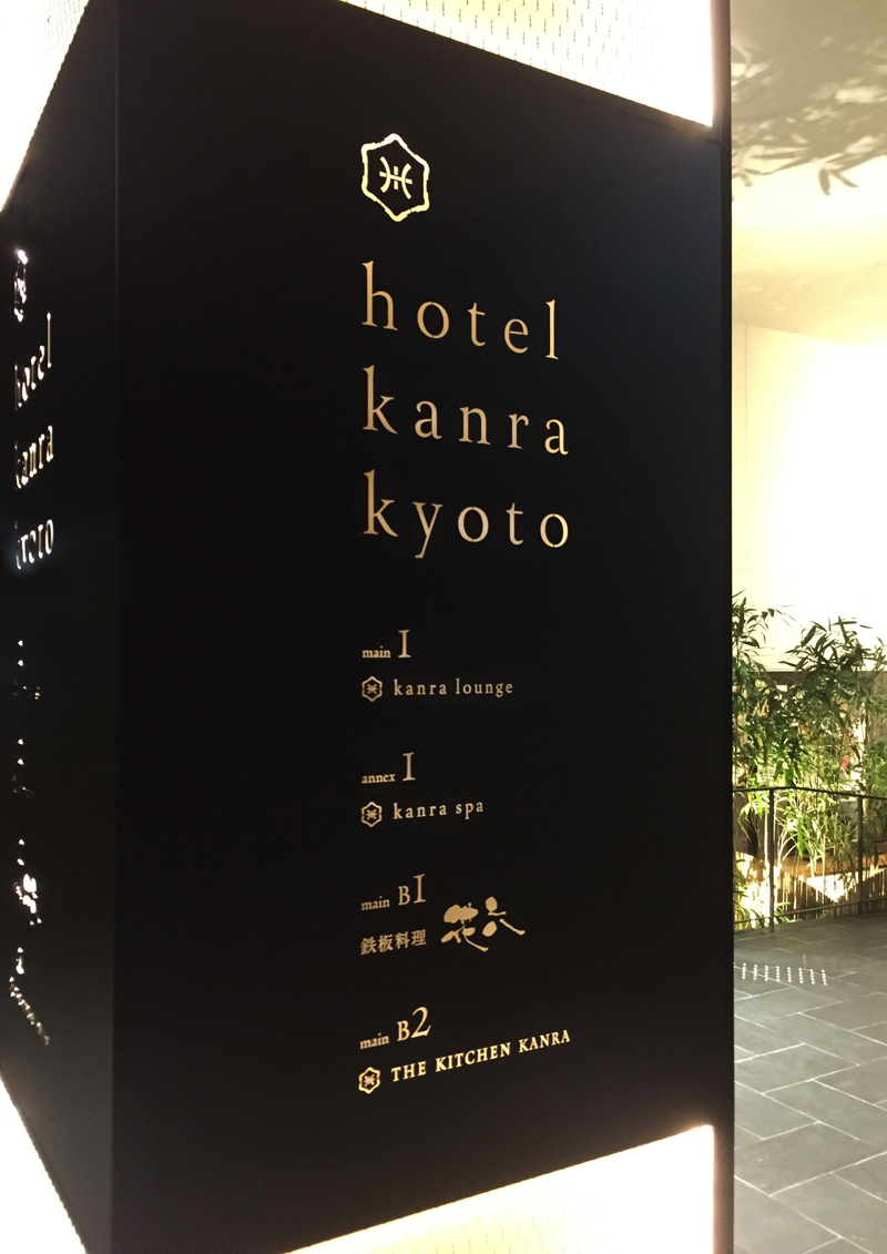
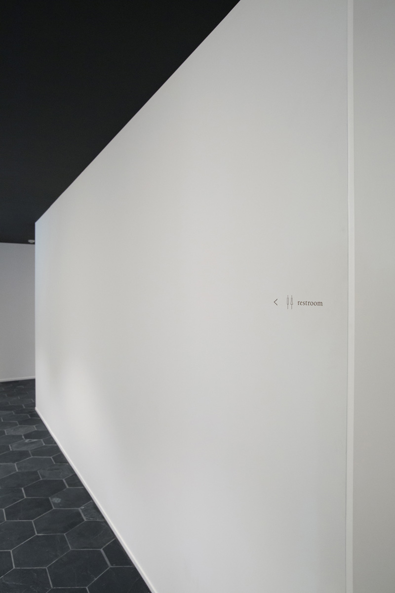
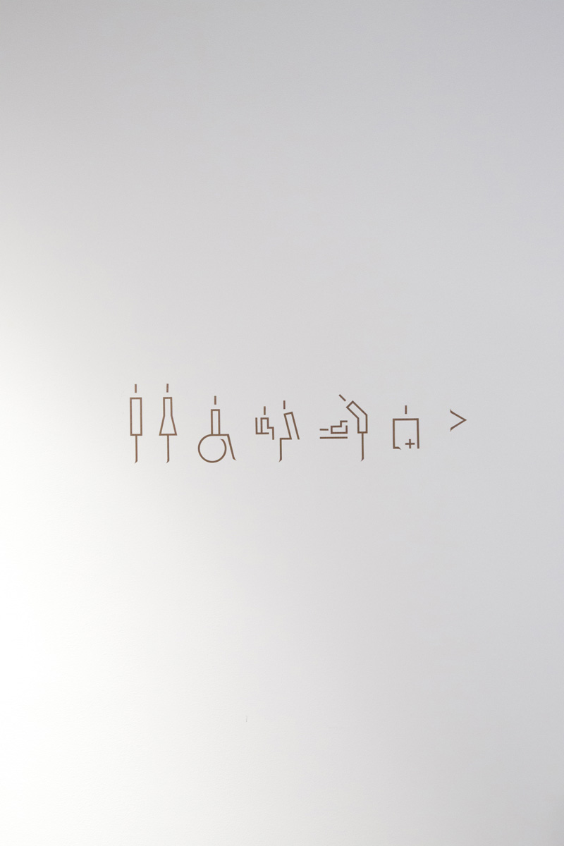
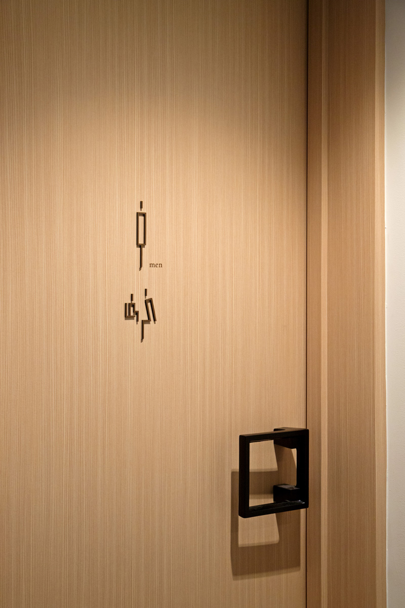
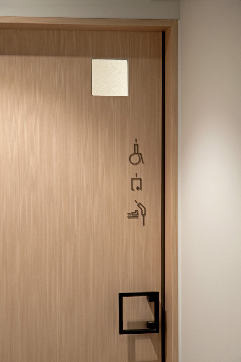
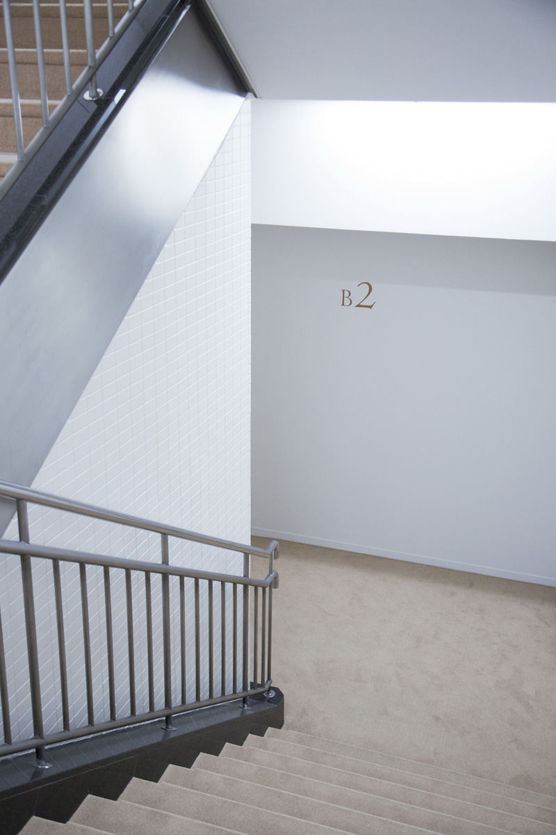
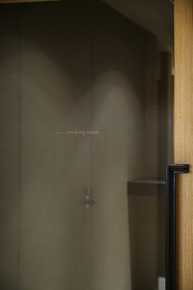
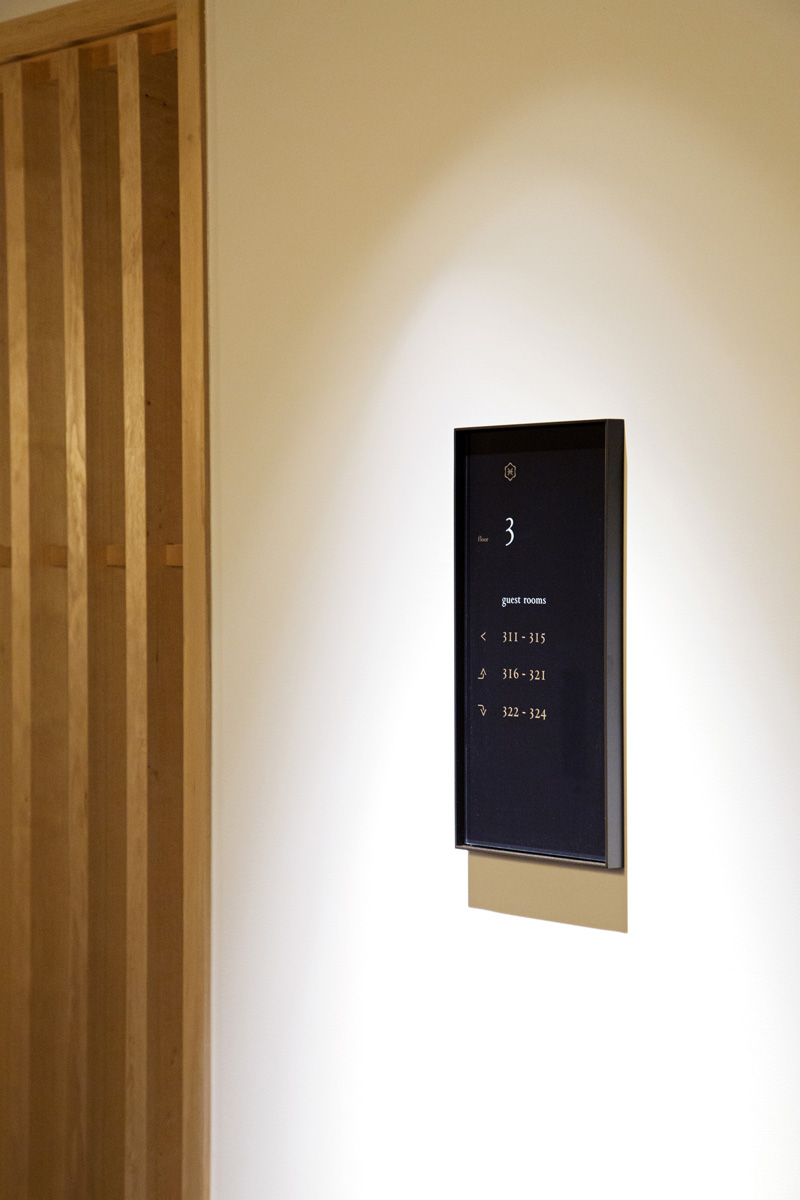
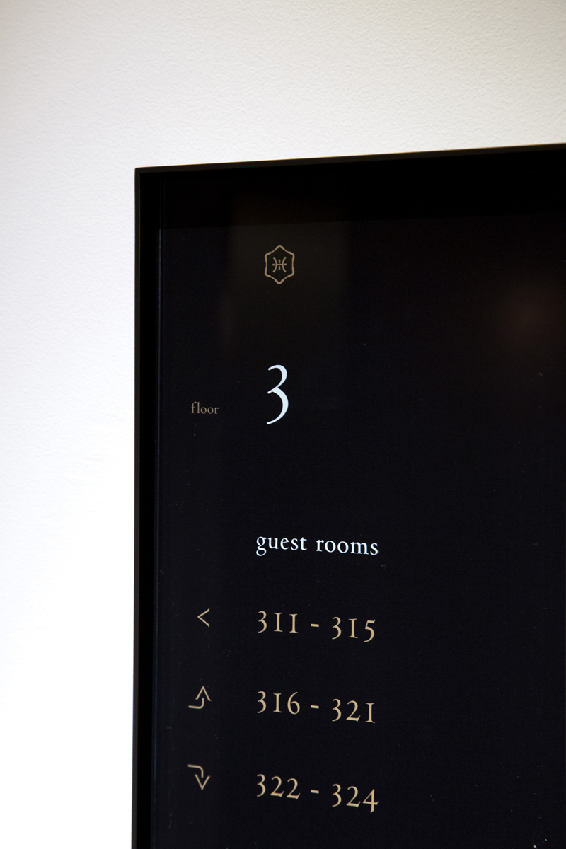
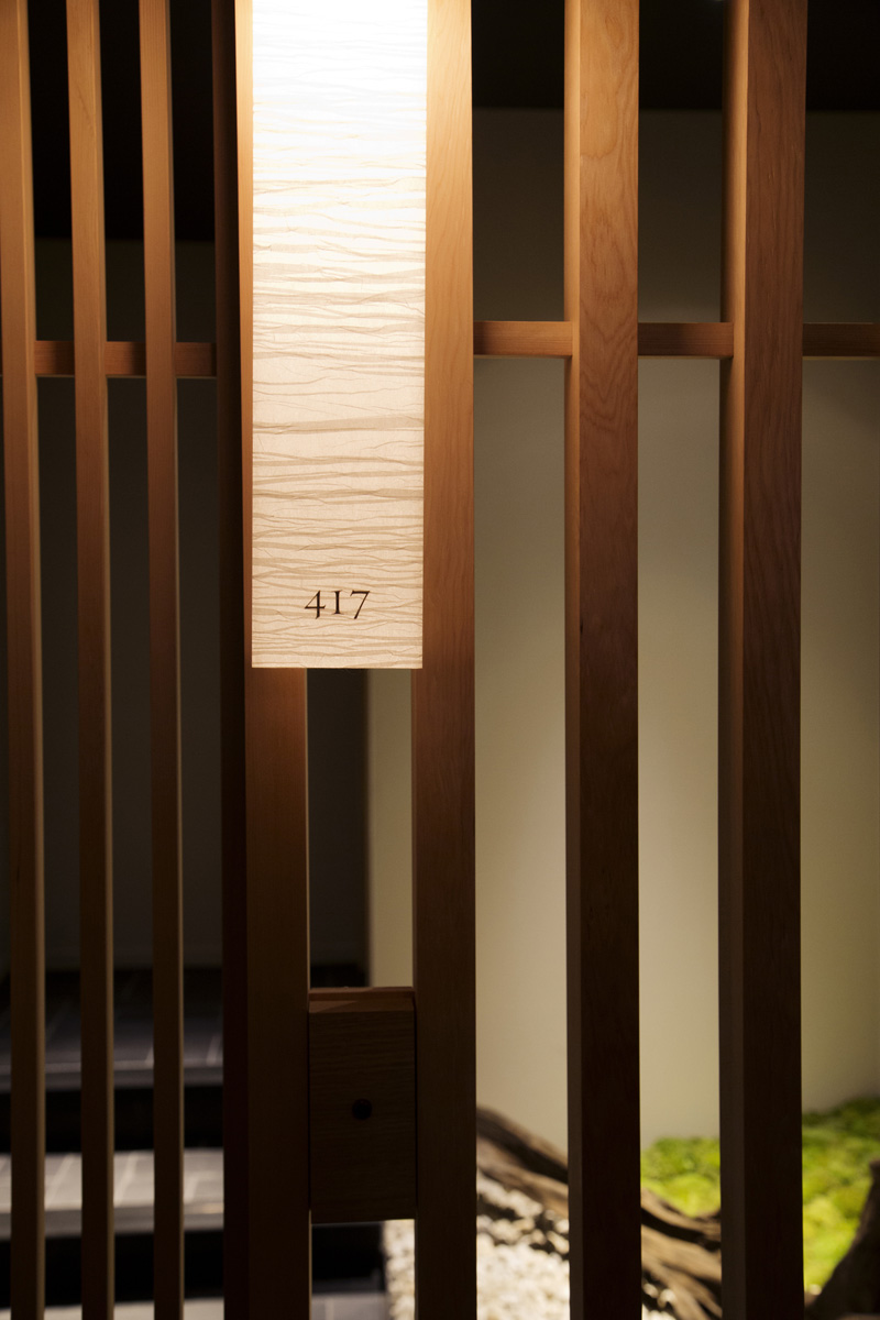
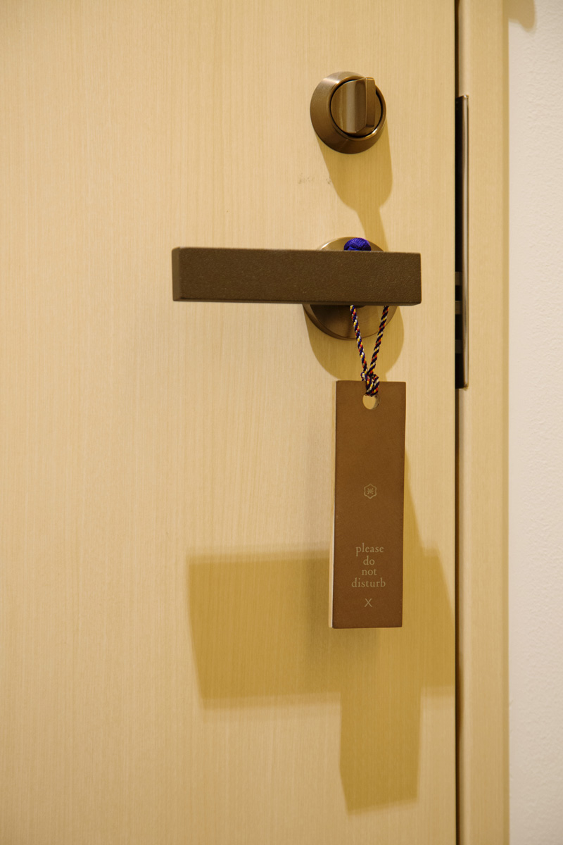
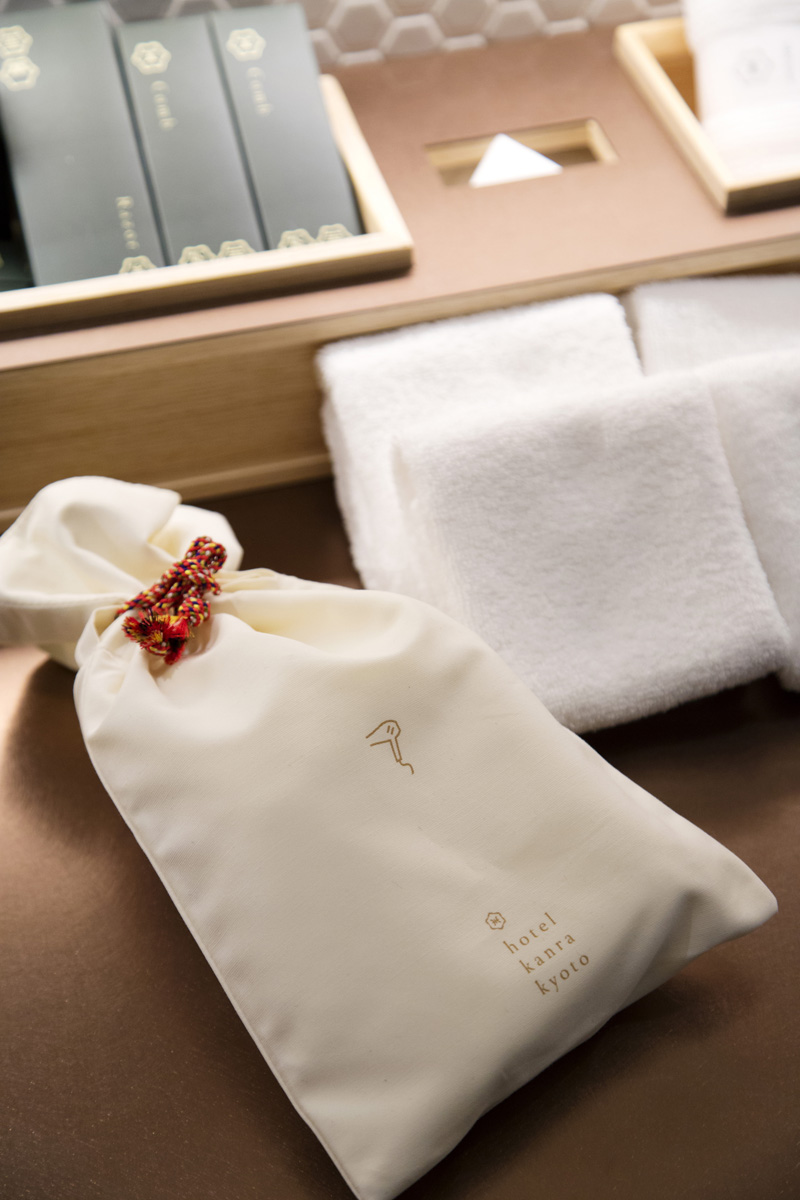
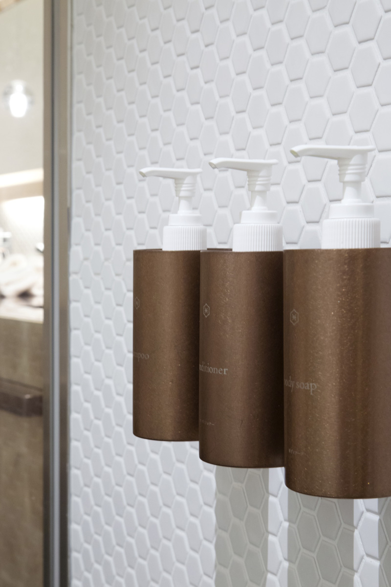
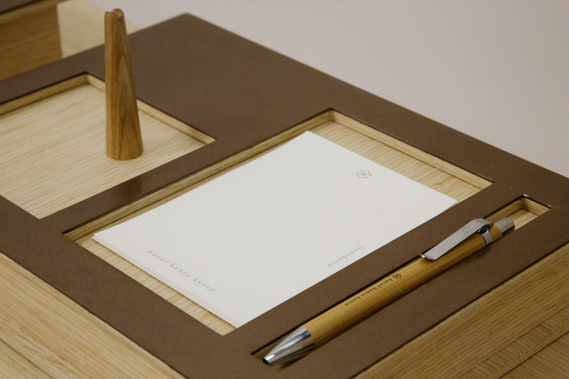
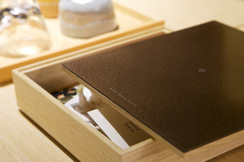
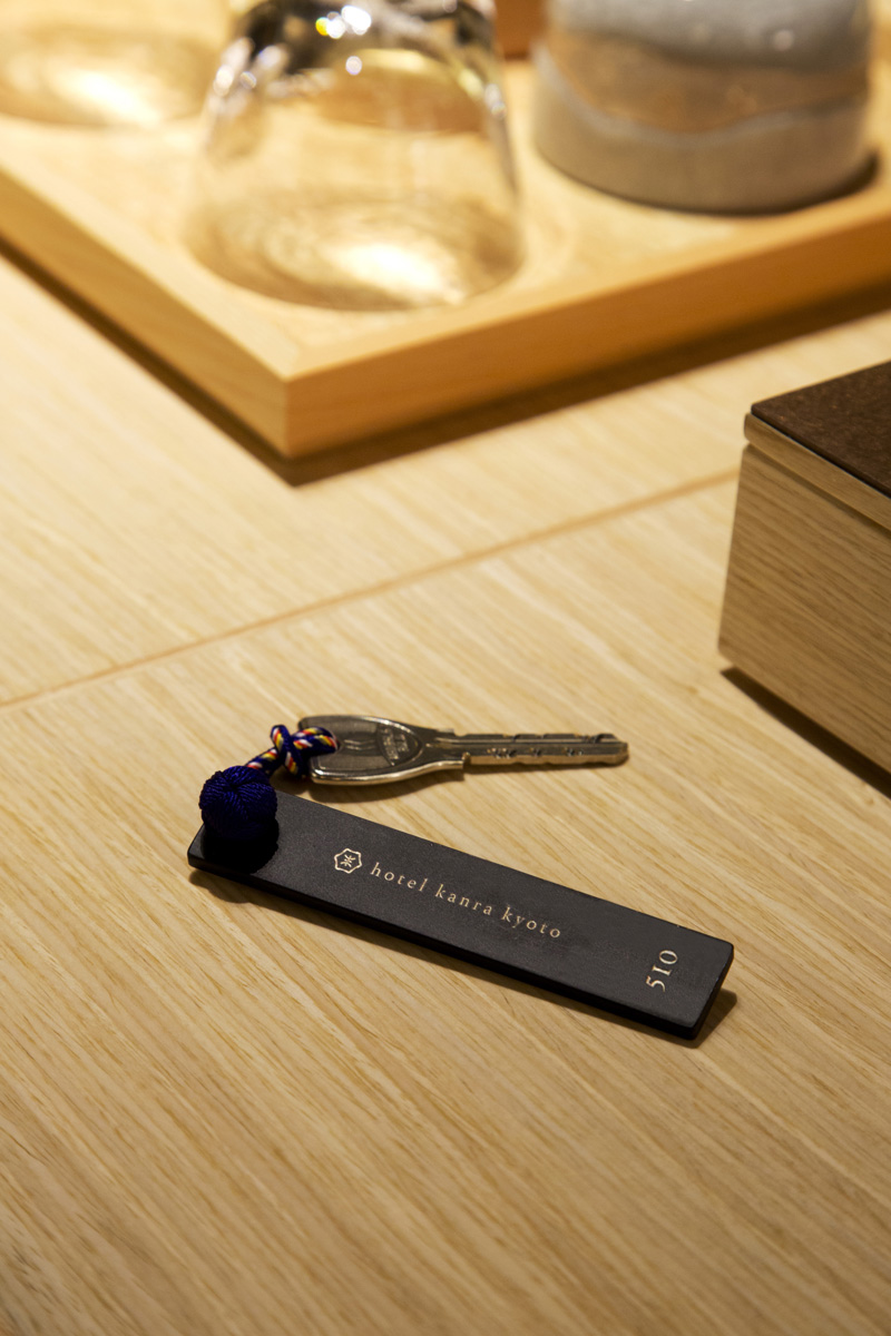
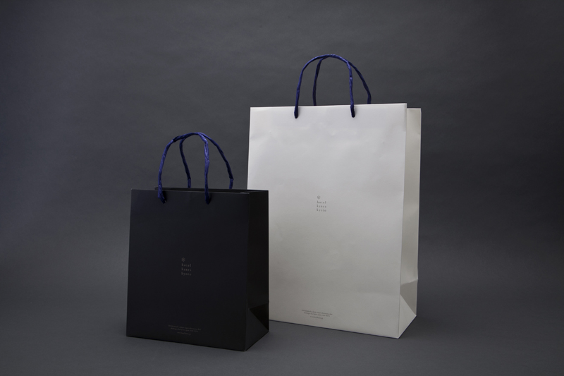
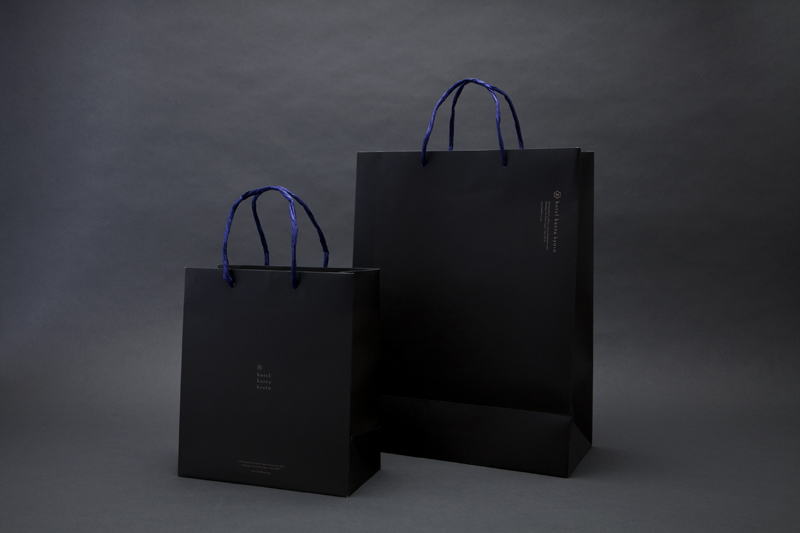
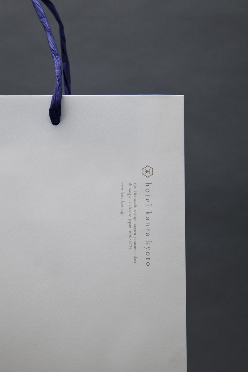
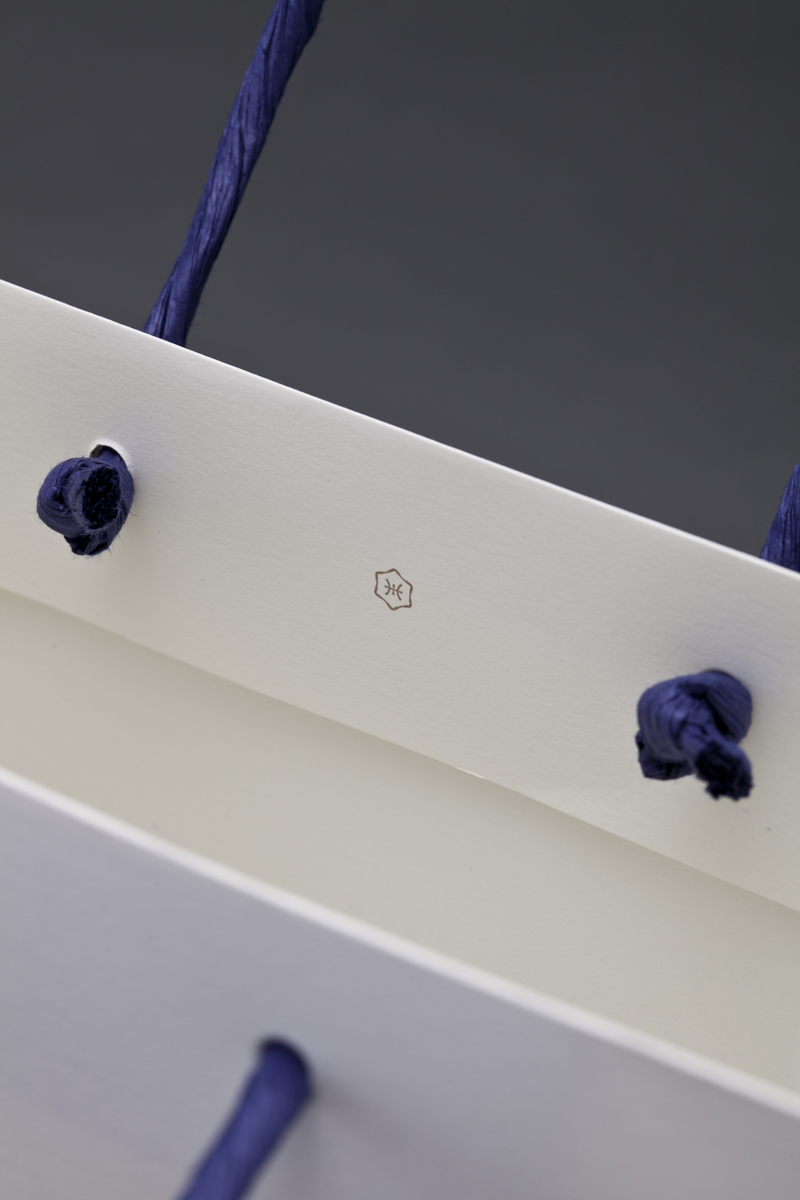
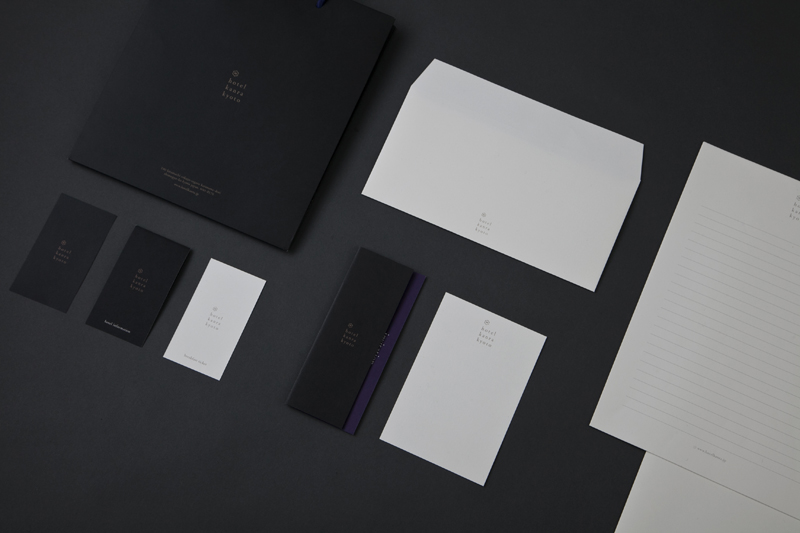
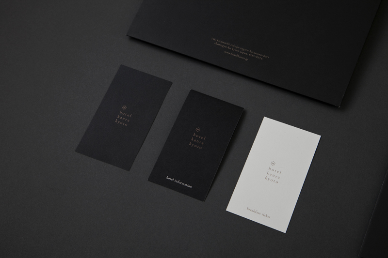
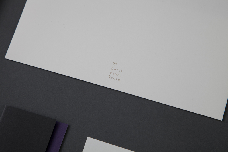
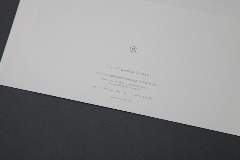
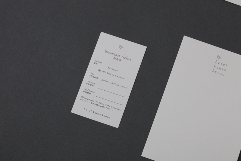
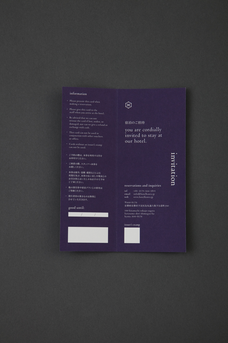
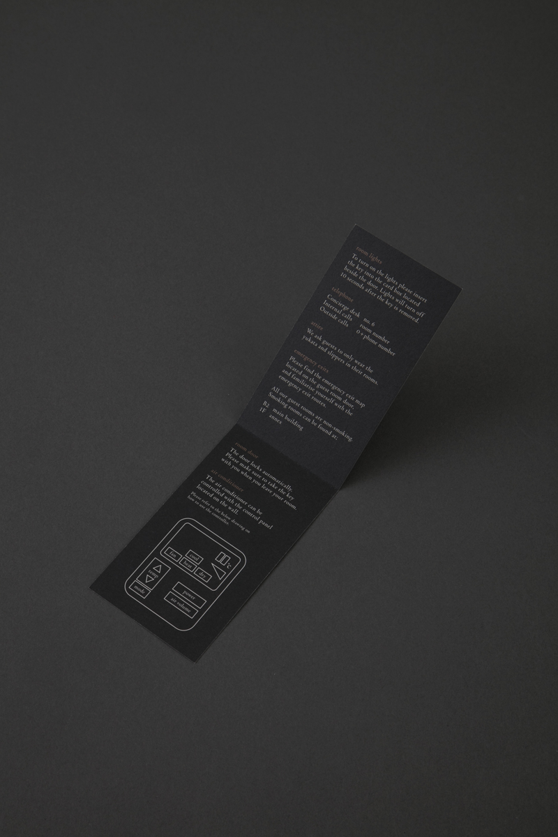
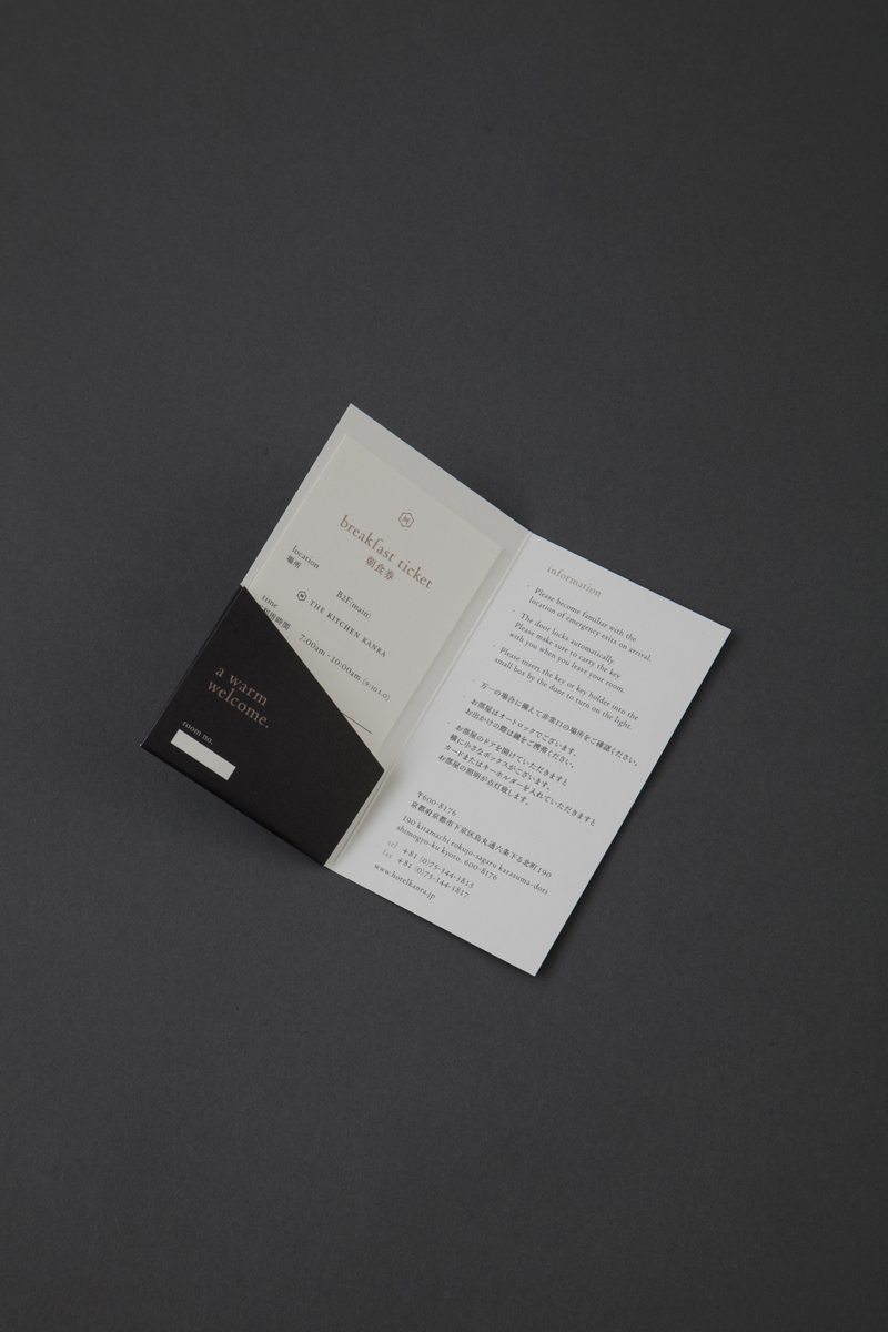
With the reopening of ‘hotel kanra kyoto’ in October 2016, artless Inc. was in charge of creating the visual identity as well as the signage system of the hotel.
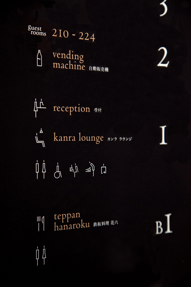
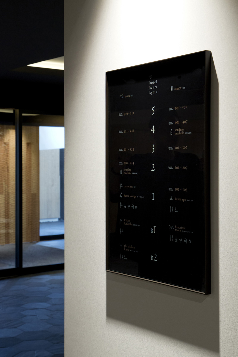
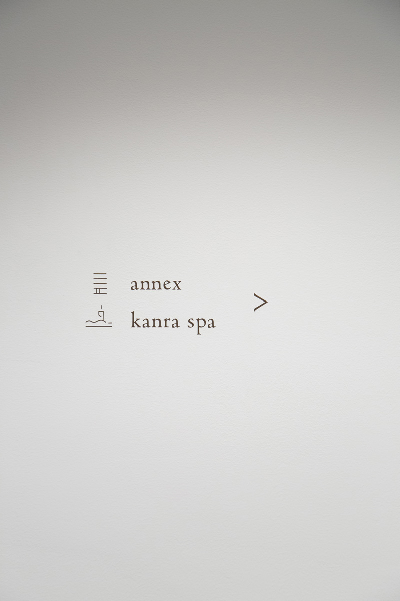
The design tenet for this project was ‘Kirei-sabi’, an aesthetic sense and philosophy of Kyoto/Japan, which was realised through the logotype, typography, pictograms, and the tastefully weathered color scheme of coal black and copper red that were used in the signage and print materials.
While elements of traditional Japanese culture are present in all levels of the design, to meet demands of a growing inbound market in Kyoto, all written materials are in both Japanese and English. Our goal for this project was to build a new brand image of ‘hotel kanra kyoto’ that is international in scope with a Japanese essence.
–
artless Inc.は、2016年10月に「ホテル カンラ 京都」がリニューアルオープンするにあたり、V.I. 及び サインデザインのリニューアルを担当させていただきました。
日本及び京都の持つ美意識と上質な佇まい、そして、デザインコードを「綺麗さび」とし、ロゴタイプ、基本書体/アイコン、少しエイジングのかかった漆黒・銅赤色をサイネージや印刷物に採用する等、ブランドカラーを設定。ロゴからグラフィック、サイネージまで包括的にブランドデザインしています。
日本の伝統文化を感じられる要素を各所に散りばめながら、増え続けるインバウンド需要、グローバルとローカルの2つの視点を大切に、全てのデザインを英語と日本語のバイリンガル表記とし、インターナショナルなトーンアンドマナーで新しい hotel kanra kyoto のブランドイメージの構築を目指したプロジェクトです。
–