planning + branding for QM weather.
QM weather.
planning + branding
credit :
concept planning: QUANTUM Inc., artless Inc.
product development: QUANTUM Inc., KAMARQ Holdings
creative & art direction: shun kawakami, artless Inc.
graphic design: koyuki inagaki, artless Inc.
photography: yuu kawakam, artless Inc.
–
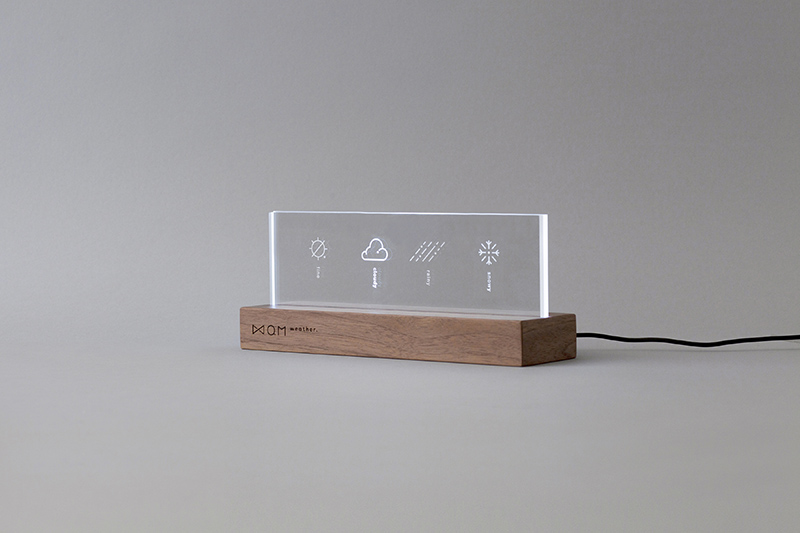
We, artless Inc., worked with QUANTUM Inc. and KAMARQ Holdings to brand their IoT weather forecast product ‘QM weather.’
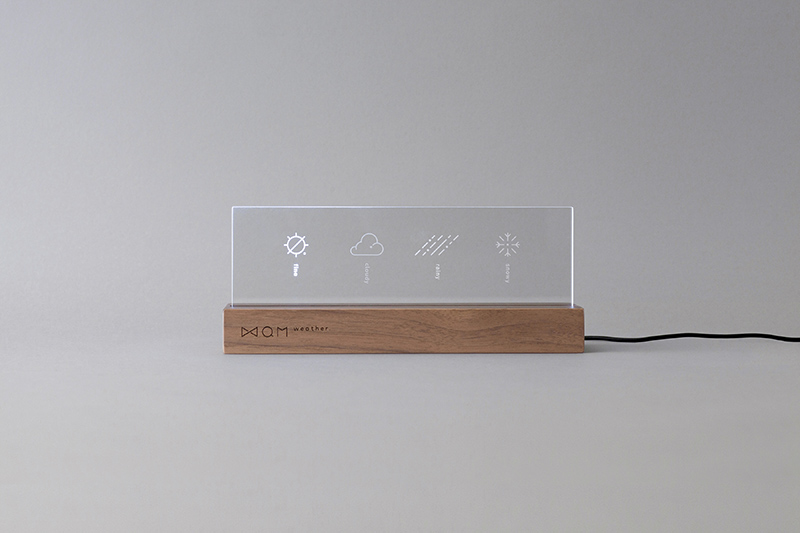
Available for purchase at Tsutaya Bookstore, the product initially started as an installation art for Hotel Risveglio Akasaka that opened in 2015. We have elevated the idea into a product that can be enjoyed at home, offices and retail stores. Our responsibilities included: art direction, branding and graphic design.
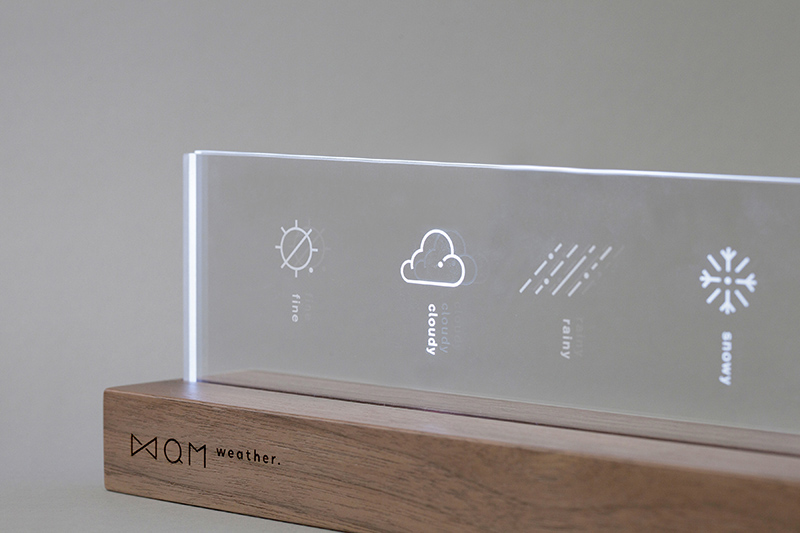
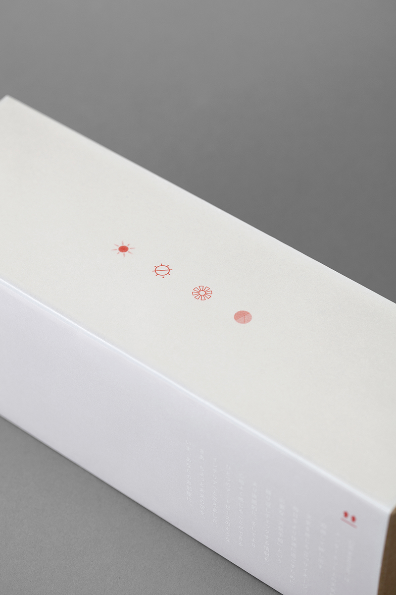
The subtle red dot we employed in QM weather.’s logo takes its inspirations from the Sun. The typeface chosen, Mark OT, a young typeface of the 21st century, represents new generation in a down-to-earth manner.
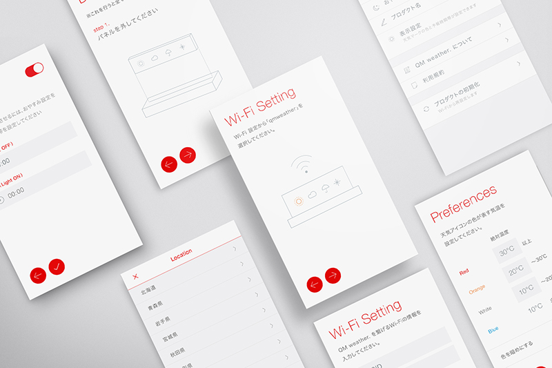
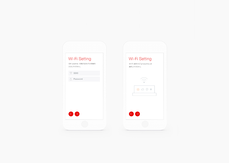
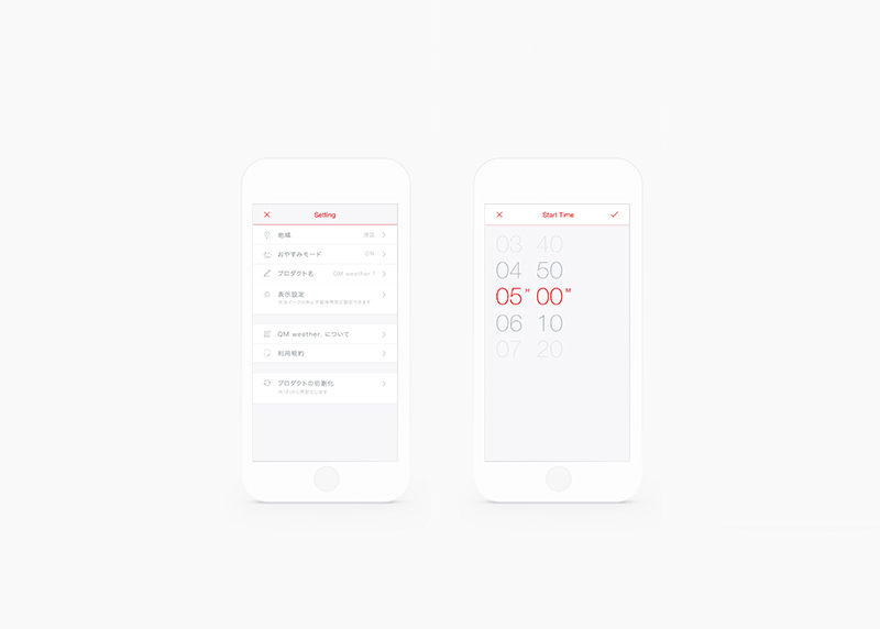
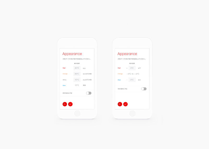
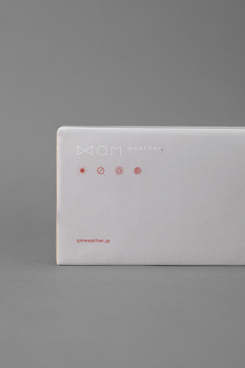
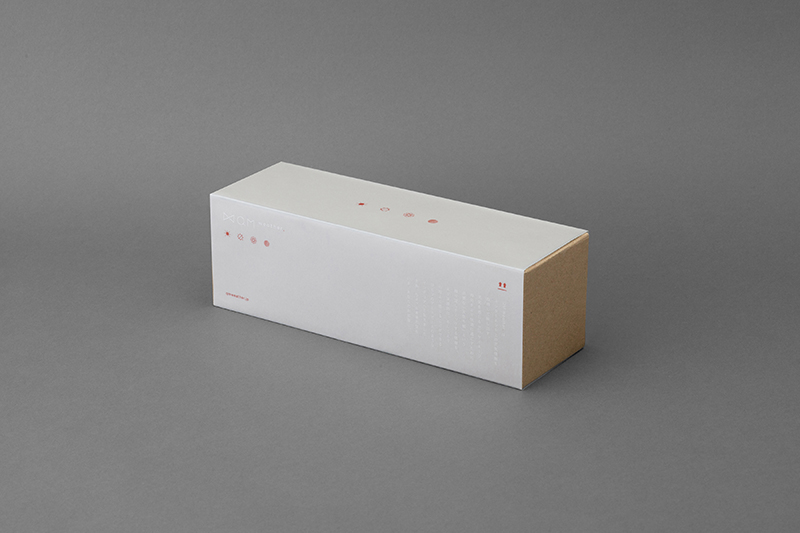
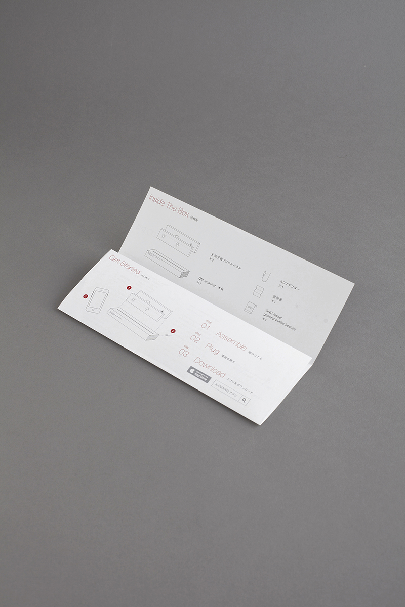
Alongside with the logo, we have created app design, packaging design, instrucition manual and iconography. ‘QM weather.’ comes in 4 versions of weather icons, created by 4 different designers. We contributed one set of icons that compliments the branding with its minimalistic lines accompanied by subtle dots.
With the clear appetite recognised for IoT devices in Asian region, we regard QM as a reflection of the diverse and inclusive nature of today’s IoT market, and have graphically translated it to a brand that is acceptable by a wide range of audience as a part of their daily life.
–
この度 artless Inc. はQUANTUM Inc.、KAMARQ Holdingsと共同で、天気を感じるIoTサイネージプロダクト「QM weather. 」を開発しました。
2015年にオープンした「HOTEL RISVEGLIO AKASAKA」のロビーに、QUANTUM Inc.とのコラボレーションで制作したIoT天気予報インスタレーションをパーソナルユースに変化させ、卓上インテリアとして楽しめるプロダクトにしました。アートディレクション・ブランディング・グラフィックデザインに携わり、ロゴをはじめとしたアイデンティティ構築、アイコン・アプリ・パッケージデザインを担当しています。
天気を象徴する太陽のイメージから、「QM weather. 」のアイデンティティはデザインされています。「IoT」というテクノロジーが、さりげなく、そっと生活に寄り添えるような佇まいになるように、モダンでありながら柔らかい雰囲気を大事にしました。ロゴタイプには、丸みが特徴的で親しみやすさを感じる「Mark OT」を使用し、赤いピリオドを印象的に添えています。
ロゴと連動するように、赤のアクセントカラーと、ドットが印象的なデザインをアイコン・アプリ・パッケージを通して実践しています。
デザインの力により、IoTテクノロジーをより身近にする手助けをしたプロジェクトです。
「QM weather. 」は7月20日より蔦屋書店、NU茶屋町にて販売しており、KAMARQのECサイト他
順次拡大予定となっています。
–
![]()