R100 tokyo
R100 tokyo
brand design:
logo + visual identity
brand guide
graphic design
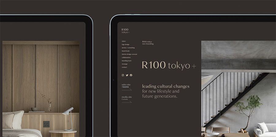
web design
book design
stationery design
–
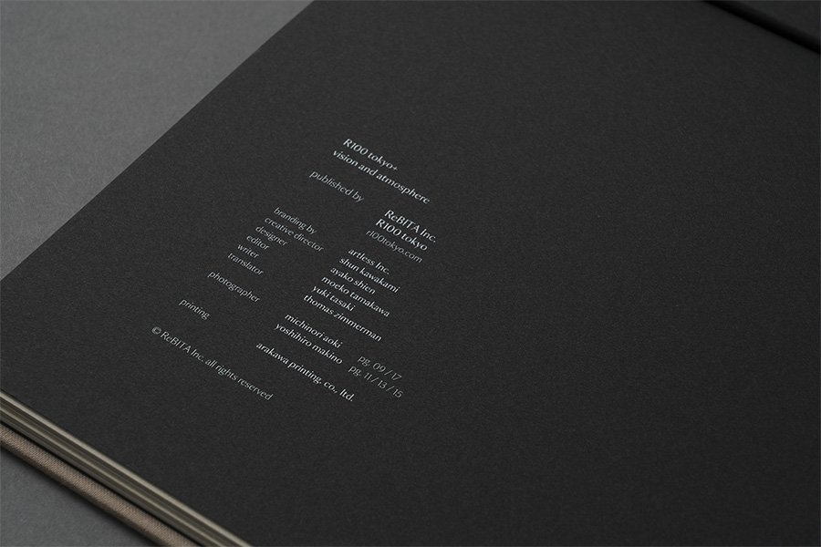
branding: artless Inc.
creative direction: shun kawakami, artless Inc.
art direction: shun kawakami, artless Inc.
graphic design: ayako shien, artless Inc.
editer: moeko tamakawa, artless Inc.
concept writer: yuki tasaki
assistant design: hisako mori + nagisa okubo, ahd osaka
project management: asami kinoshita + lyoske kurita, artless Inc.
item photography: yuu kawakami
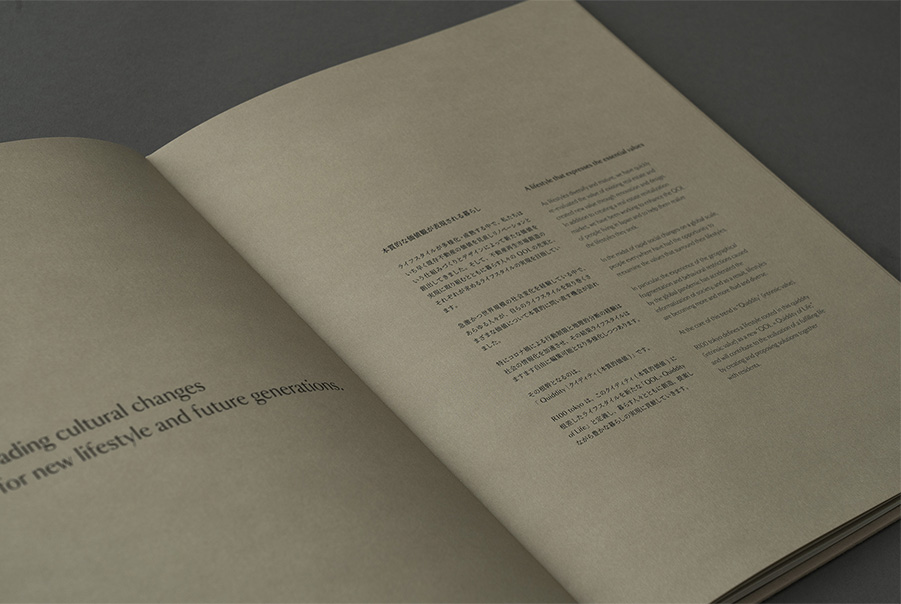
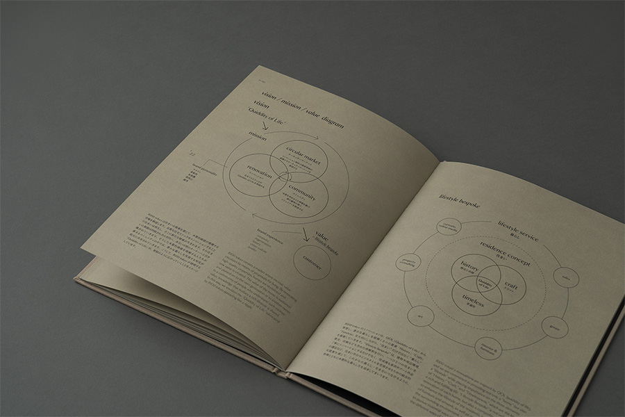
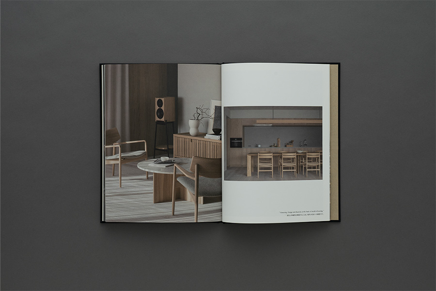
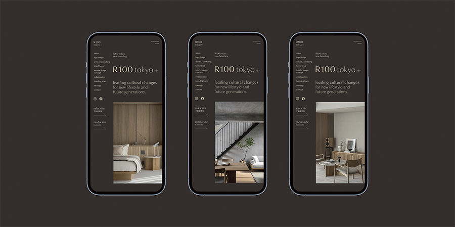
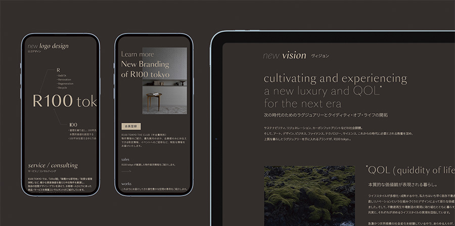
R100 tokyo is a brand that proposes residences and lifestyles with intrinsic value from the perspective of ” living well in Tokyo ” and focuses on renovated properties with sustainability in mind, which it produces and sells. The brand identity has been updated for the coming era, and a lifestyle based on quiddity (intrinsic value) has been defined as the new ” QOL = Quiddity of Life ” with the aim of seeking and realizing an affluent lifestyle. artless Inc. rebranded R100 tokyo in the spring of 2023 with the aim of exploring and realizing a lifestyle of abundance. artless Inc. was in charge of the brand identity and visual identity, starting with the brand core, and the brand communication tools, rebranding all touchpoints from the graphics to the website.
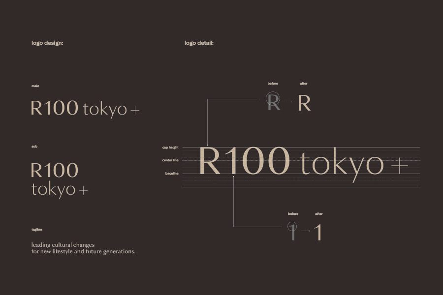
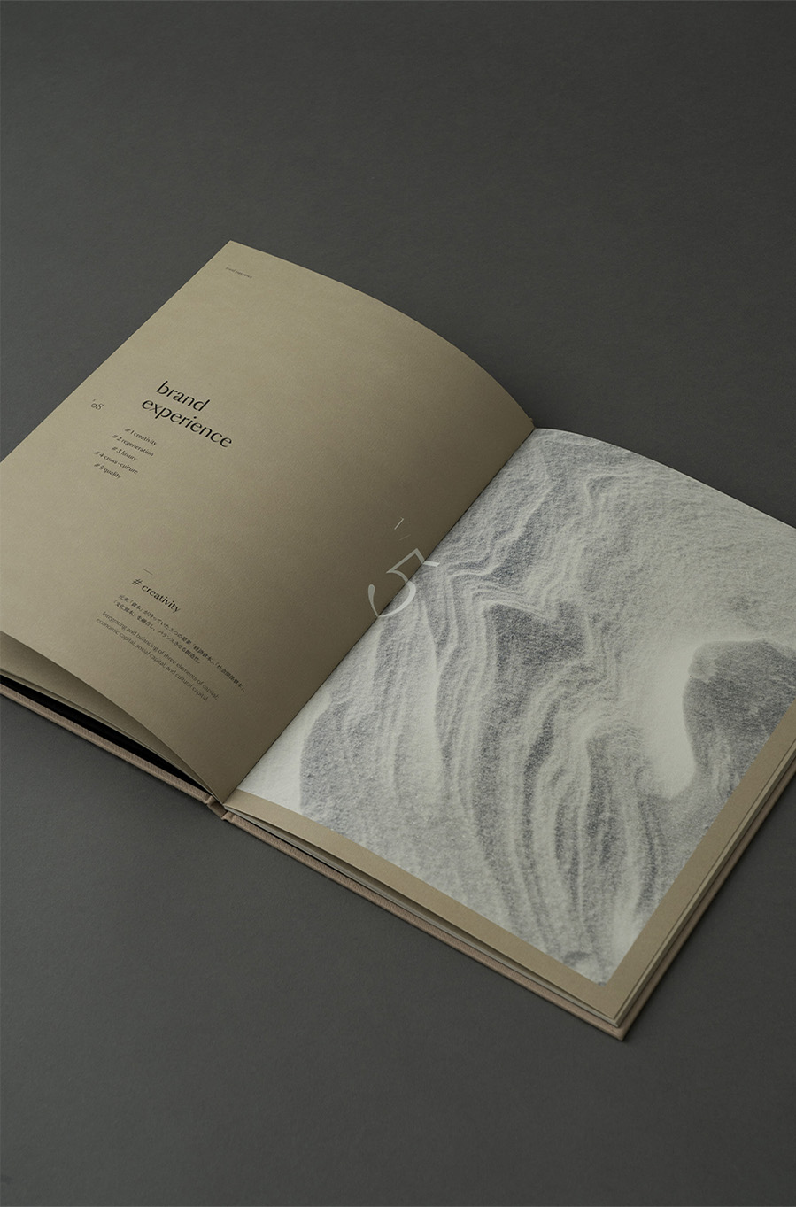
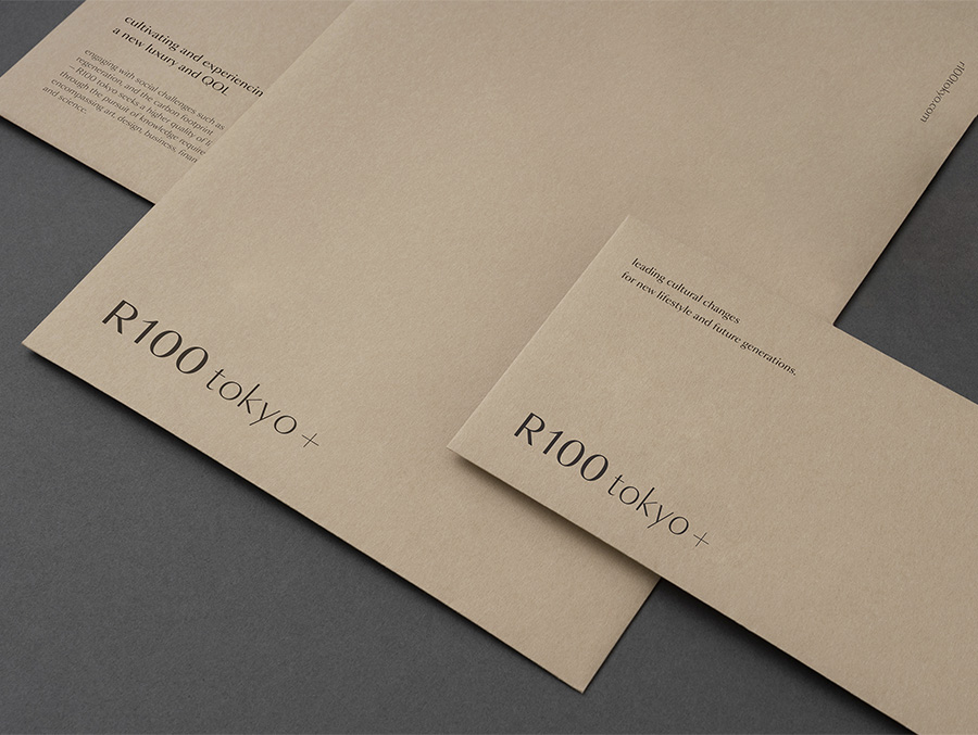
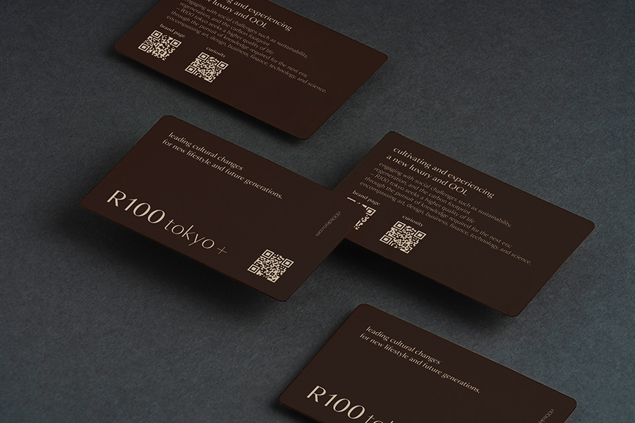
R100 tokyo’s rebranded vision is to “ lead the way in pioneering the next era of luxury and quality of life. ” The logo design is based on a neoclassical silhouette typeface that evokes a sense of humanity and richness, and each letter is individually adjusted to evoke a sense of delicacy and craftsmanship. The brand color is beige, an earthy and natural color rooted in coexistence and harmony with the environment, such as regeneration and sustainability, which are also keywords of the brand. Dark gray is used as a color that expresses high-quality living and new luxury.
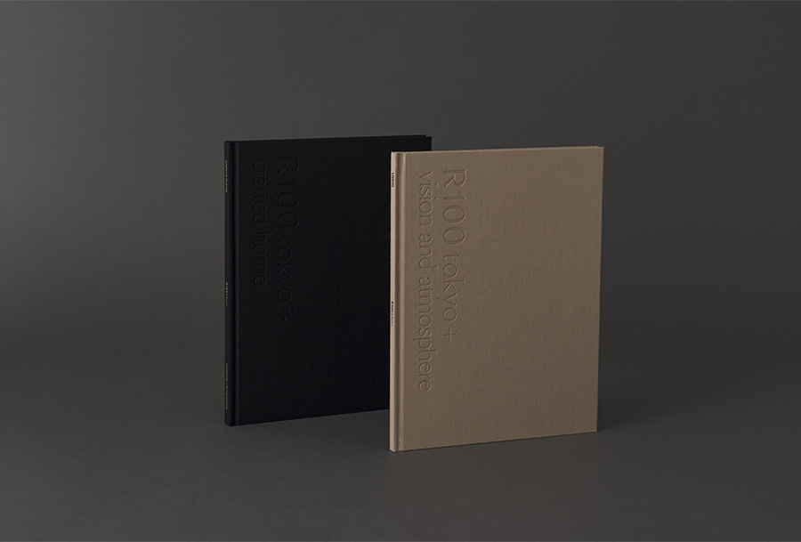
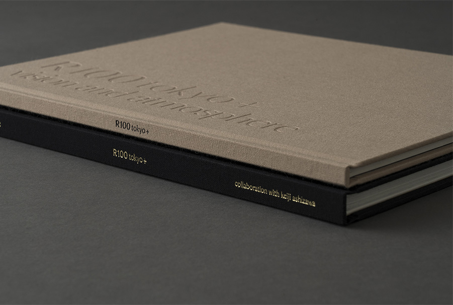
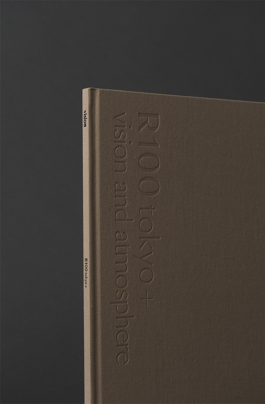
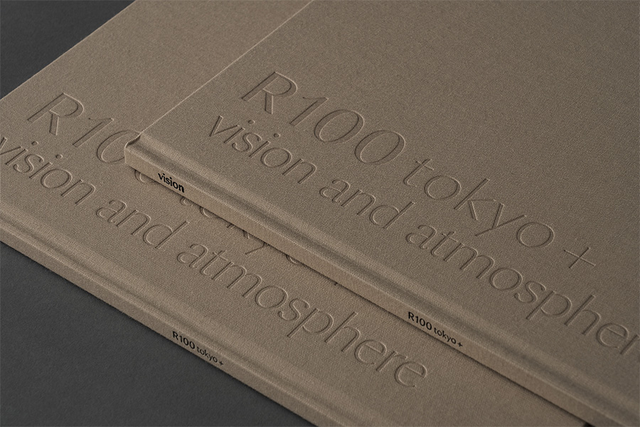
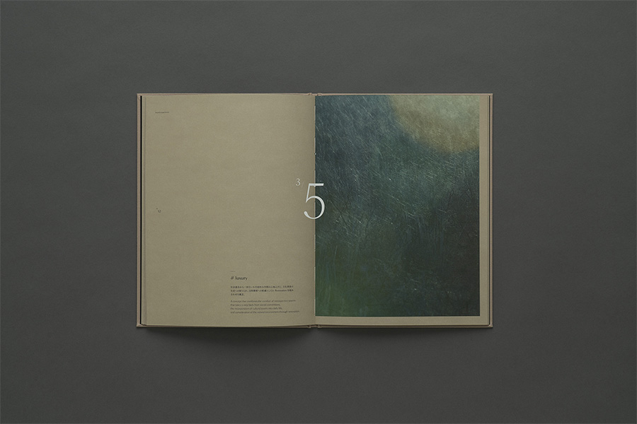
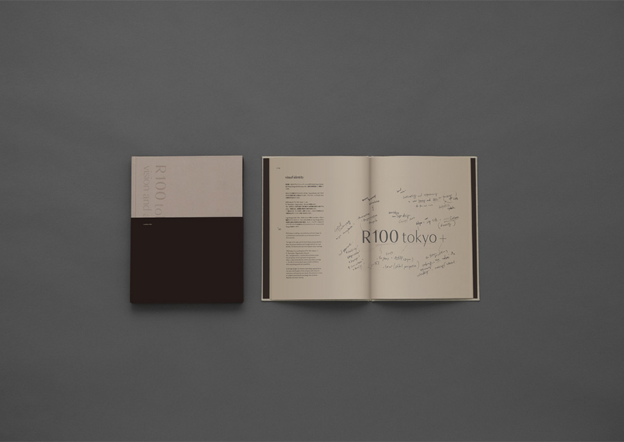
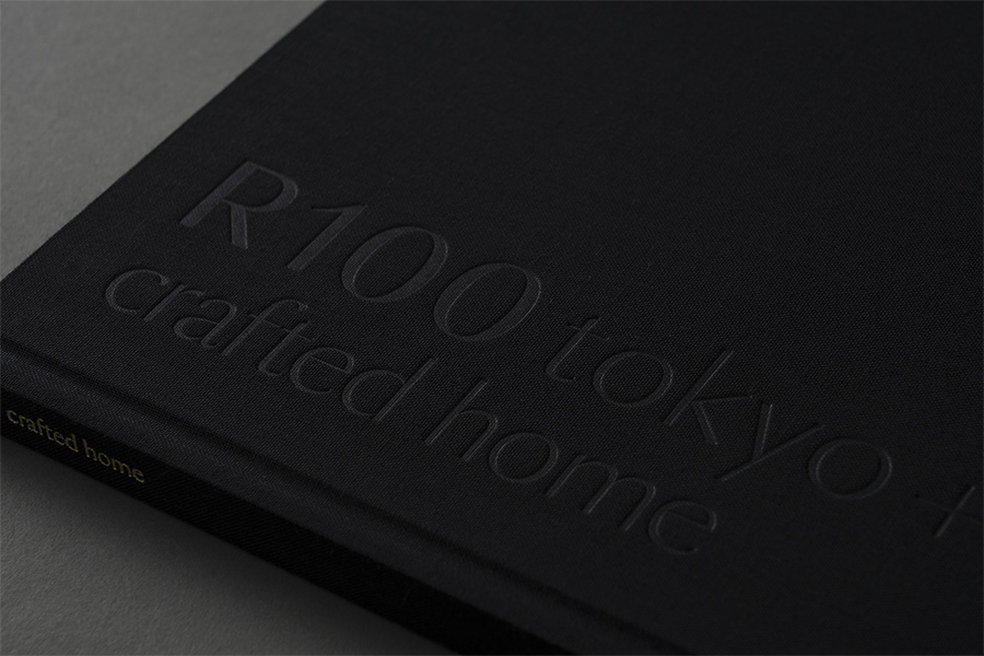
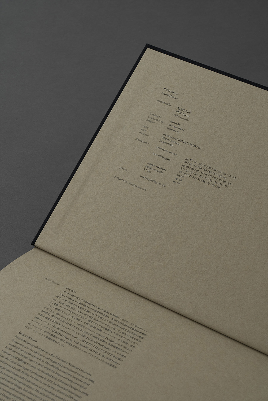
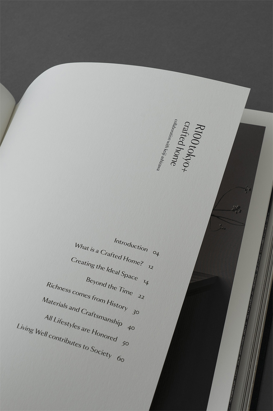
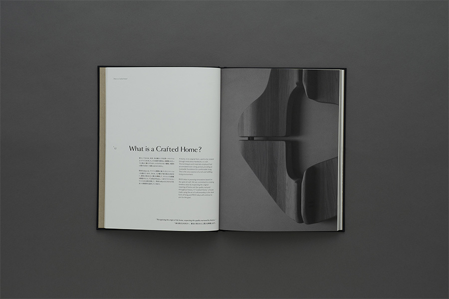
A brand book was also created as a communication tool to further convey the brand vision. The brand book is a set of two books, one showing the brand vision and the other showing the commitment to craftsmanship, expressing the values of R100 tokyo.”
R100 tokyo は、「豊かに暮らす」という視点で、本質的な住まいとライフスタイルを提案する、リノベーション物件だけを取り扱うブランドです。今回、さらなるライフスタイルの提案にむけて、Quiddity | クイディティ (本質的価値) に 根差したライフスタイルを新たな < QOL = Quiddity of Life > と定義し、暮らす人々と共に創造、提案しながら豊かなくらしの実現を目指すべく、リブランディングを行いました。artlessでは、ブランドコアをはじめとするブランドアイデンティおよびビジュアルアイデンティティの構築、それらに伴うブランドツールの制作を一貫したブランドデザインを担当しました。
リブランディングに伴い、R100 tokyoは、「次の時代のラグジュアリーとクオリティオブライフの開拓へ導く」ことをビジョンとして掲げています。ロゴデザインでは、人間性や豊かさを感じるネオクラシックなシルエットの書体をベースに、文字の1つ1つに手を加え、繊細さとクラフトを彷彿させるデザインを。ブランドカラーには、ブランドのキーワードにもなっている、リジェネレーションやサステナビリティといった環境との共存・調和を根ざすアーシーでナチュラルなカラーであるベージュを。上質な暮らしや新しいラグジュアリーを表現する色としてダークグレーを設定しています。
また、よりブランドのヴィジョンを伝えるためのコミュニケーションツールとして、ブランドコンセプトブックを制作しました。このブランドブックは、ブランドビジョンを示すビジョンブックと、クラフトデザインへのこだわりを示すクラフトブックの2冊で1組となり、R100 tokyoの価値観を表現し、その感覚が手に取ったときにも感じてもらえるように、手触りのある紙や布を選定、繊細な箔押しやカバータイトルをディボスにするなど、細部へのこだわりを持ったデザインを行っています。