ryokuensha
ryokuensha
brand design:
logo + visual identity
brand guide
graphic + web design:
stationery design
–
brand design: artless inc.
creative direction & art direction: shun kawakami, artless inc.
graphic design: qiwen cao, artless inc.
project management: ken aoki, artless inc.
photography: yuu kawakami, artless inc.
client: ryokuensha inc.

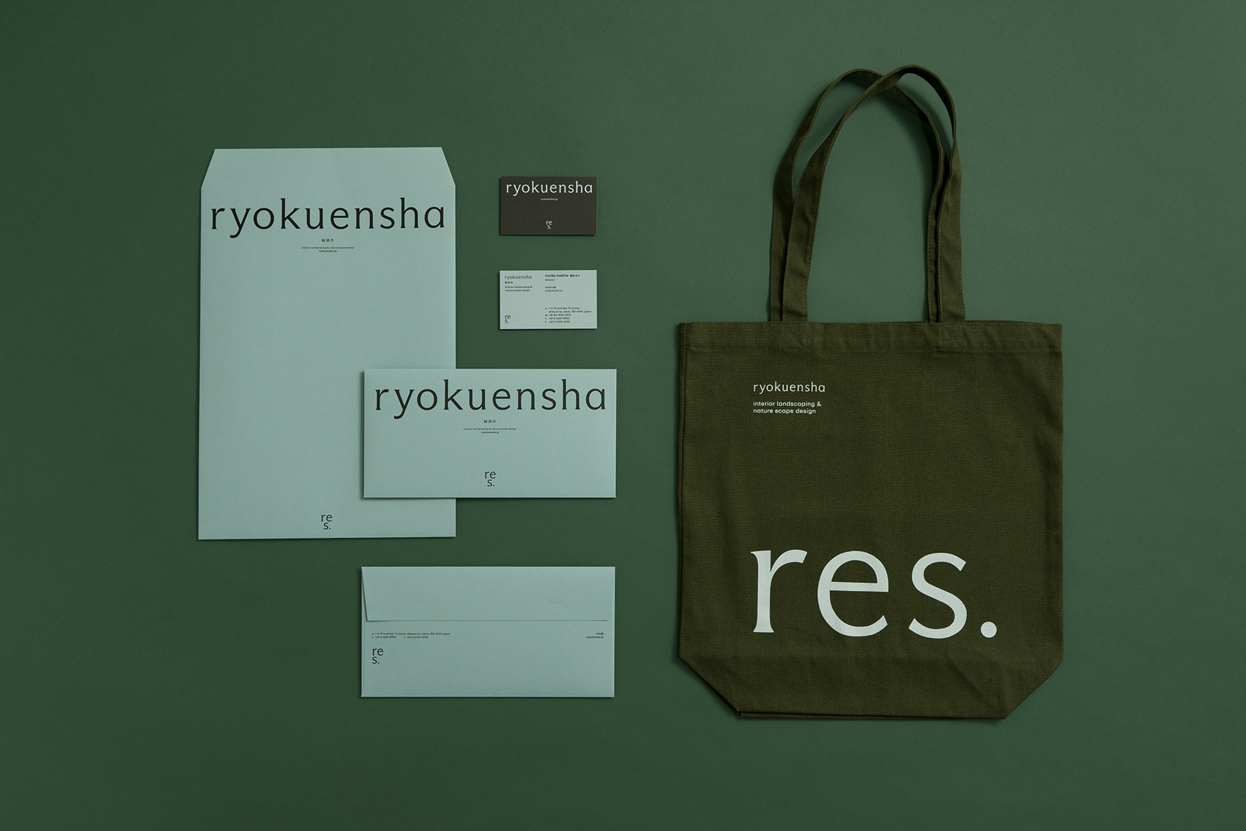
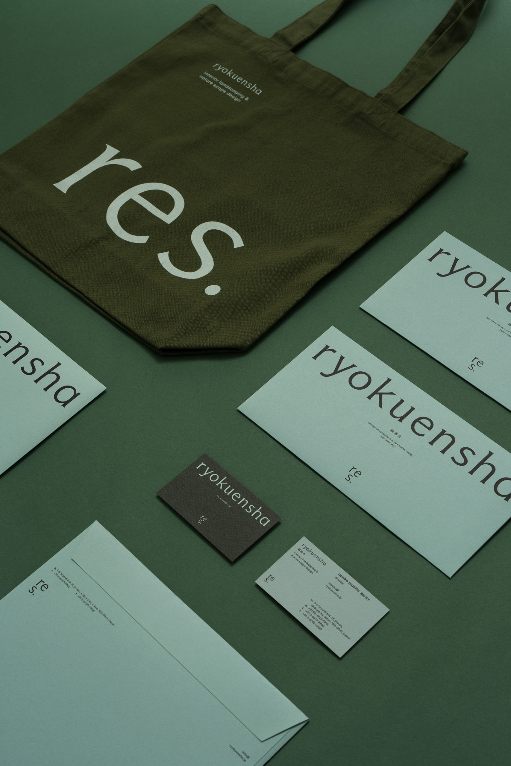
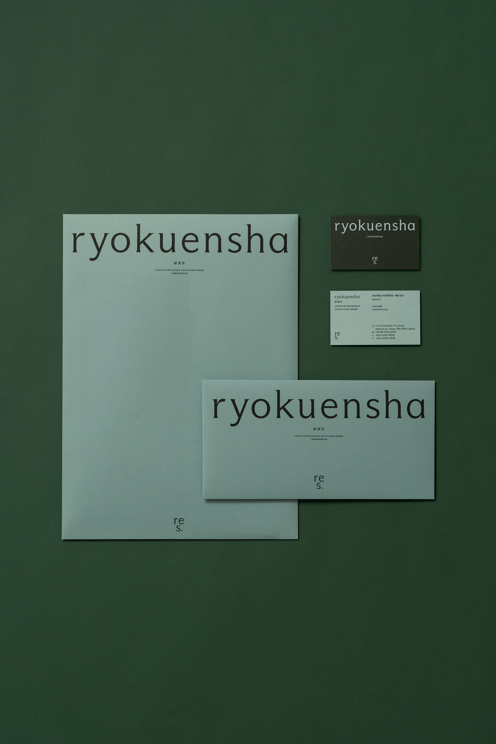
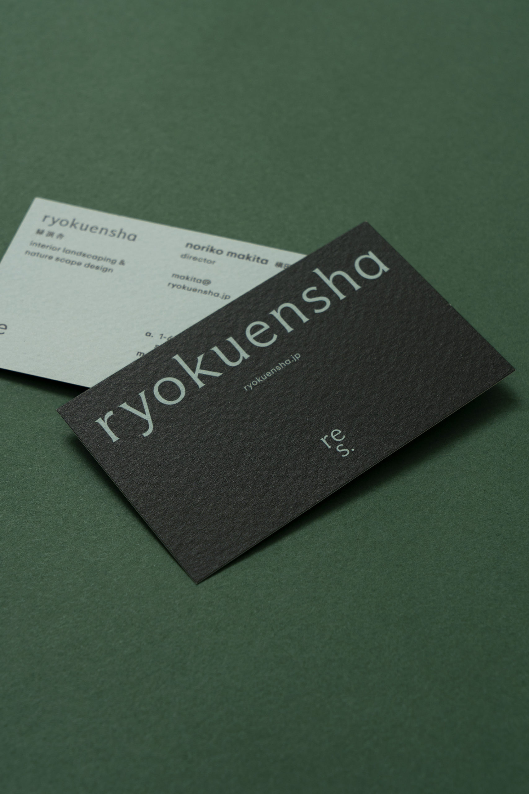
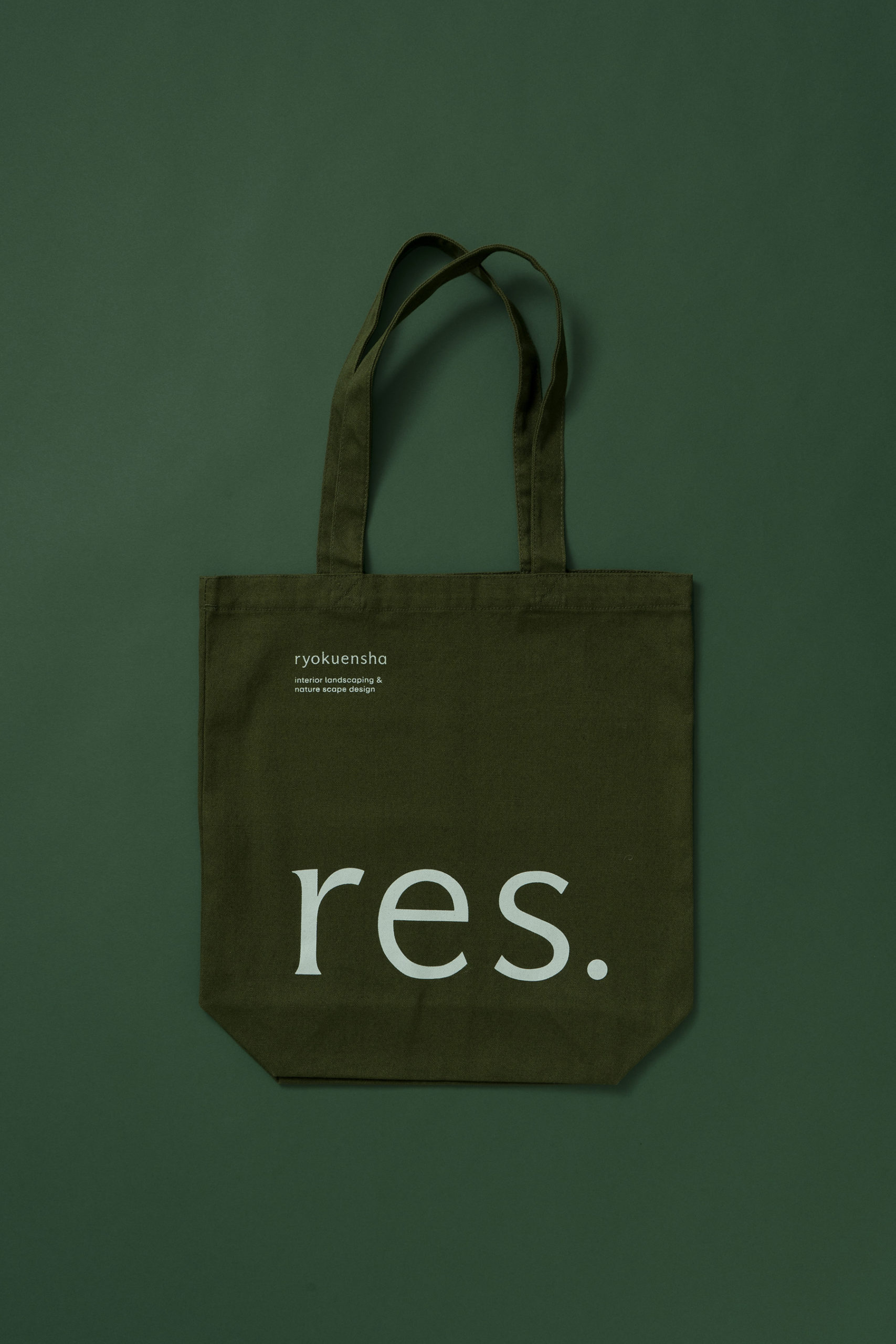
artless redefined ryokuensha’s brand identity, realigning its atmosphere and visual language around a new logo and typography.
ryokuensha is a design firm specializing in interior greenery and nature-led landscape design, crafting diverse botanical environments through a unique approach. by nurturing the relationship between plants and people—as well as between plants and the city—it aims to create landscapes where nature quietly blends into the rhythms of everyday urban life. this philosophy was translated into a visual language and reconstructed into a brand identity that weaves together the organic and the refined.
the logo draws inspiration from the growth and posture of plants, with subtle adjustments to the edges of the serifs and strokes, evoking the gentle sprouting of new life. we aimed to evoke subtle dynamism within a restrained structure by designing the proportions and spacing of the letters to carry an organic rhythm and a sense of life. furthermore, the three variations of the logo mark, based on the ‘res’ motif, serve both symbolic and functional roles within the system, existing as an entity that drifts between the abstract and the concrete.
the color palette is anchored by forest green, with aqua green and stone gray serving as complementary colors. Together, they create a calm and profound atmosphere that spans “nature and space,” “craft and thought,” and “body and memory.”
through this renewal, our goal was to provide ryokuensha with a consistent yet flexible visual foundation that reflects its philosophy and practices.
ryokuensha は、インテリアグリーンやネイチャースケープデザインを専門とし、独自の手法で多様な植物空間を創出するデザインファームです。植物と人、そして植物と都市との関係性を育むことで、都市の日常に自然が溶け込むような風景の実現を目指しています。そのフィロソフィーをビジュアルランゲージとしてトランスレートし、オーガニックと洗練を融合するようなアイデンティティへと再構築しました。
ロゴは植物の成長や姿勢に着想を得ており、セリフやストロークの端部に繊細な調整を加えることで、芽吹きのような柔らかな動きを表現しています。文字のプロポーションとスペーシングの設計において、オーガニックなムーブメントと生命感を宿し、抑制された構成の中にダイナミズムを滲ませる佇まいを目指しました。また、“res” をモチーフに展開した3種のロゴマークは、シンボリックでありながらシステムのモジュールとしても機能し、具象と抽象のあいだにたゆたう存在として設計されています。
カラーパレットはフォレストグリーンを主軸に、アクアグリーンとストーングレーを補色として展開。「自然と空間」「手仕事と思考」「身体と記憶」といった領域を横断するような、穏やかで奥行きのあるトーンを構成しています。
このリニューアルを通して、ryokuensha の思想と実践に、継続的でしなやかなビジュアルベースを提供することを目指しました。