yubune
design-led branding :
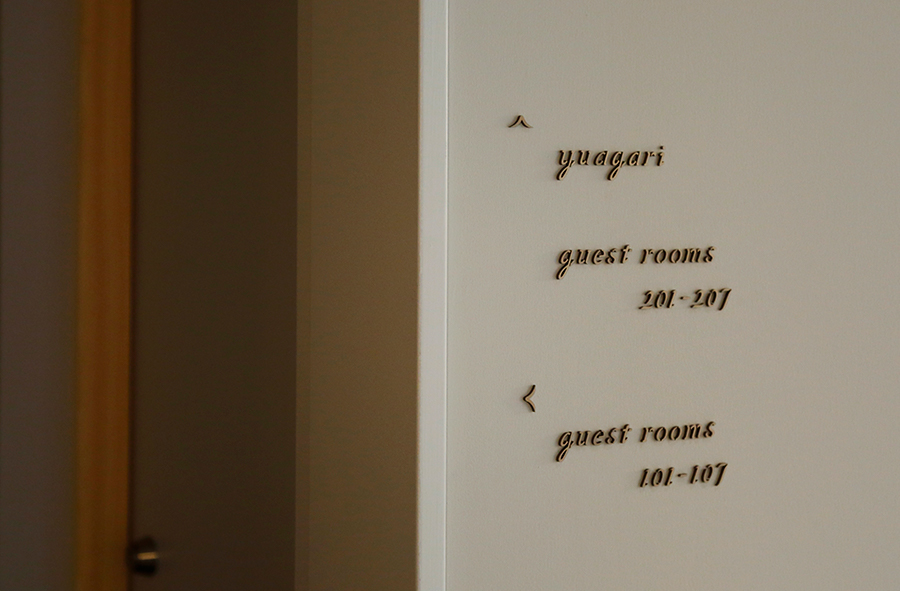
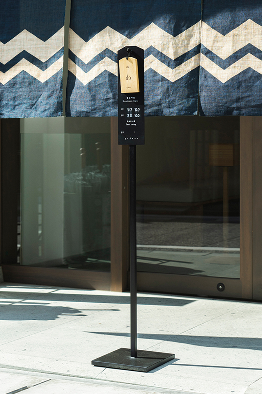
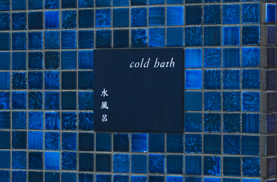
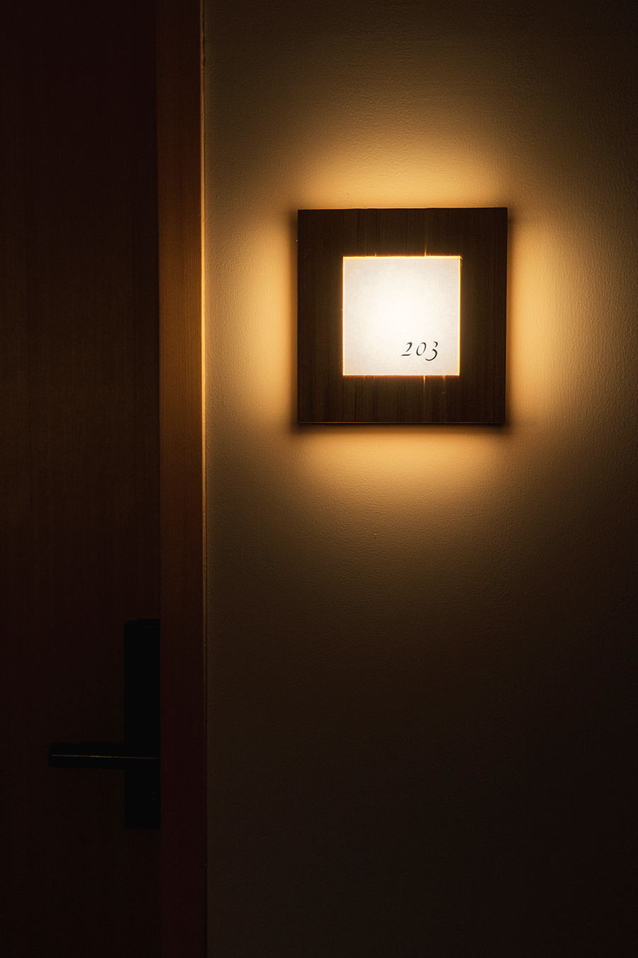
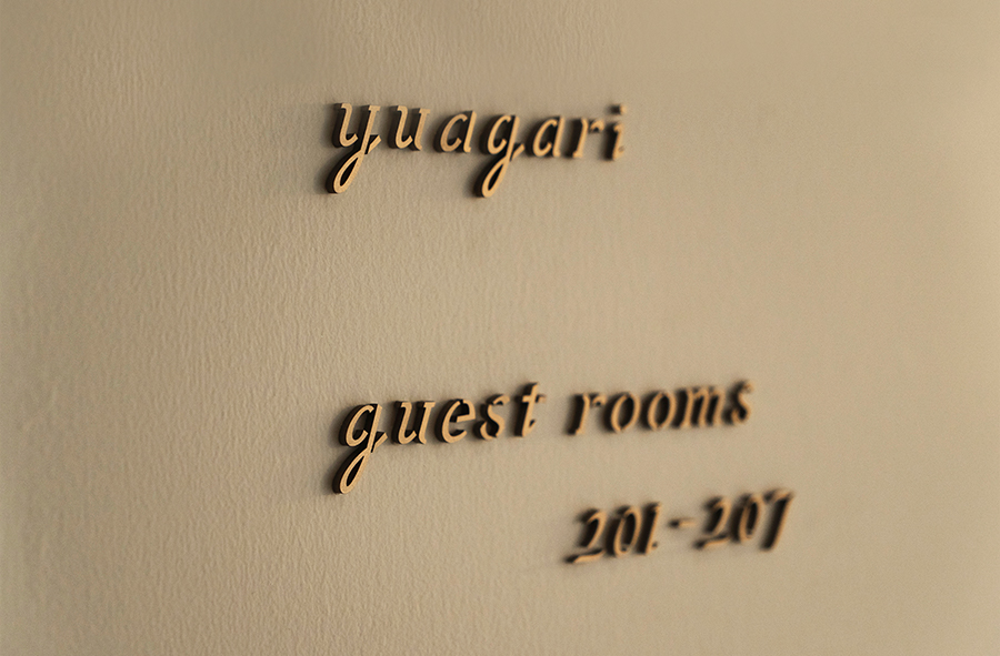
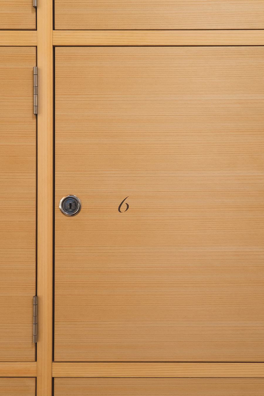
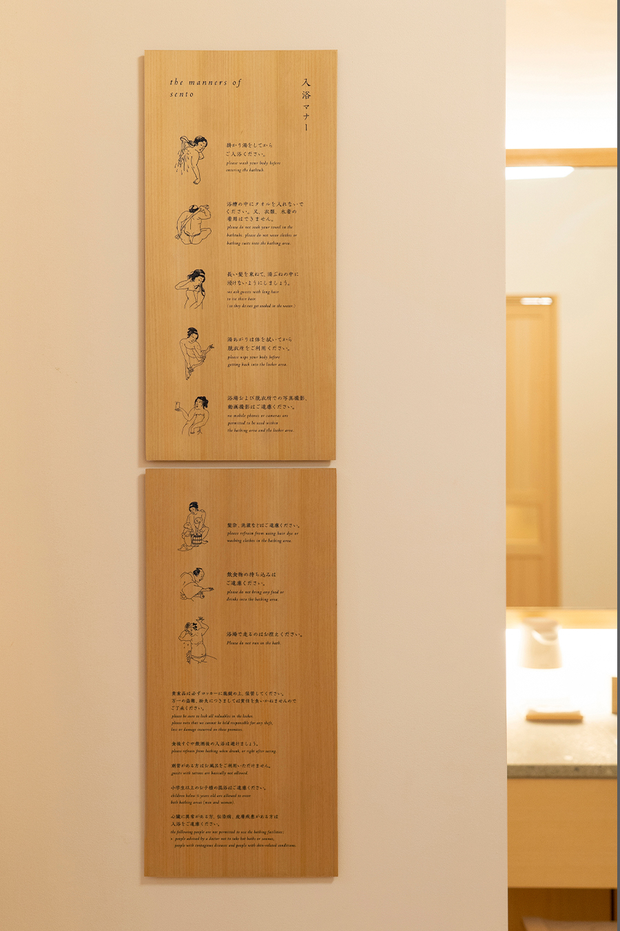
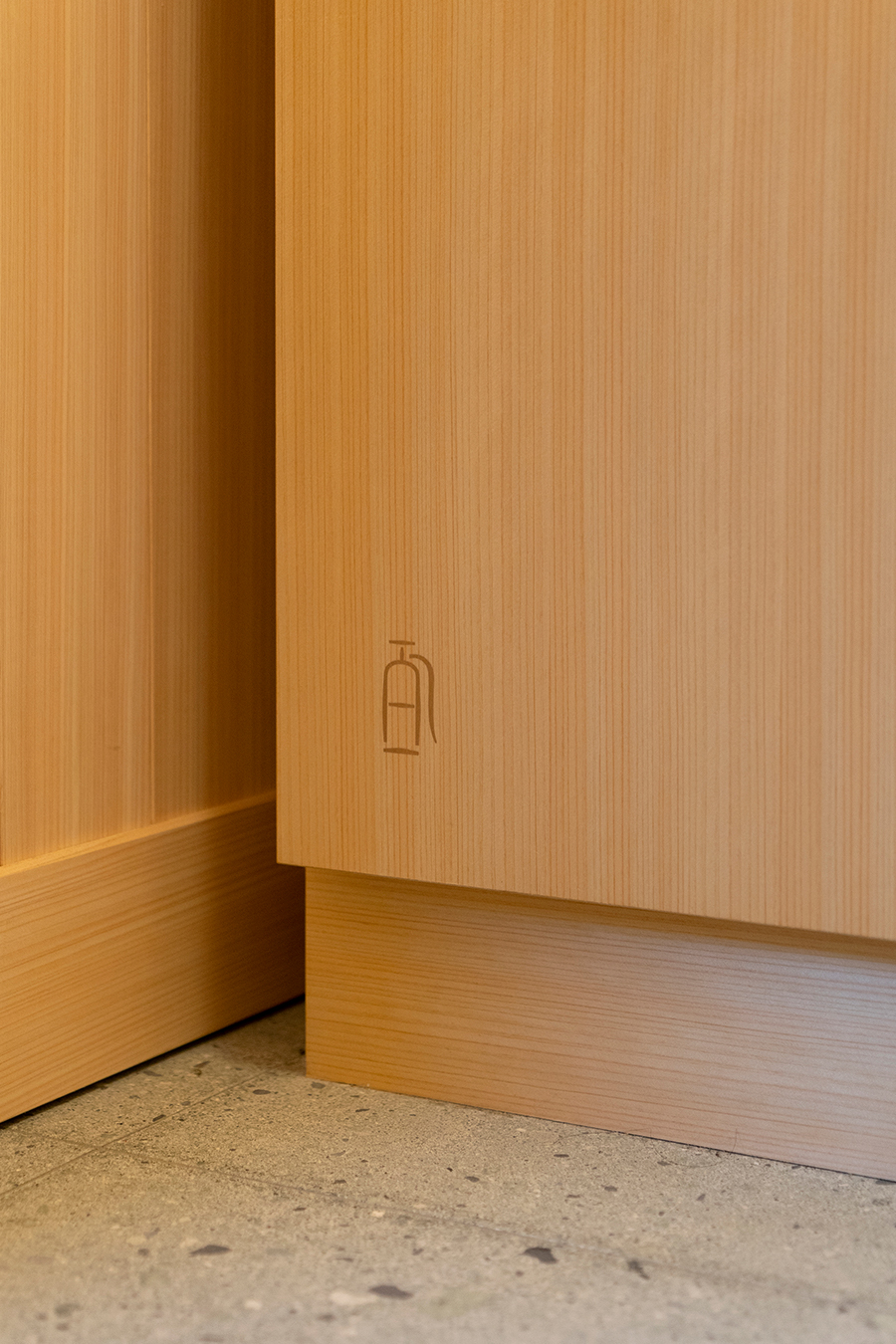
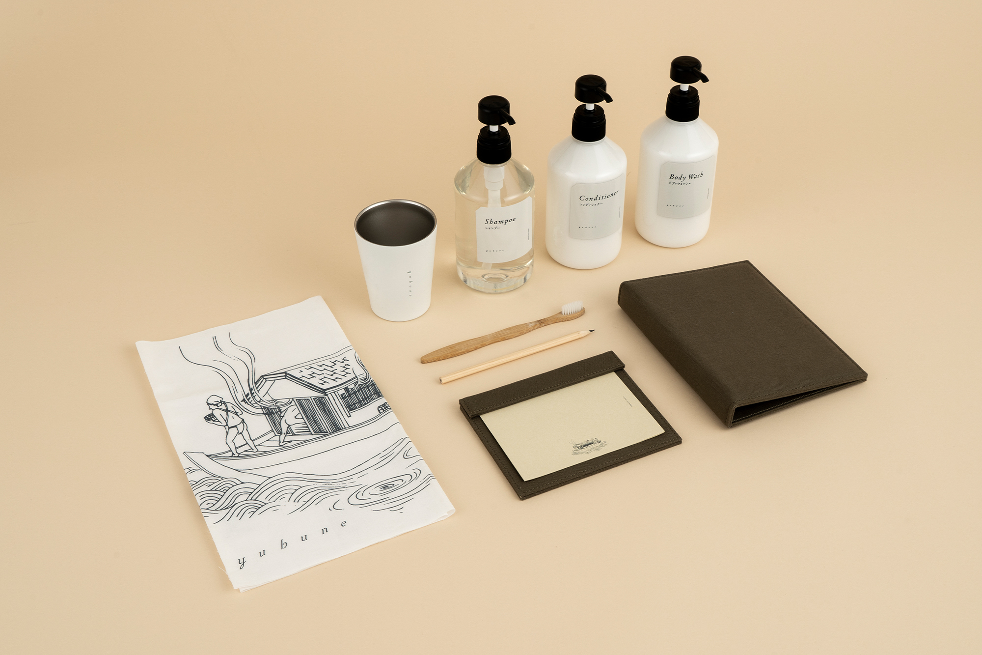
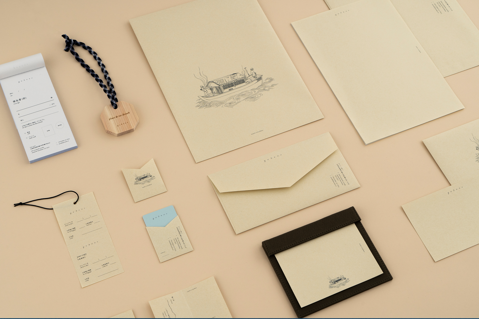
logo & visual identity, graphic & signage, hotel amenities, goods & items, web.
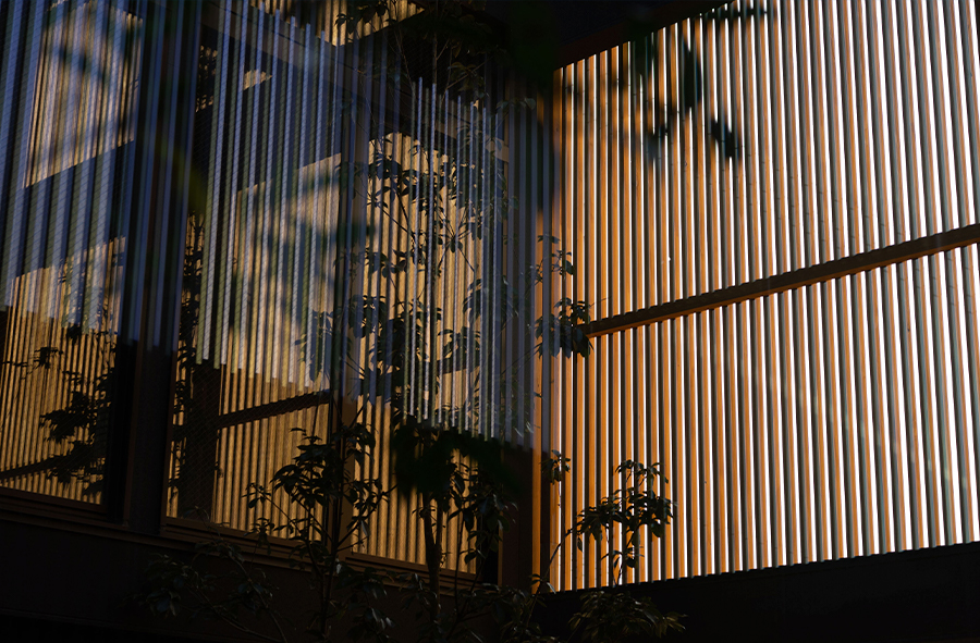
architectures: Shiro Miura, Rokukaku-ya co,ltd & Azumi Setoda architectural design team
construction: Daiwa Kensetsu Co., Ltd
branding: Terasu
brand design: artless inc.
creative direction & art direction: shun kawakami, artless inc.
design: hsieh yin & aoi fujikawa & yafa koseko, artless inc.
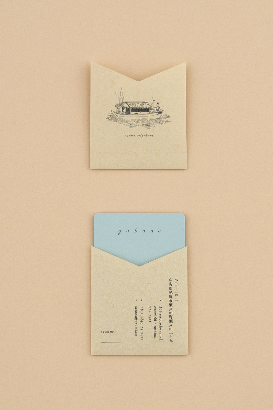
illustration: yafa koseko
project management: moeko tamakawa, artless inc.
photography: yuna yagi & max houtzager
signage & item photography: yuu kawakami, artless inc.
client: Azumi Japan Inc. & Naru Developments
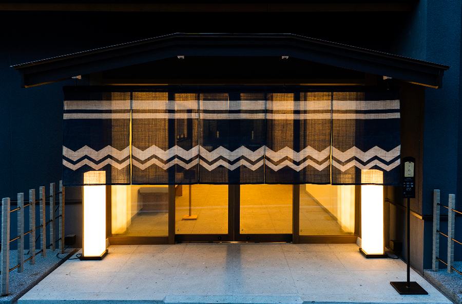
yubune is the Setoda’s community bathhouse and inn, located across the street from Azumi Setoda on a small island in the Setouchi Sea.
Similar to Azumi Setoda, we were in charge of the branding and art direction, including logo, v.i., signage, stationery, amenity, and web design. We worked closely with Kyoto-based architect, Shiro Miura of Rokkakuya. Shiro Miura is an expert in private residences and trained in the sukiya style of Japanese architecture.
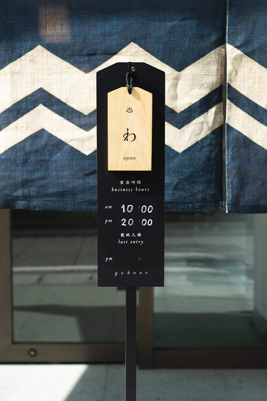
Historically, “Hatago” was a place of commune between the travelers and residents of the local town. Located at the mouth of a shopping street where vestiges of its former glory still remain, yubune embodies the Japanese ryokan with a public bath as it’s core.
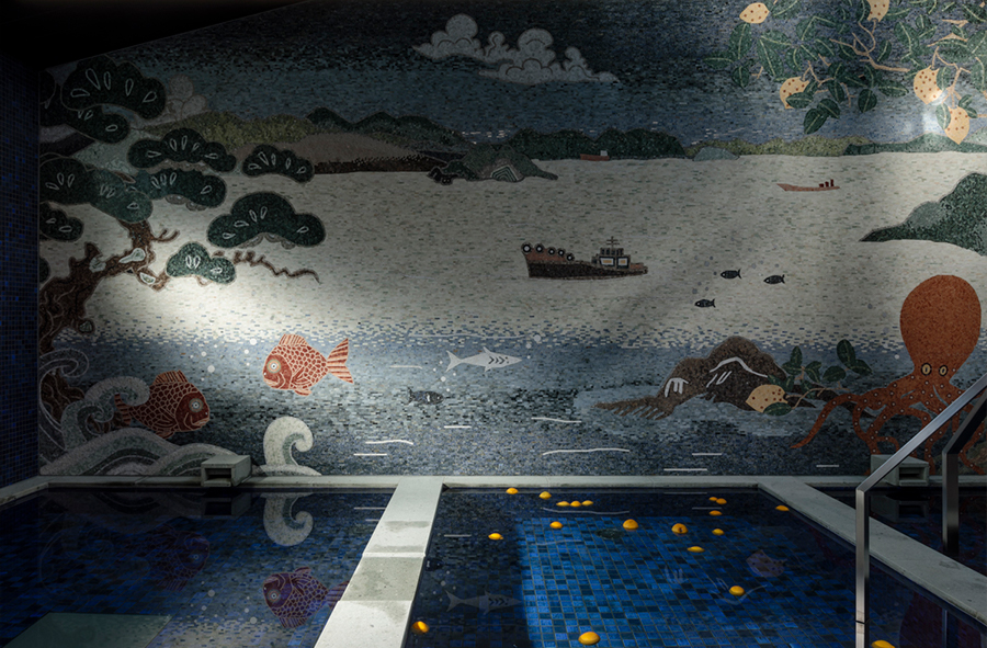
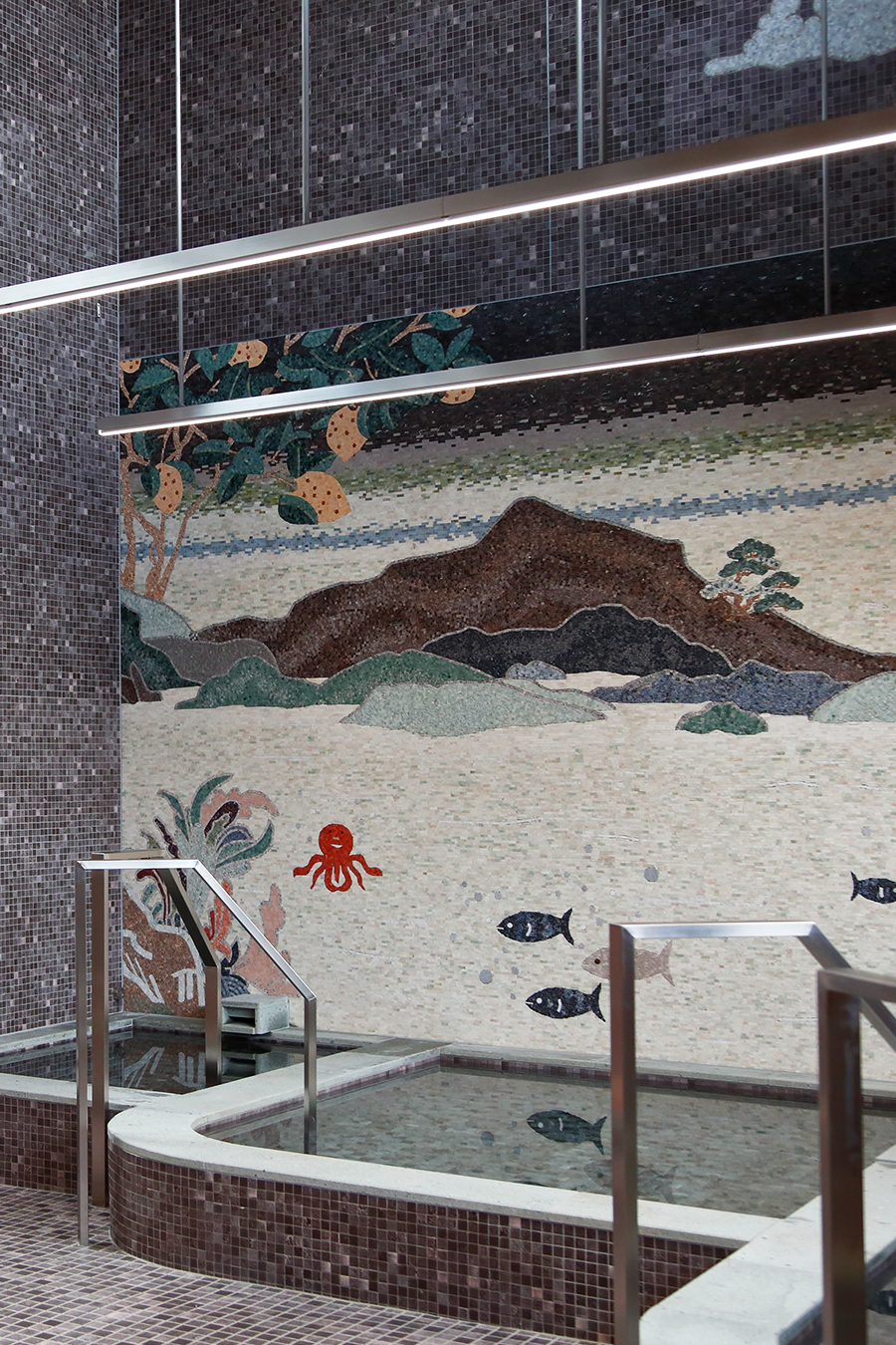
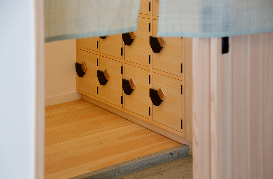
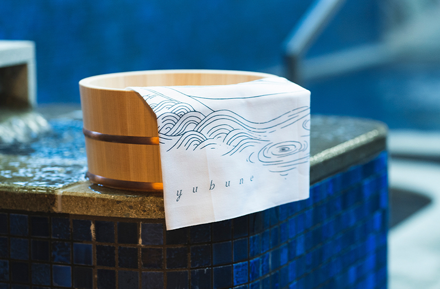
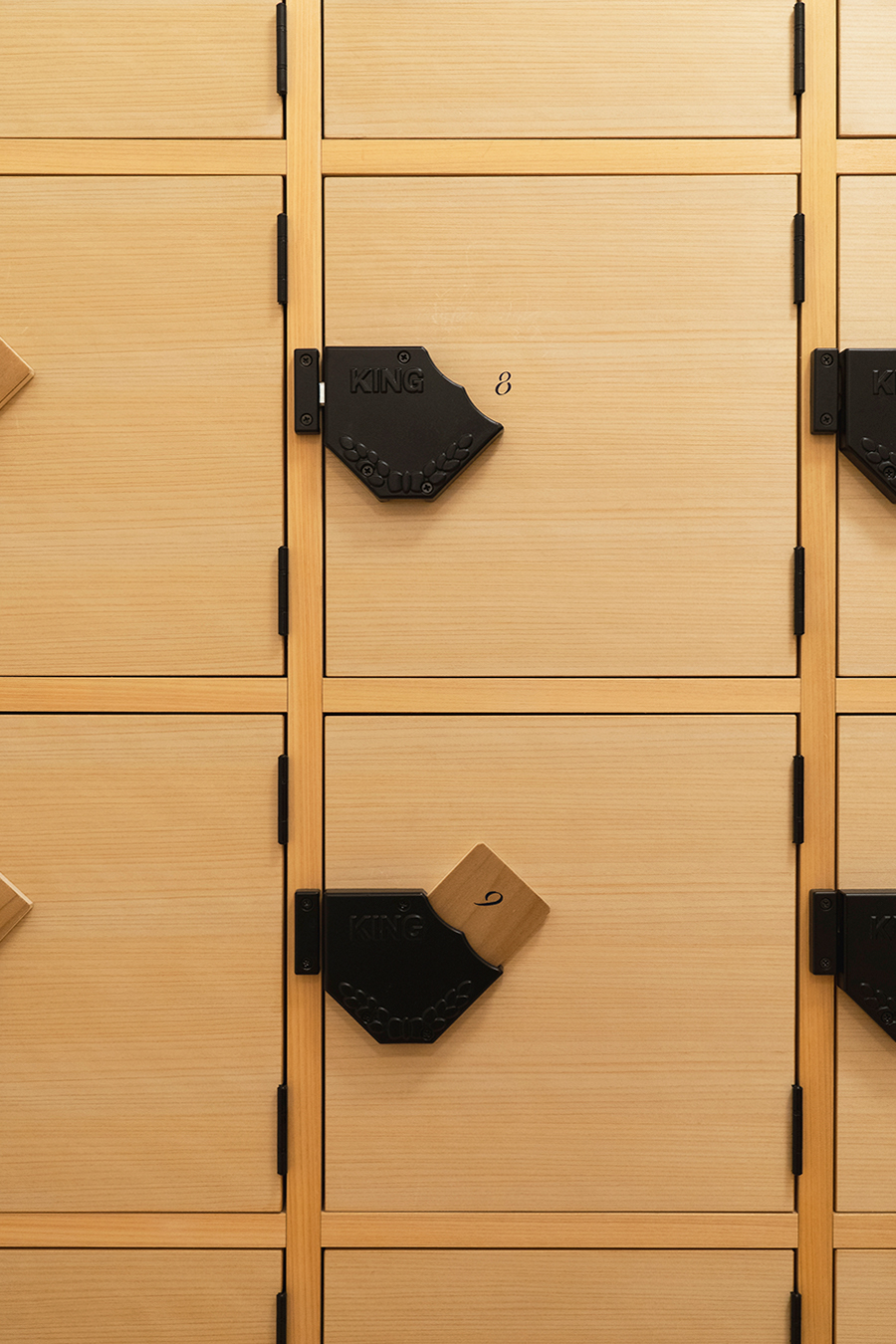
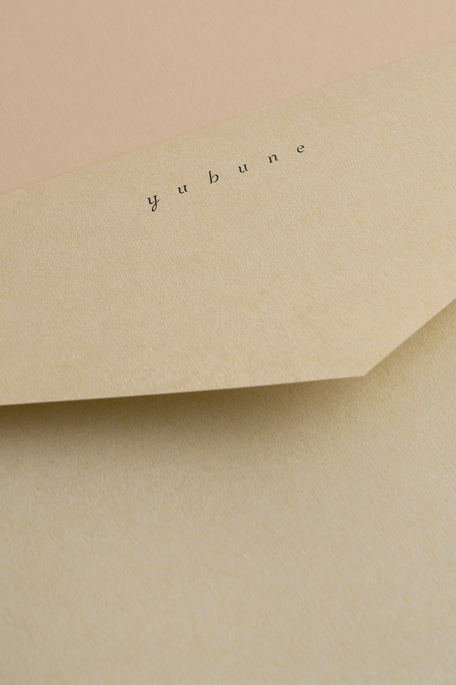
While keeping the aesthetic sense of Azumi Setoda, the main visual for yubune is an illustration based on the motif of an Ukiyo-e. The illustrations used in the main visuals and bathhouse signage were designed to create a sense of intimacy, as our goal for yubune was to make it a place where encounters between people are valued.
For the brand color, we used kinari. Inspired by the architecture, we sought to create a warm-hearted atmosphere. Channeling the Setouchi sea, we used two different kinds of blue, asagi and dark navy for the accent color.
Guests may use the lounge area as their day office, or just as a place to relax.
Our hope is that yubune will be discovered by many bathhouse enthusiasts, cyclists, and global travelers during their trip to Setouchi.
瀬戸内海の小さな島(生口島)に佇む日本旅館「Azumi Setoda」。
その向かいに、「Azumi」 が手掛ける銭湯と旅籠「yubune」が「Azumi Setoda」とともに開業しました。
「Azumi Setoda」と同じく、artlessは、ロゴデザインを始めとしたV.I.の構築、サイン / ステーショナリー / アメニティ/ ウェブ と一貫したブランディング及びアートディレクションを担当。建築デザインの監修も、「Azumi Setoda」と同じ、京都を拠点とし伝統的な日本建築を主とする六角屋・三浦史朗氏が担当しました。
かつて「旅籠」は旅人と町の住人の交流の場でした。古き良き面影の残る商店街の中に建つ「yubune」 は街に開かれた銭湯を中核とし、人々が行き交う旅籠としての役割を現代に体現しています。
V.I.をはじめすべてのデザインは「Azumi Setoda」の世界感を踏襲しつつも、「yubune」には浮世絵をモチーフにしたイラストをメインビジュアルに採用。人と人の出会いが大切にされる場所であって欲しいという思いから、親近感が生まれるイラストに仕上げています。また銭湯内にある各種サインにも、浮世絵への雰囲気で描かれた人物像を用いています。
ブランドカラーには、建築や人の温かみを感じさせる、やわらかい生成り色を選定。アクセントに瀬戸田の静寂な海をイメージしたあさぎと濃紺の2種類の青を織り交ぜました。
銭湯愛好家はもちろんのこと、サイクリストや、リモートワーク、家族やグループでのご旅行など、様々なシーンでぜひご利用ください