旅の駅
旅の駅
brand design:
logo + visual identity
brand guide
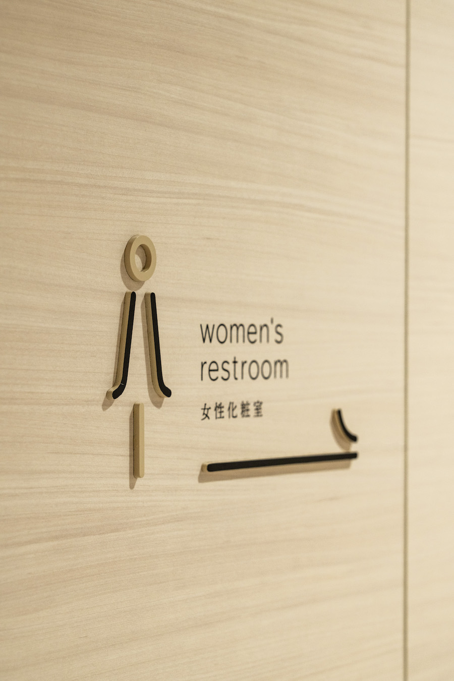
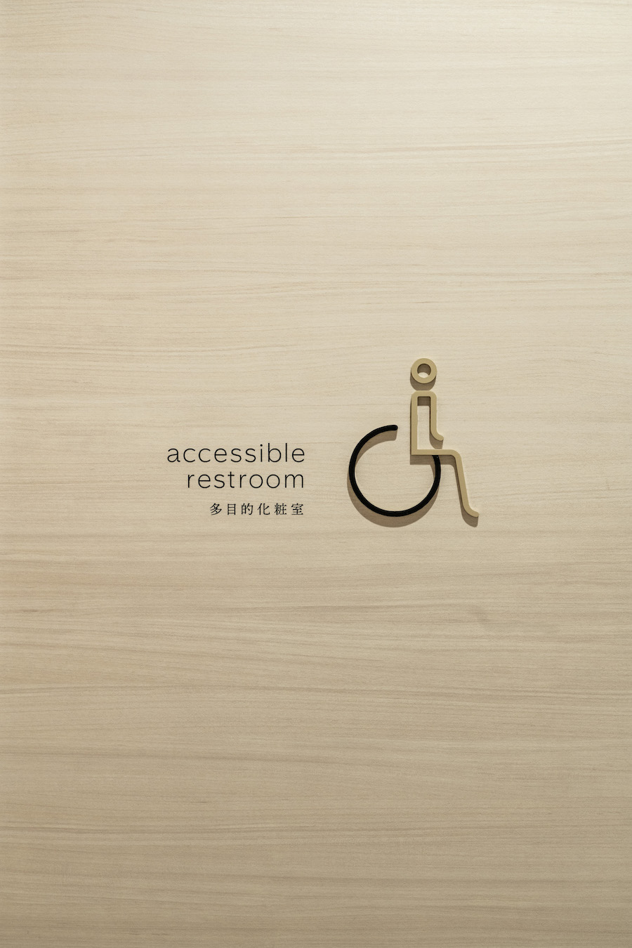
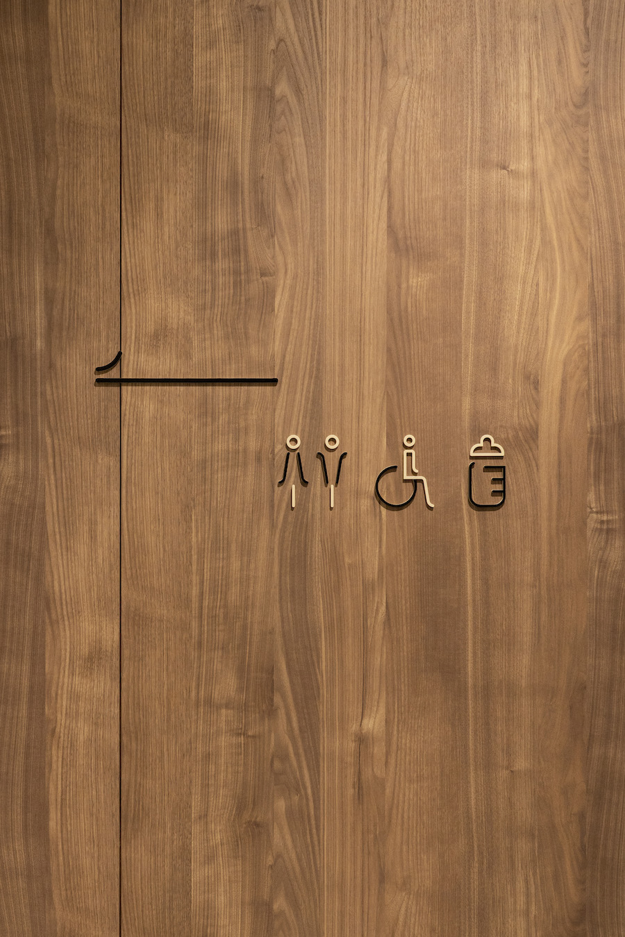
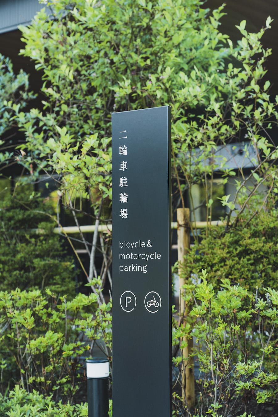
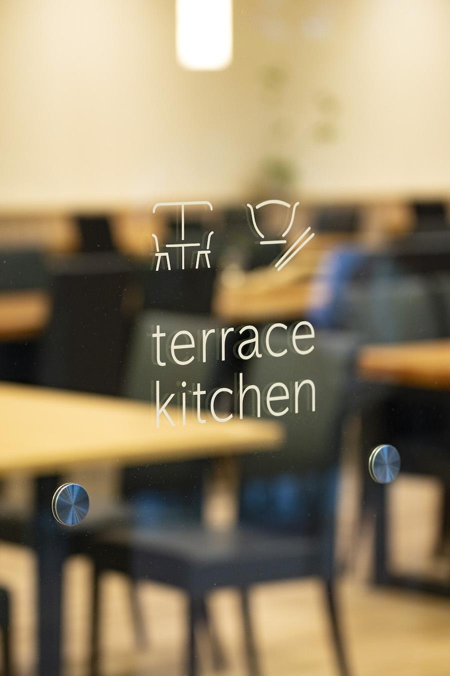
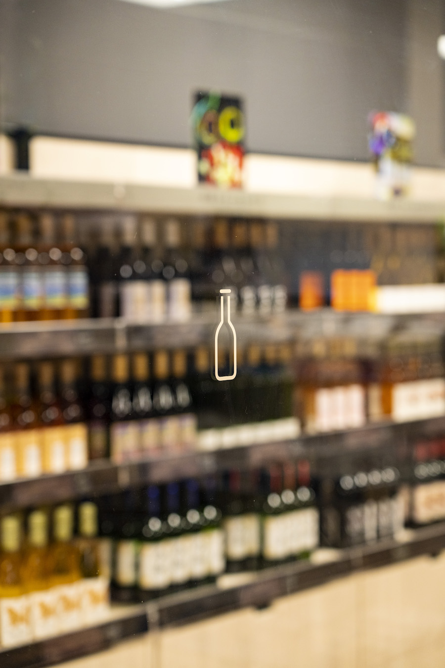
sign design
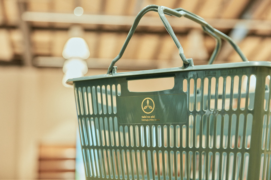
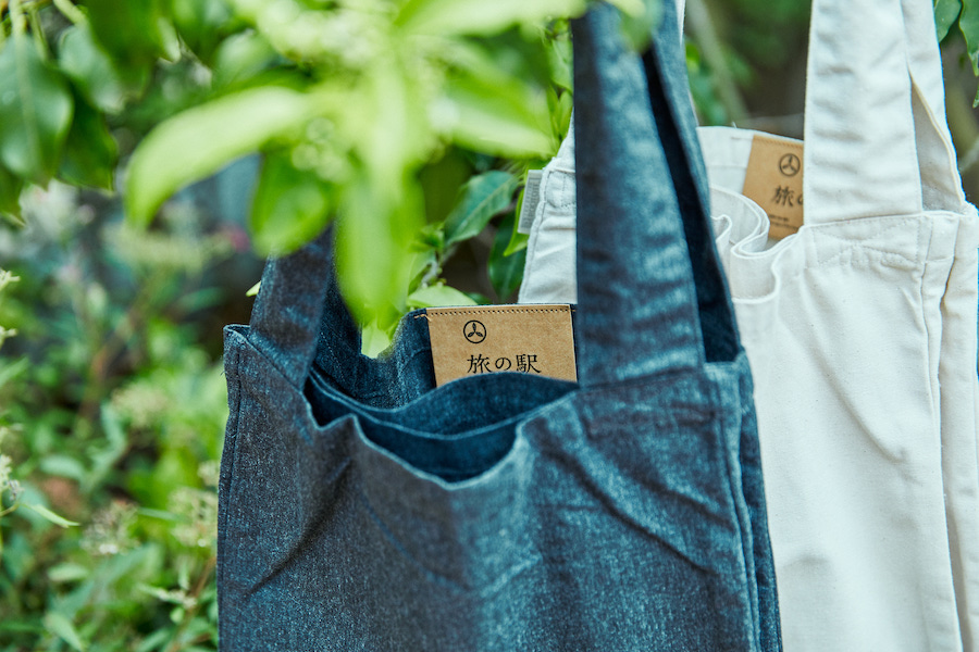
item design
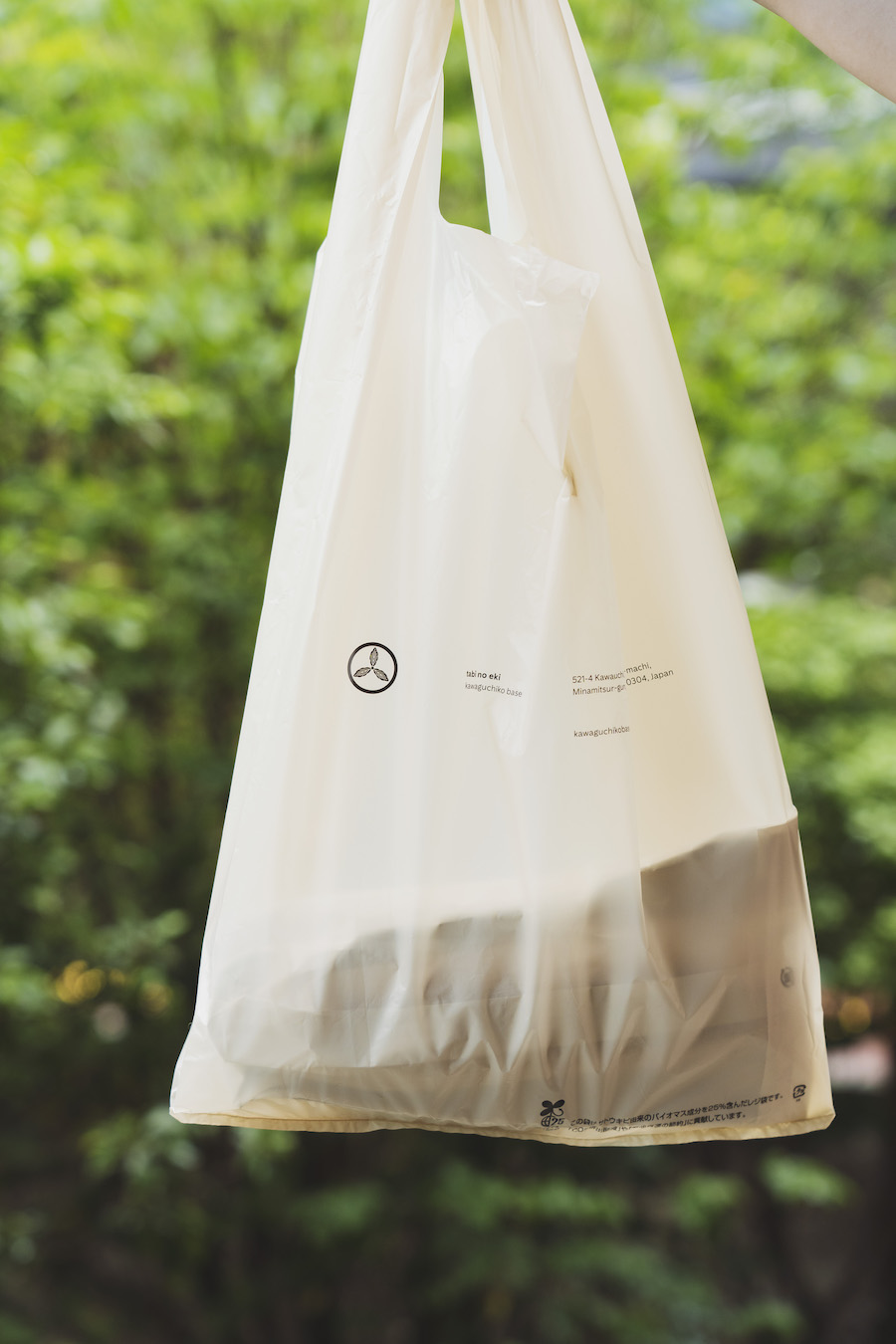
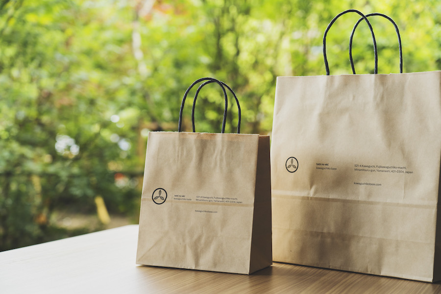
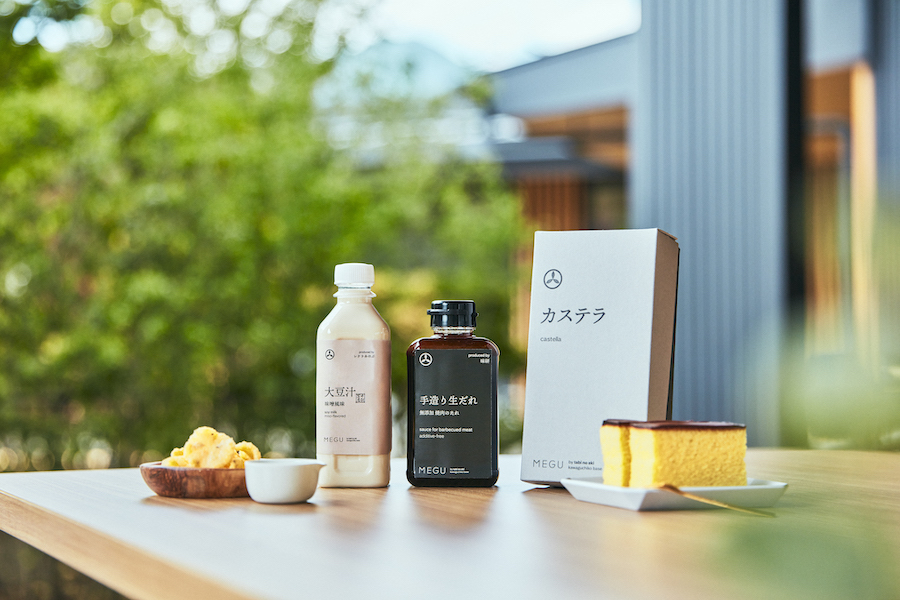
package design
–
branding: artless Inc.
creative planning : SATOYUME CO., LTD
creative direction: shun kawakami, artless Inc.
art direction: shun kawakami, artless Inc.
graphic design: ayako shien, artless Inc.
assistant design: junyi zhang, artless Inc.
project management: asami kinoshita, artless Inc.
web programming: hyper creation alpha,inc
signage & item photography: yuu kawakami
client: 株式会社 大伴リゾート
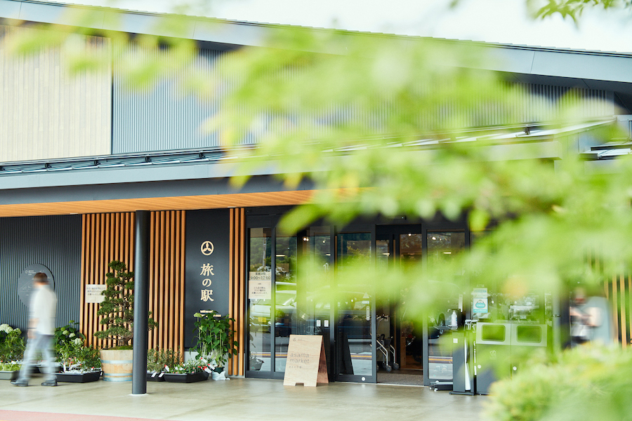
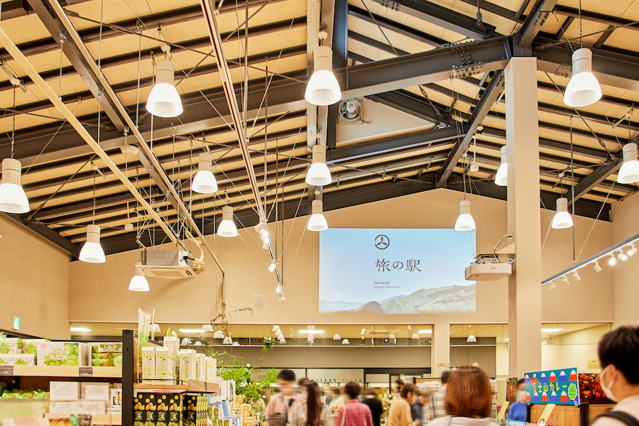
artless Inc. provided brand strategy consulting, brand logo, graphic design, signage planning, and architecture for the Kawaguchiko base, a commercial complex with retail stores and restaurants in the Kawaguchiko area at the foot of Mt. We provided creative direction and visual identity development.
We aimed to raise the core target and brand positioning set by many roadside stations toward the future and the changing times and mass market, and to foster a rich local culture. While targeting a wide age range from children to the elderly, the branding and design is based on essential values/ quality and sophistication, with a sense of hospitality, kindness, and comfort.
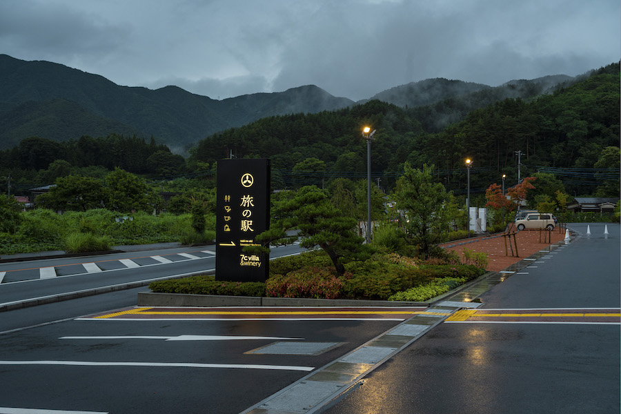
The project began with the launch of a winery and glamping project (7c winery) adjacent to a travel station. However, as we proceeded with brand consulting, we realized that a comprehensive brand design for the entire site was strategically essential to create new value in a new location, so we decided to brand the entire site, including the Travel Station, which was underway at the same time.
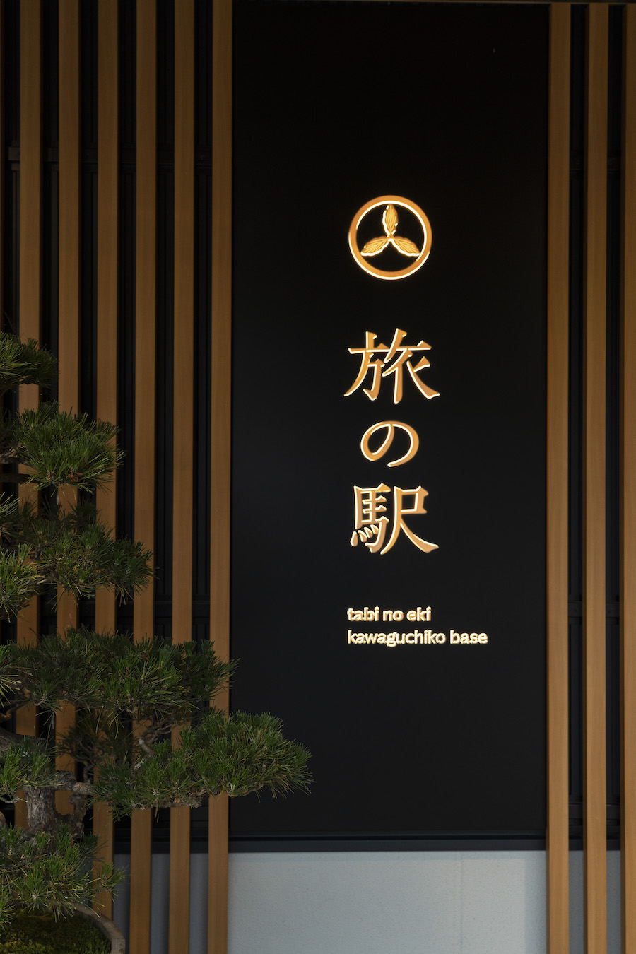
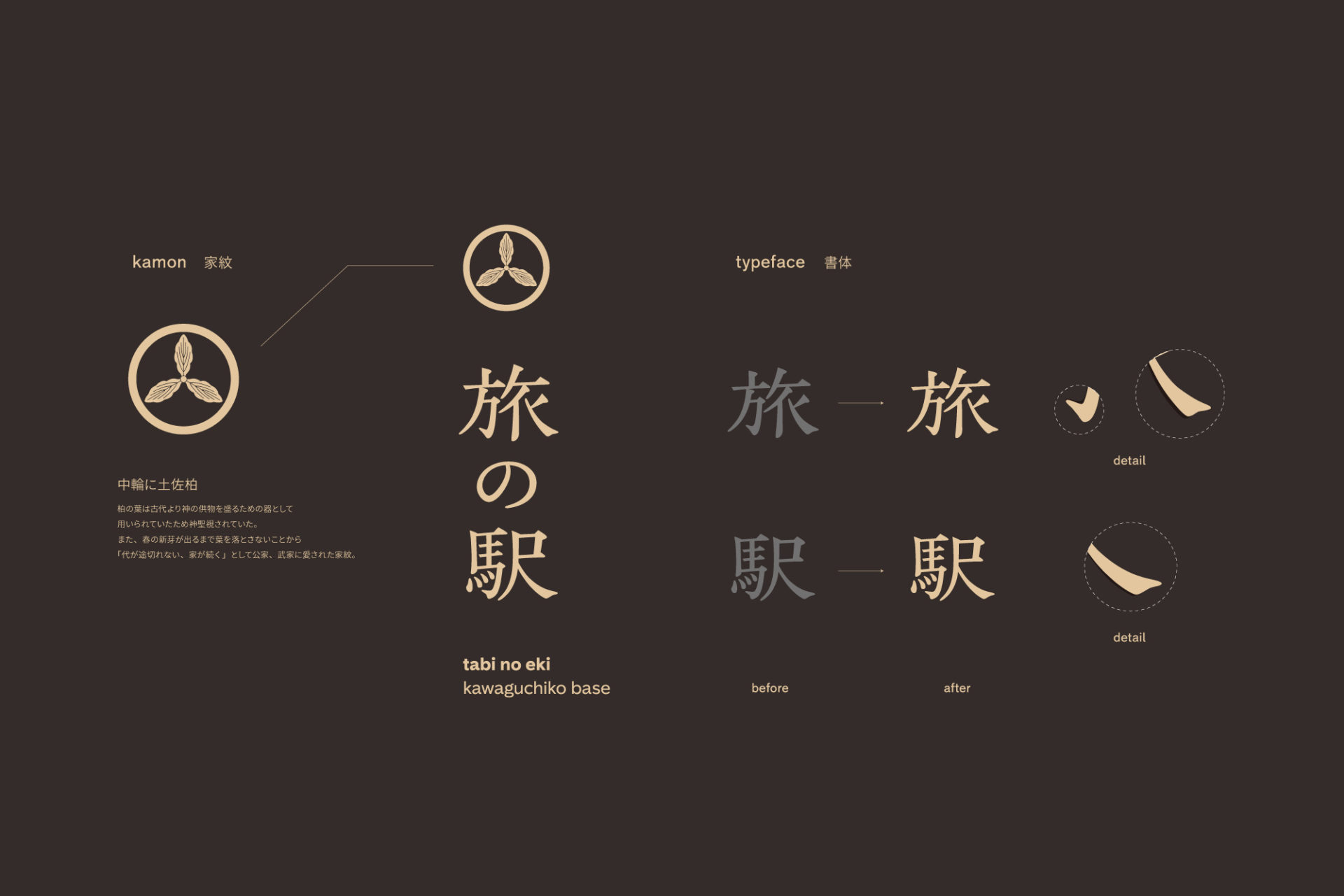
The logo features the family crest, “Tosa Kashiwa (Tosa Kashiwa) in the middle ring. The oak tree does not lose its leaves until new buds emerge in spring, which is said to mean “generations will not be interrupted, and the house will continue to grow.” This symbolizes our wish that this project will continue for a long time. The logo design is based on the Mincho font, which has a soft impression as if it were written in India ink, and the details of each letter are beautifully arranged to create a warm and friendly feeling. For the brand colors, inspired by the materials of the architecture and the nature and history of Kawaguchiko, we chose sumi ink, which is a mixture of persimmon tannin and black ash, and beige, which is reminiscent of the color of traditional board fence paint, as well as the color of cedar wood materials.
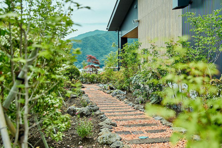
For the architecture, we collaborated with artless Inc. group company 1A. ltd. (landscape design) to draw a master plan that integrates the entire site with the natural environment. We were able to realize a brand design and brand communication, including architecture, for the travel station as a future-driving place where multi-use values gather while respecting the essentials. In doing so, we aim to raise the standard in Japan as well.
artless Inc. は、富士の麓、河口湖エリアに物販店舗及びレストランを併設した複合型の商業施設【旅の駅 kawaguchiko base】のブランド戦略コンサルティングをはじめとしたブランドロゴ、グラフィックデザイン、サイン計画、そして、建築の包括的なクリエイティブディレクションとヴィジュアルアイデンティティの構築を行いました。
多くの道の駅が設定するコアターゲットやブランドポジショニングを、未来や変化する時代とマスマーケットに向けて引き上げ、豊かな地域文化の醸成を目指しました。子供から高齢者まで広い年齢層をターゲットにしながらも、本質的な価値観/ 上質と洗練をベースに、おもてなしや優しさ、心地よさを感じるブランディングとデザインを行っています。
プロジェクトの起こりは、旅の駅に隣接しているワイナリーとグランピングのプロジェクト(7c winery)の立ち上げでした。しかし、ブランドコンサルティングを進めてゆくなかで、戦略的に敷地全体としての包括的なブランドデザインが、あらたな土地に、あらたな価値を生み出すには必要不可欠と考え、同時に進行していた旅の駅を含めた敷地全体のブランディングを行うことになりました。
ロゴには家紋である「中輪に土佐柏」の紋をあしらっています。柏は春になり新芽が出るまで葉を落とさないことから「代が途切れない、家が続く」といわれており、本事業が末長く続いていくようにという願いが込められています。墨で筆書したような柔らかな印象の明朝体をベースとし、文字1つ1つのディテールをより美しく整え、温かみや親しみを感じられるようなロゴデザインに仕上げました。ブランドカラーには、建築のマテリアルや、河口湖の自然・歴史からインスパイアを受け、柿渋に灰墨を混ぜ合わせた古くから伝わる板塀の塗料をイメージした墨色と、杉の木の素材の色をイメージしたベージュを選んでいます。
また、建築では、敷地全体を自然環境と融合するマスタープランを描くために、artless Inc.のグループ会社 1A. ltd. (ランドスケープデザイン)と共同での設計を行いました。旅の駅は、本質を大切にしながらも多用的価値観が集まる未来を牽引する場所として、建築を含めたブランドデザインとブランドコミュニケーションを実現することができました。これにより、日本のスタンダードをも引き上げすることを目標としています。