ab concept / hong kong
ab concept
brand design:
logo + visual identity
brand guide
art direction:
photo direction
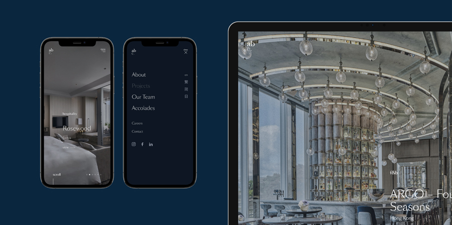
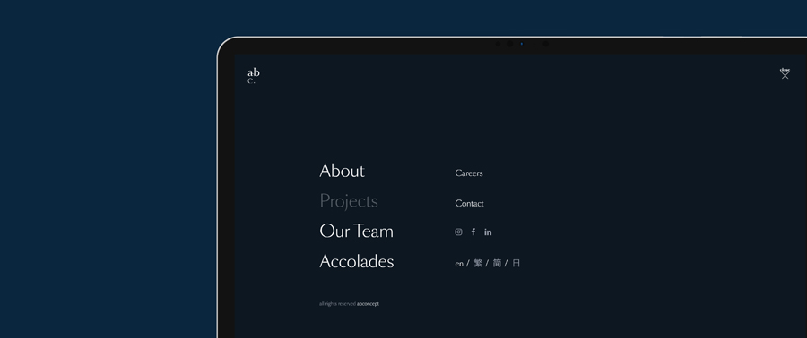
graphic + web design:
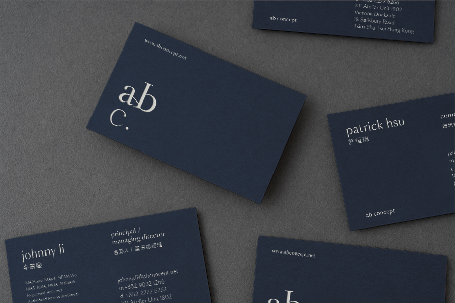
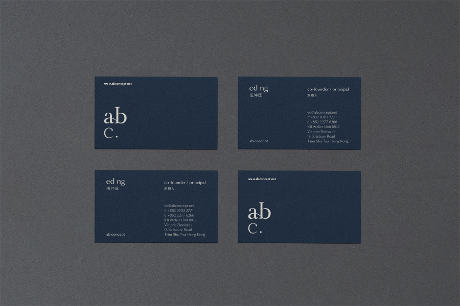
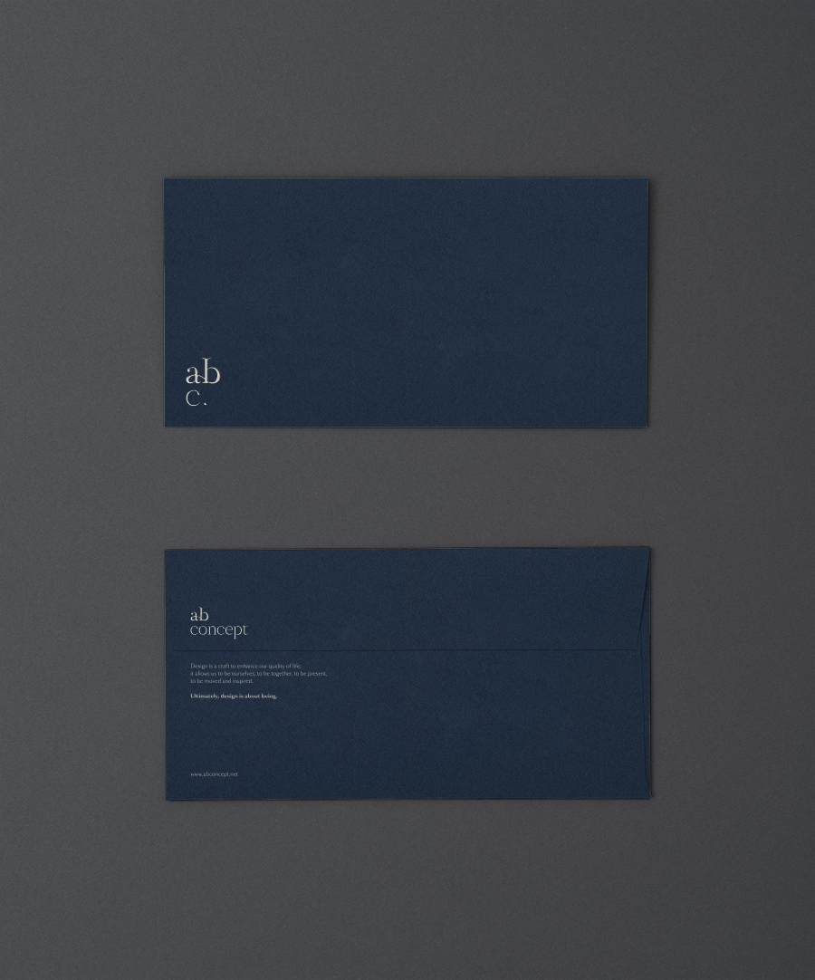
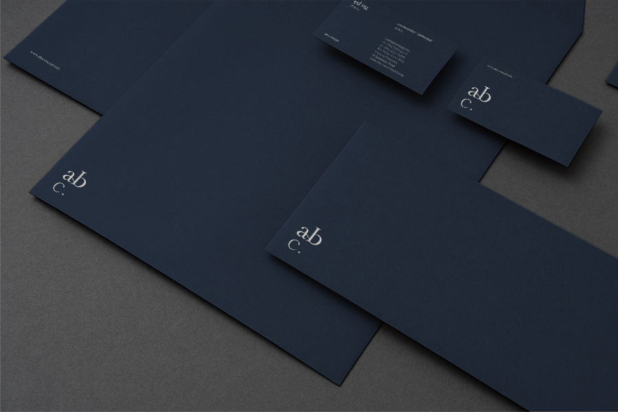
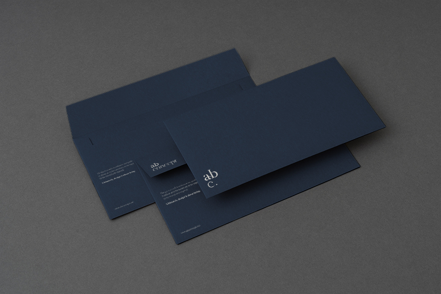
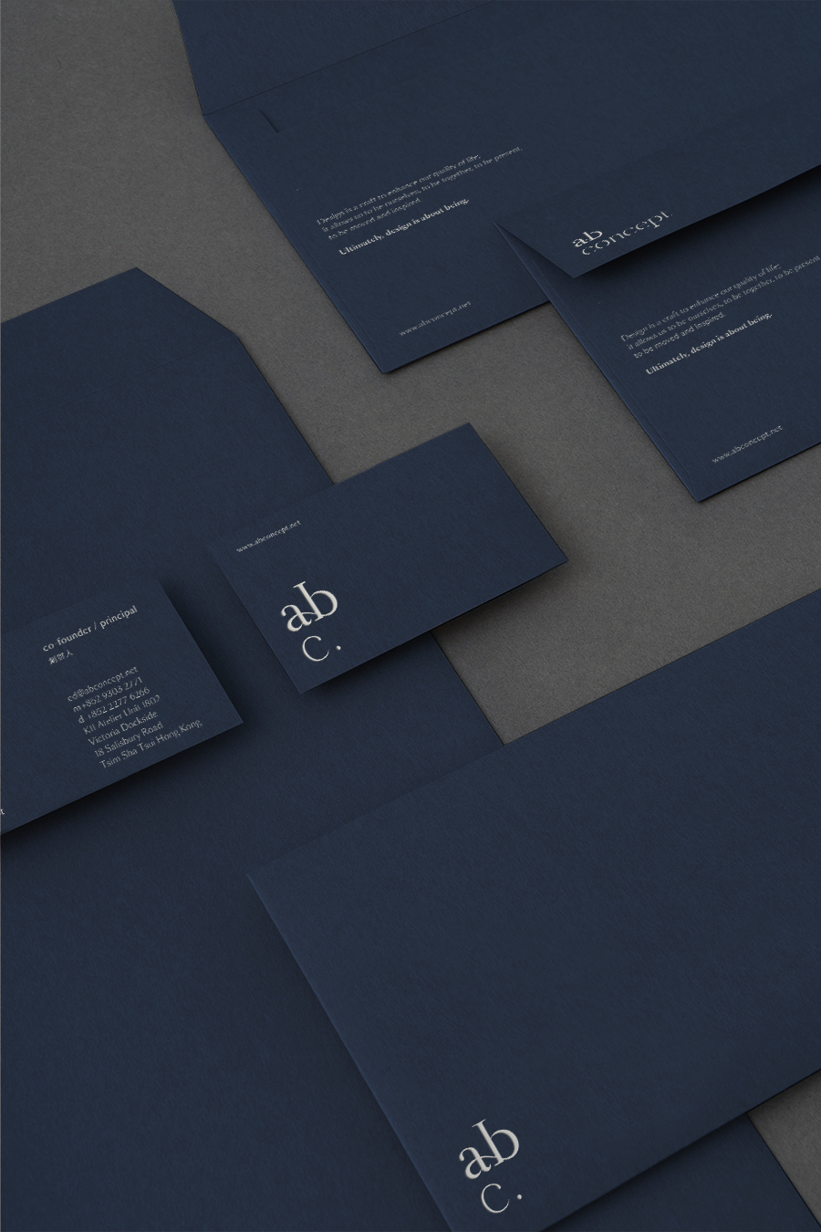
stationery design
web design
–
branding: artless Inc.
creative direction & art direction: shun kawakami
graphic & web design: thomas zimmerman + shinsaku iwatachi
web programming: adrien dufond
project management: asami kinoshita
client: ab concept ltd.
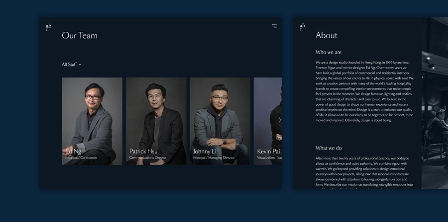
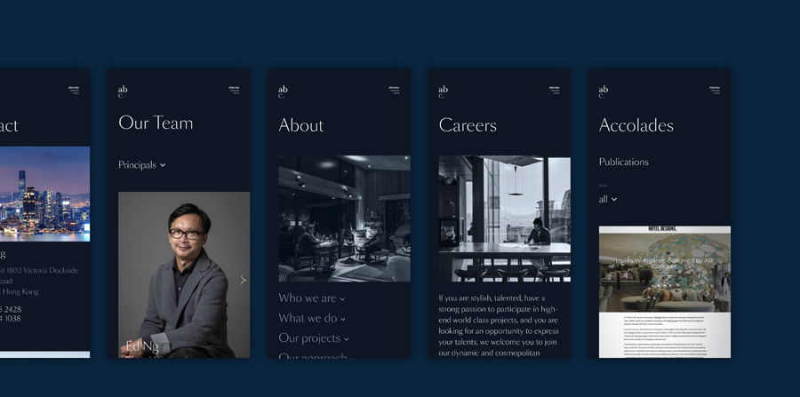
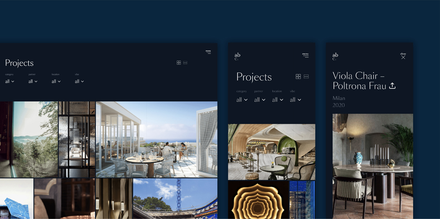
We were approached by architect Terence Ngan and interior designer Ed Ng to rebrand their design studio ab concept founded in 1999 in Hong Kong. We were in charge of rebranding their C.I. (Corporate Identity), encompassing the logo, V.I., web design, and stationary design.
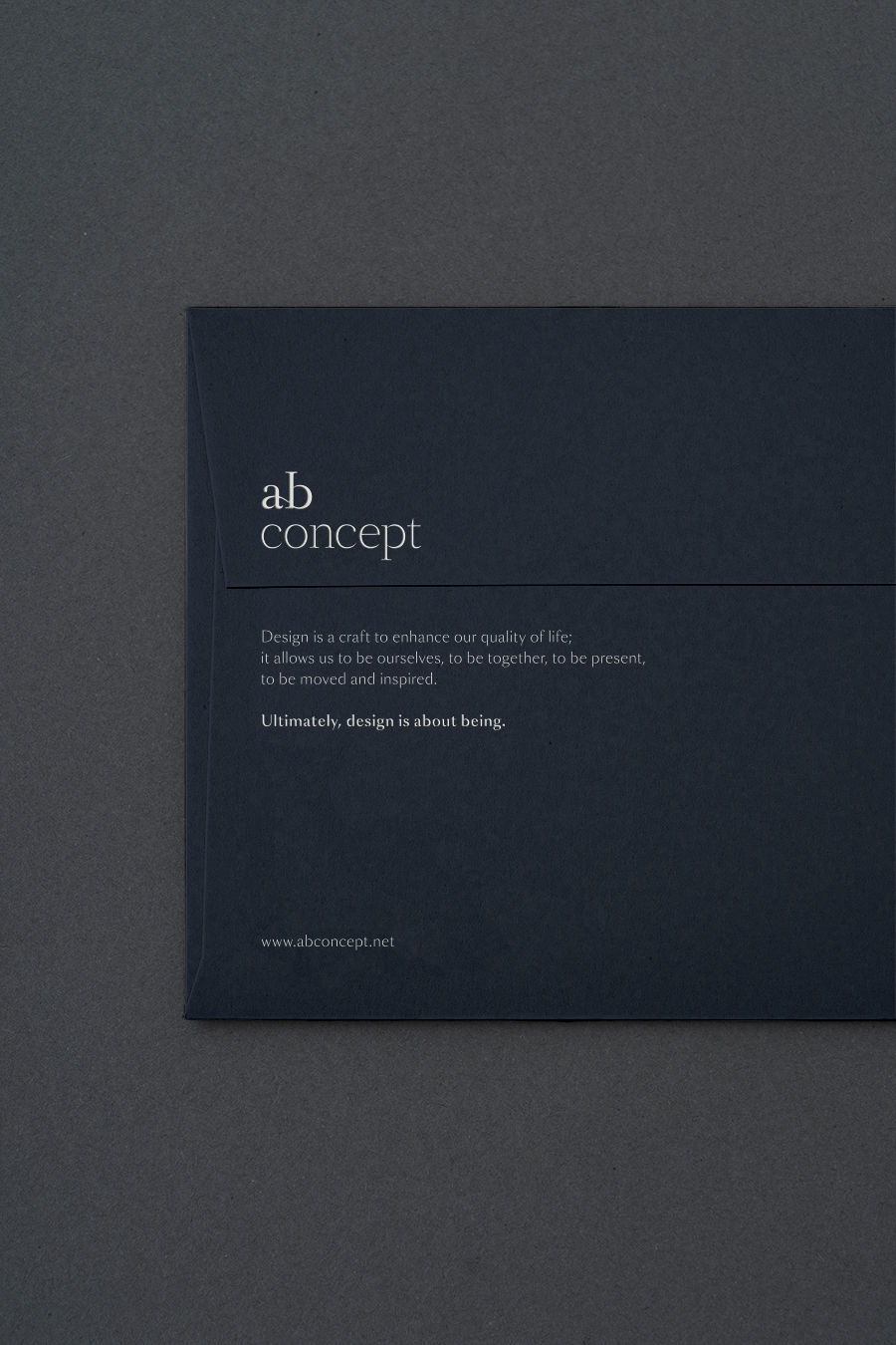
ab concept has been a creative partner to leading hospitality brands around the world for over 20 years, providing comprehensive interior design and creative direction as well as furniture, lighting, and textiles designs. Inspired by their mantra of, “Ultimately, design is about being.”, our goal was to create a brand identity that brings in elements of a human-touch while maintaining the timelessness present in ab concept’s work.
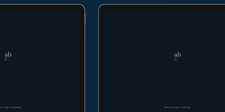
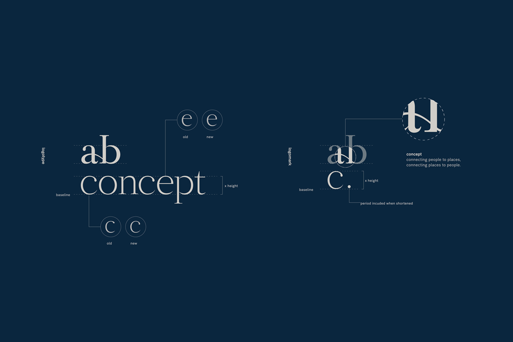
By connecting the initials of “about being”, the logo expresses the various connections that ab concept values—craft and industry, scale and intimacy, people and places.
The brand colors of deep blue and light gray represents both elegance and modernity, while the humanist font, Sang Bleu, ties together this delicate balance to evoke a sense of silent authority. Designed with meticulous attention to every detail, we strive to create a brand design that accompanies ab concept’s journey to a new phase of exploration and maturity.
Terence NganとEd Ngによって1999年に香港で設立したデザインスタジオ「ab concept」。artlessは、ロゴからタイプフェイスやブランドカラー設定、グラフィック、ウェブ、フォトディレクションなど、ブランドデザインガイドの構築、C.I.(コーポレートアイデンティティ)のリブランディングを担当しました。
「ab concept」はこれまで20年以上にわたり世界中の一流ホスピタリティブランドのクリエイティブパートナーとして活動し、家具、照明、テキスタイル含む、包括的なインテリアデザインとクリエイティブディレクションを行っています。フィロソフィーである 「Ultimately, design is about being 」にインスパイアされ、「ab concept」の作品に共通するタイムレスな佇まいを意識し、人の手による官能的な要素を取り入れたロゴデザインを目指しました。
「about being」の頭文字の「a」と「b」を繋げることで「ab concept」が大切としている、工芸品と工業製品、スケール感と親しみやすさ、人間と空間、といった様々な繋がりを表現しています。
ブランドカラーには格式とニュートラルな現代性を感じさせる深い青とクールグレーを設定し、書体には人間性や豊かさを感じるSang Bleuを選定することで静かなる品格を意識しています。細部までにこだわり抜いたデザインを構築することで、新たなステージに進む「ab concept」を更なる高みへと導くためのブランドデザインを心がけています。