hyatt regency kyoto / cafe 33
hyatt regency kyoto / cafe 33
brand design:
logo + visual identity
brand guide
graphic + sign design:
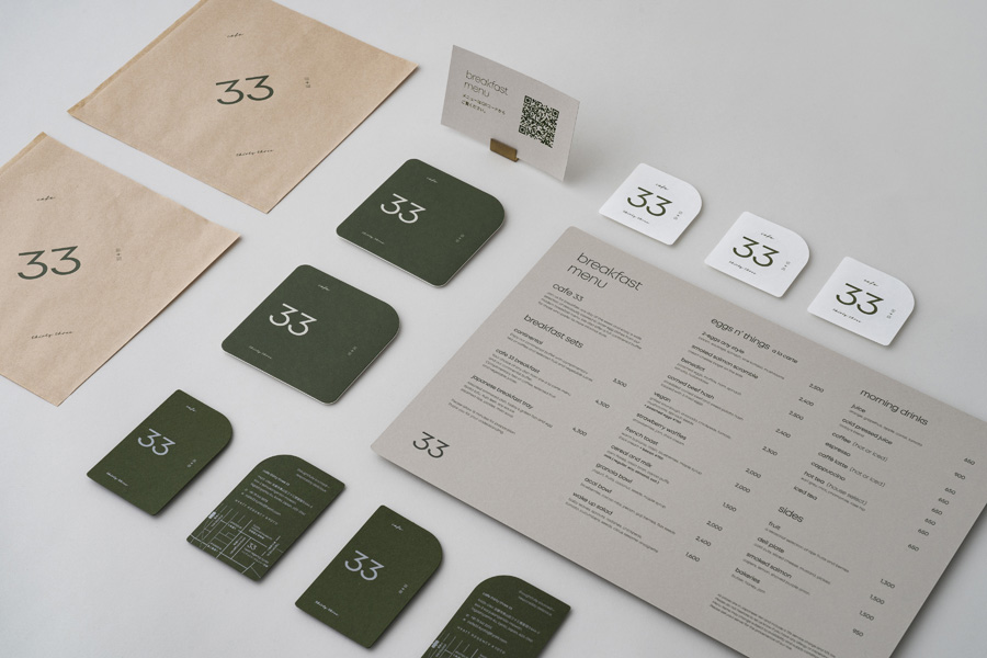
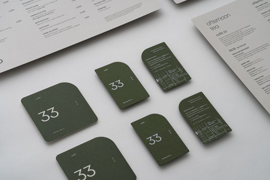
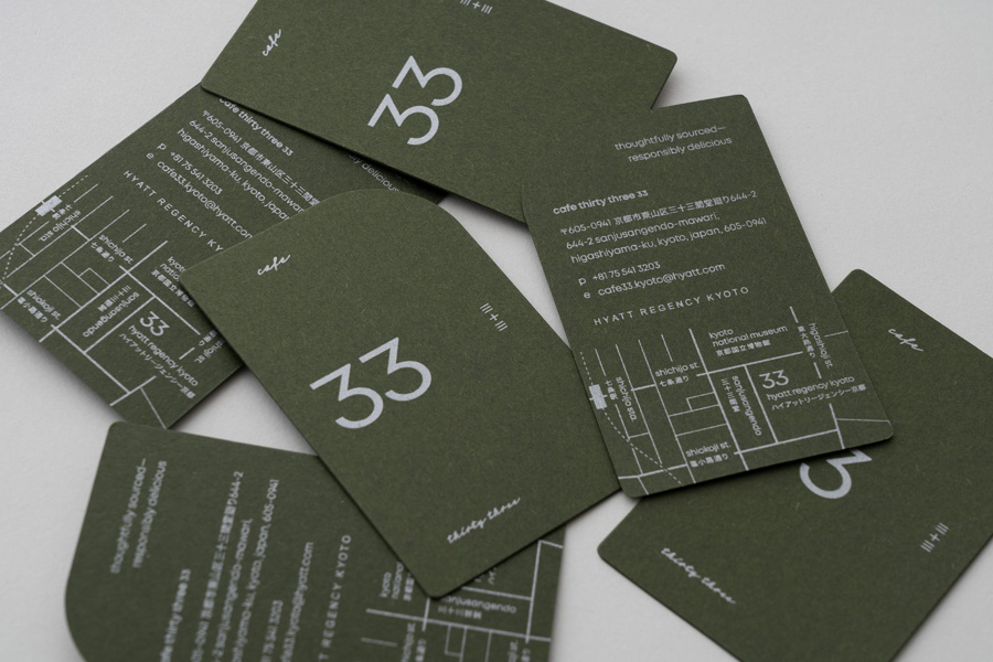
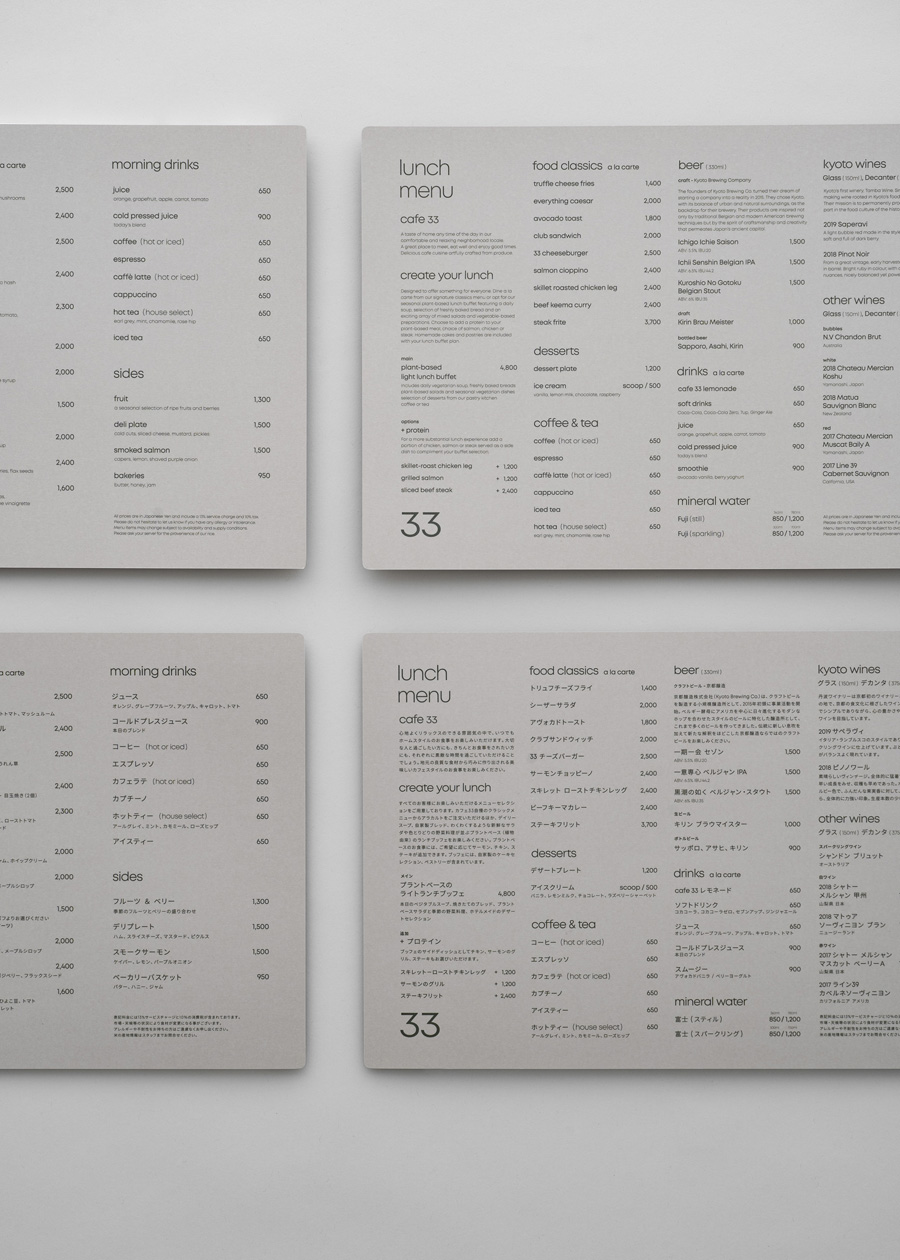
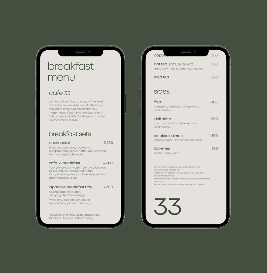
menu design
item design
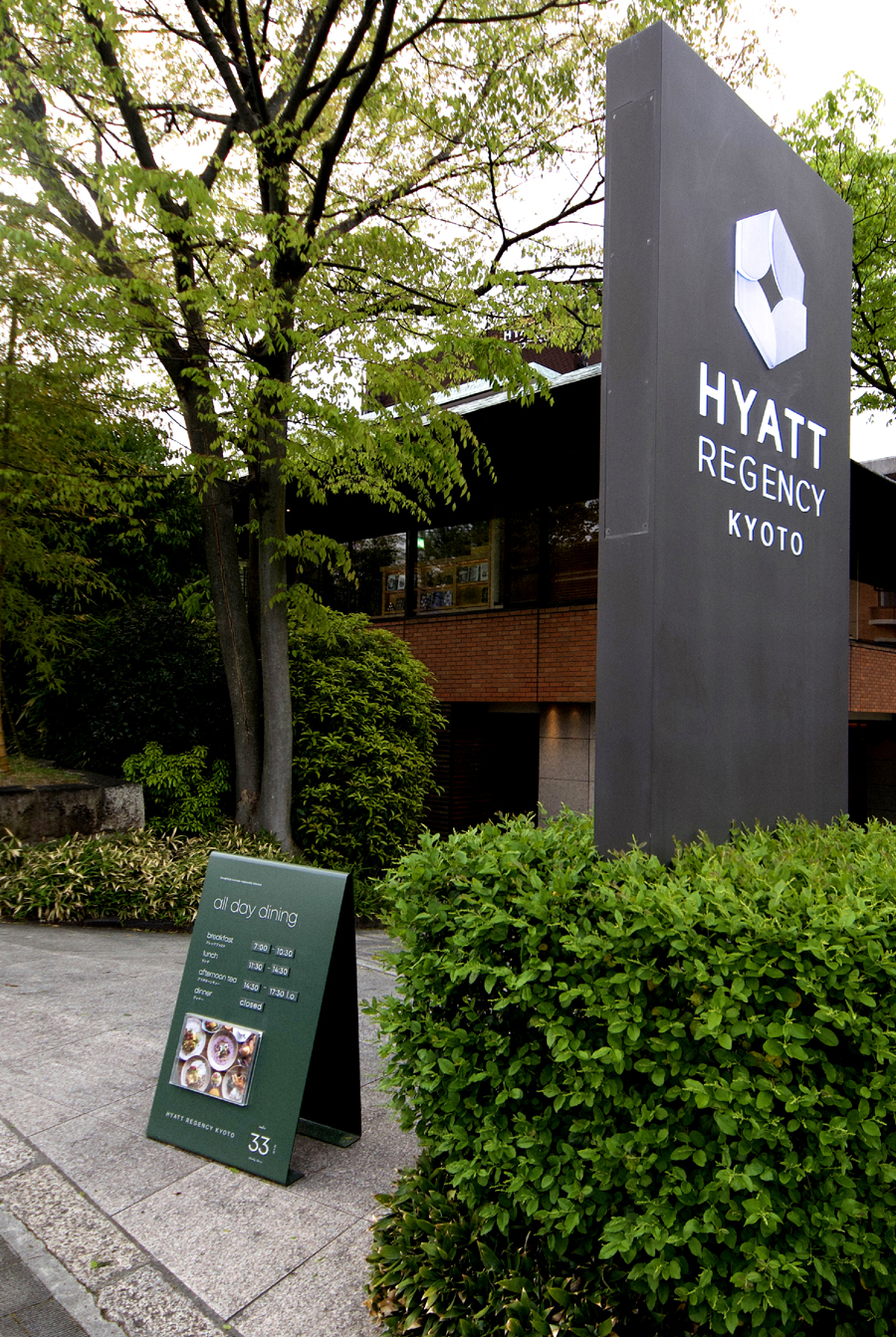
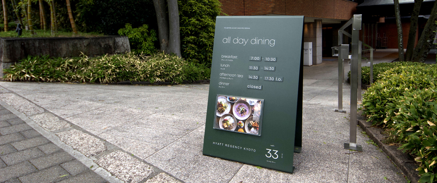
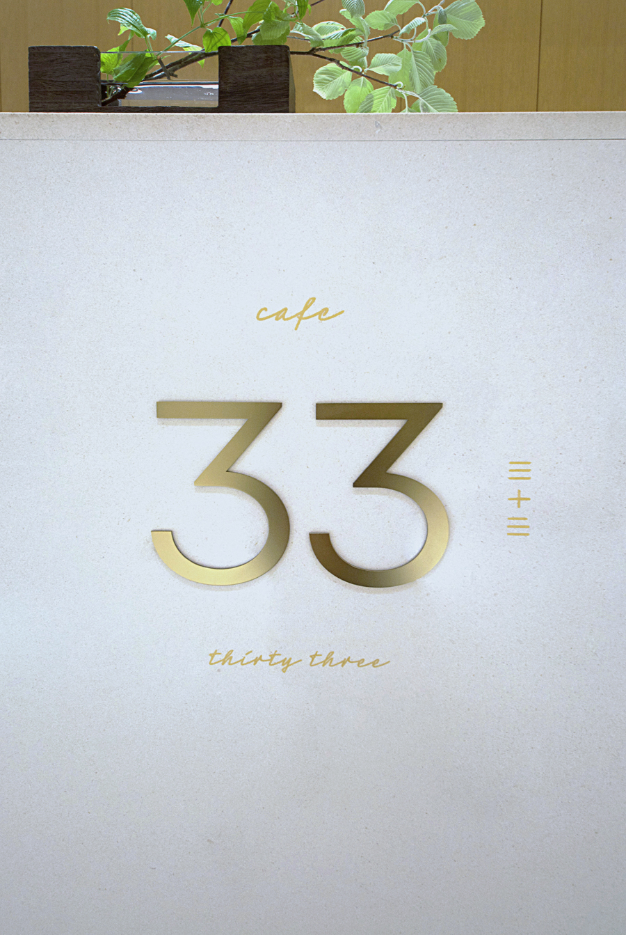
sign design
–
interior design: NAO Taniyama & Associates
branding: artless Inc.
creative direction & art direction, logo design: shun kawakami & kazuki kaneko
graphic & signage design: thomas zimmerman
project management: asami kinoshita
photography: yuu kawakami
client: hyatt corporation
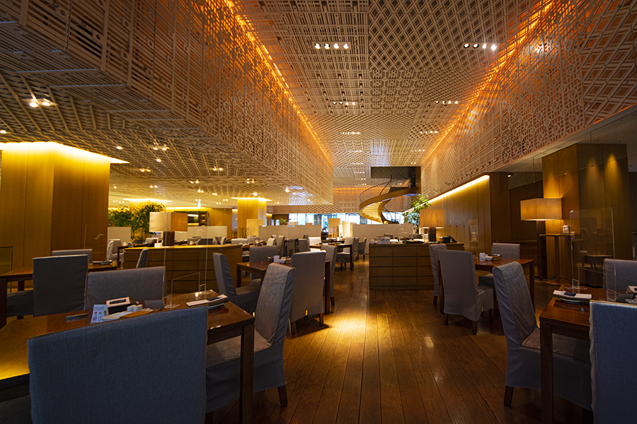
“cafe 33” is a cafe-style restaurant located in Hyatt Regency Kyoto offering locally sourced farm-to-table food in the heart of Kyoto. We were responsible for the comprehensive brand design, encompassing the logo, V.I., graphic design, signage design, as well as digital and physical menu design.
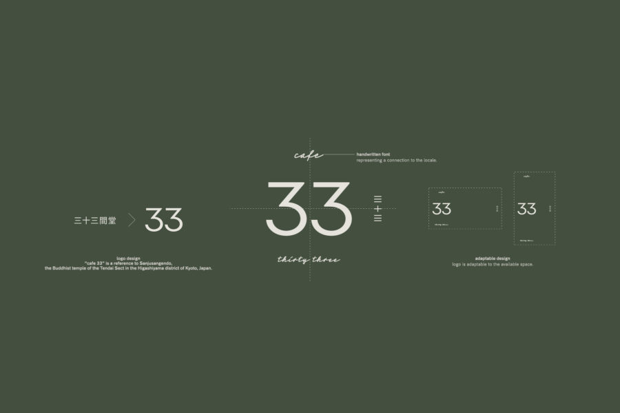
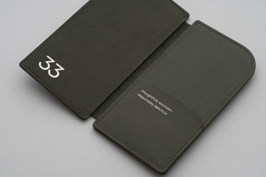
“cafe 33” is a reference to Sanjusangendo, the Buddhist temple of the Tendai Sect in the Higashiyama district of Kyoto, Japan. With the Arabic numeral “33” as the focal point of the logo, we arranged script letters and kanji characters to express the warmth of the homestyle foods and Japanese traditions and handicrafts.
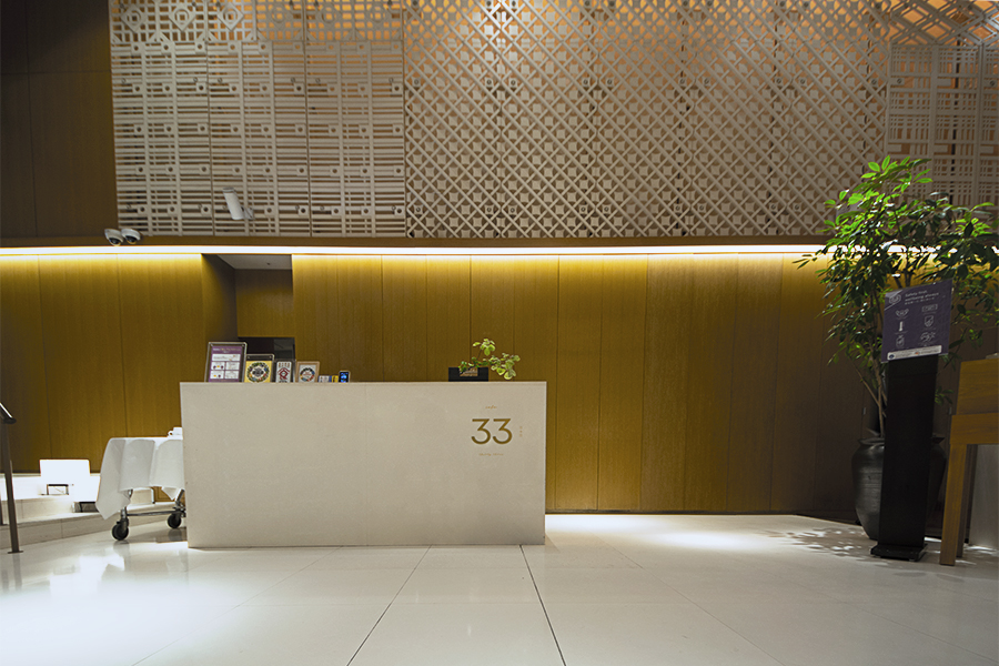
For the brand color, green was selected to evoke the lush greenery of the Japanese garden directly viewable from the restaurant. The menus, stationary, and outdoor signage all utilize the same garden green, greeting the guests with a natural and warm welcome to the restaurant. In addition, brass was used for signage and other items to complement the interior design by NAO Taniyama & Associates.
As a project that began amid the global pandemic, we had the unique challenge of adapting the design to respond to the requirements of the times, building a brand design that balances timelessness and flexibility.
ハイアットリージェンシー京都の1Fエントランススペースにある「cafe 33」は、Farm-to-Tableをコンセプトに、地元の食材を使った料理を提供する新しいスタイルのダイニングレストランです。artlessは、ロゴやタイプフェイス、ブランドカラーなど v.i. (visual identity)を構築し、グラフィック、サイネージ、メニュー、アイテムなど、包括的なブランドデザインを担当しました。
京都の東山にある天台宗の寺院「三十三間堂」にちなんだ「cafe 33」のロゴは、数字の「33」を中心に筆記体と漢字を添えることでホームスタイルの食事の暖かさと、日本の伝統と手仕事を大切にするハンドクラフトなスタンスを表現しています。
ブランドカラーには解放感のある窓から望む日本庭園の豊かな緑を連想させるグリーンを選定し、メニュー、ステーショナリー、スタンドサインなどに展開することで、豊かさと安らぎのある上質な佇まいを表現しました。また、サインや一部アイテムに真鍮を使うことで、NAO Taniyama & Associatesが手がけたインテリアデザインとの調和を図りました。
新型コロナウイルスの大流行の中で始動したプロジェクトとして、ニューノーマルの課題に応えるレストランデザインを作るという挑戦もあり、タイムレスでありながらも柔軟性のあるブランドデザインの構築を心がけました。