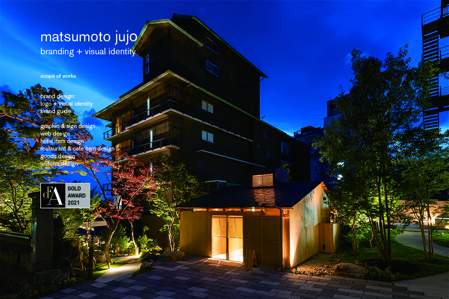
matsumoto jujo
松本十帖
matsumoto jujo
brand design:
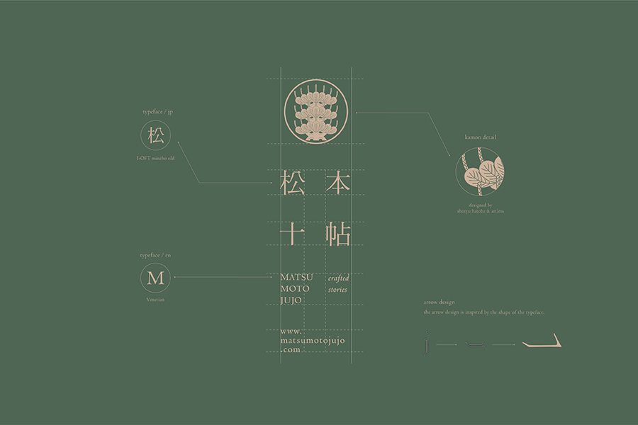
logo + visual identity
brand guide
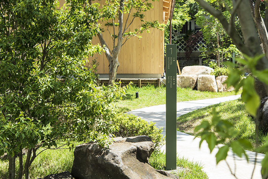
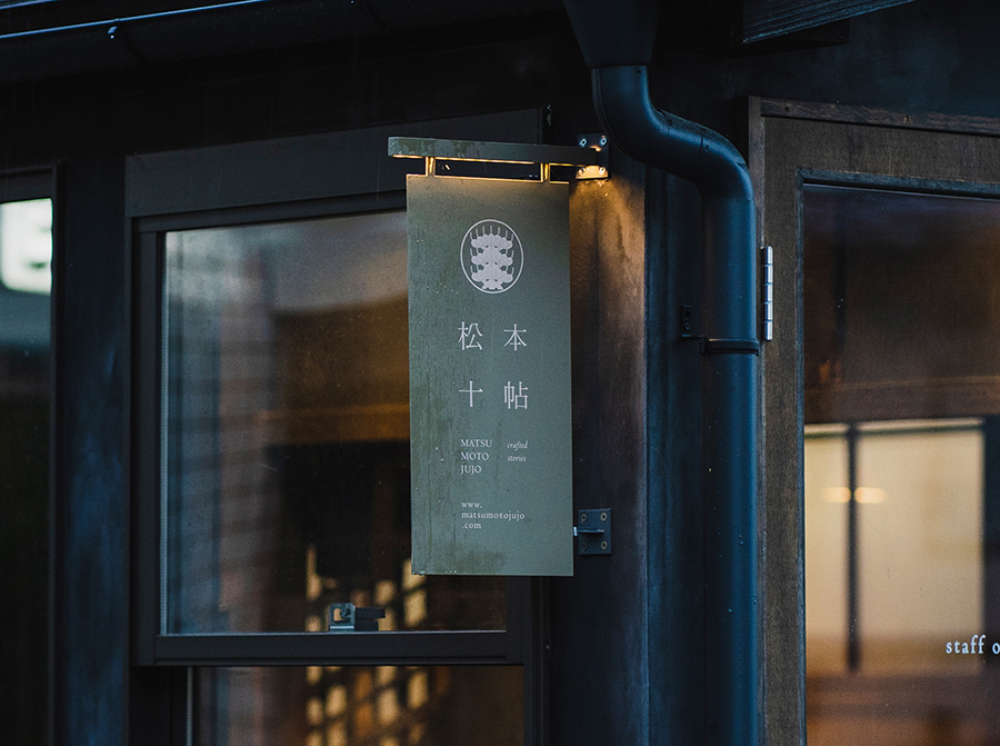
graphic & sign design
web design
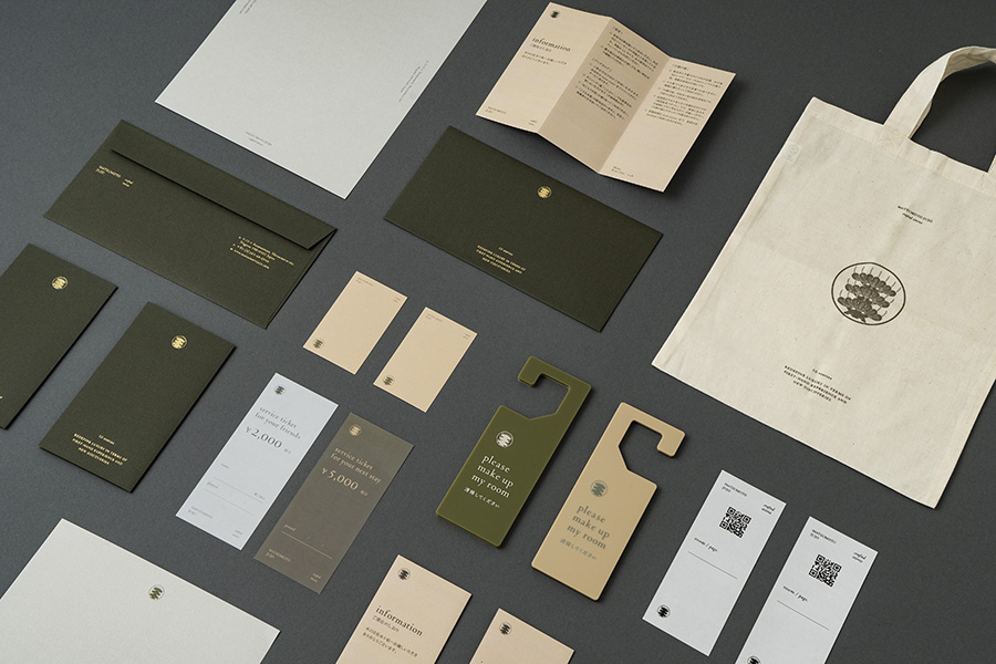
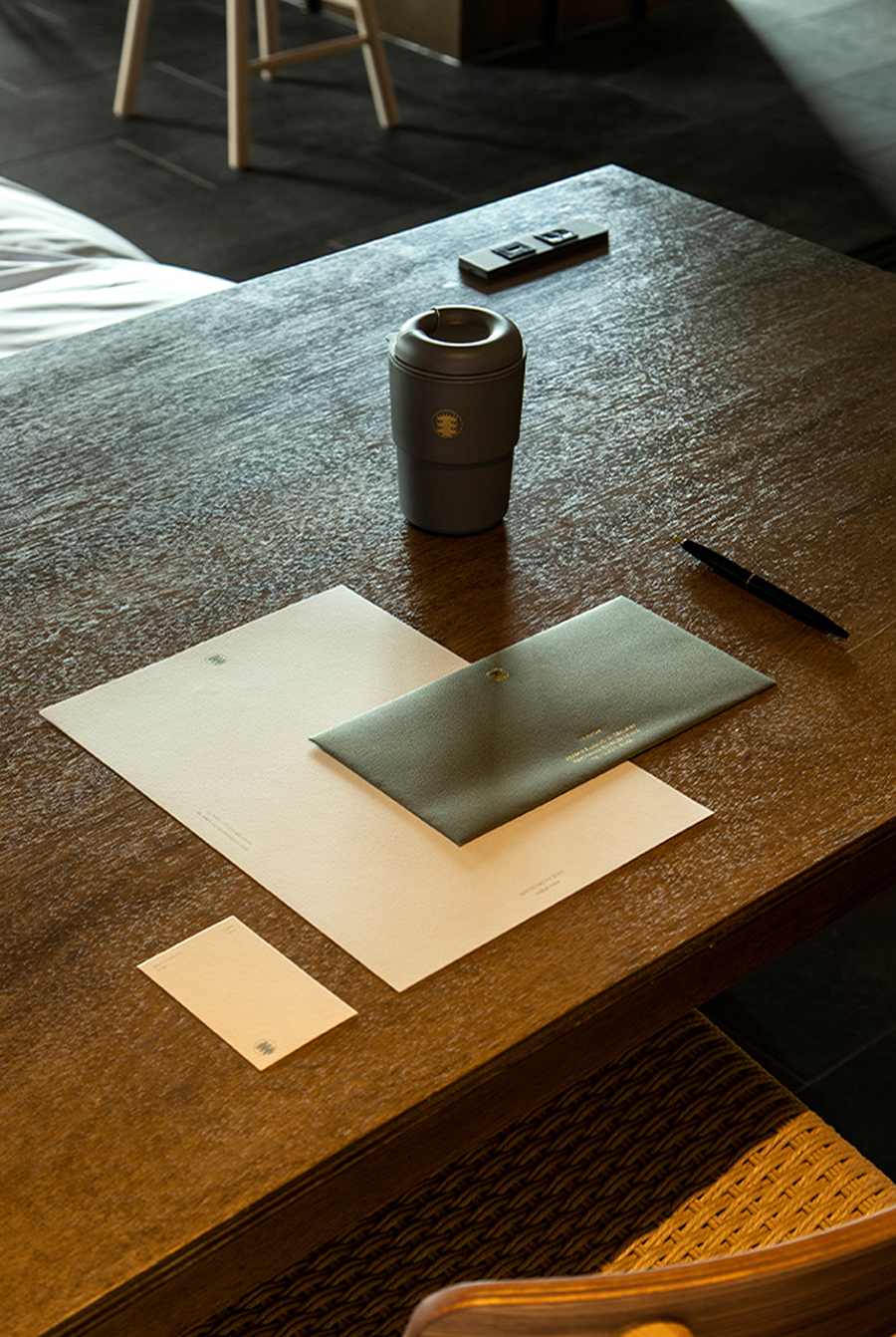
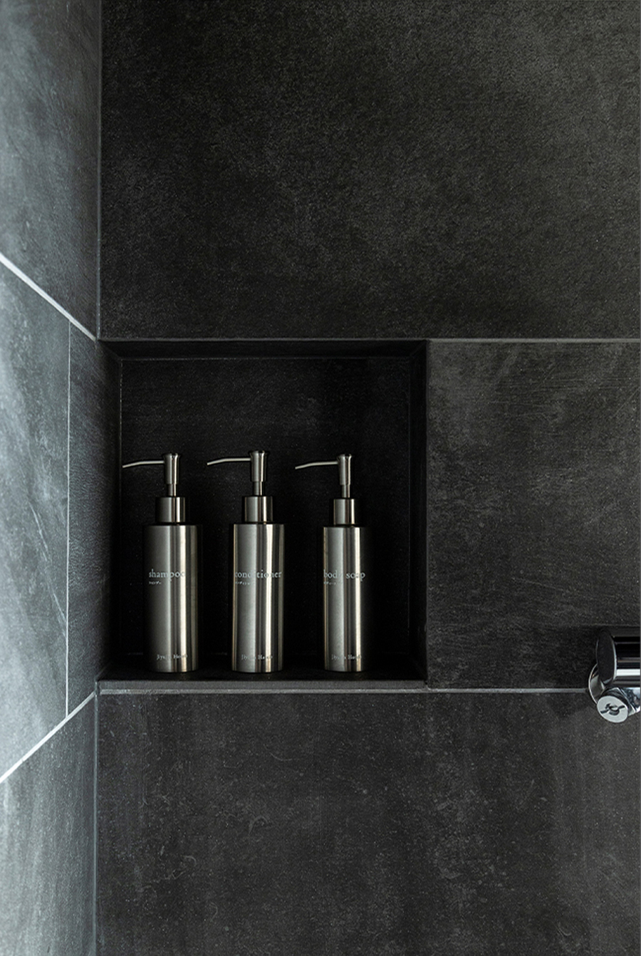
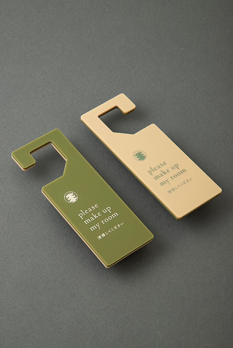
hotel item design
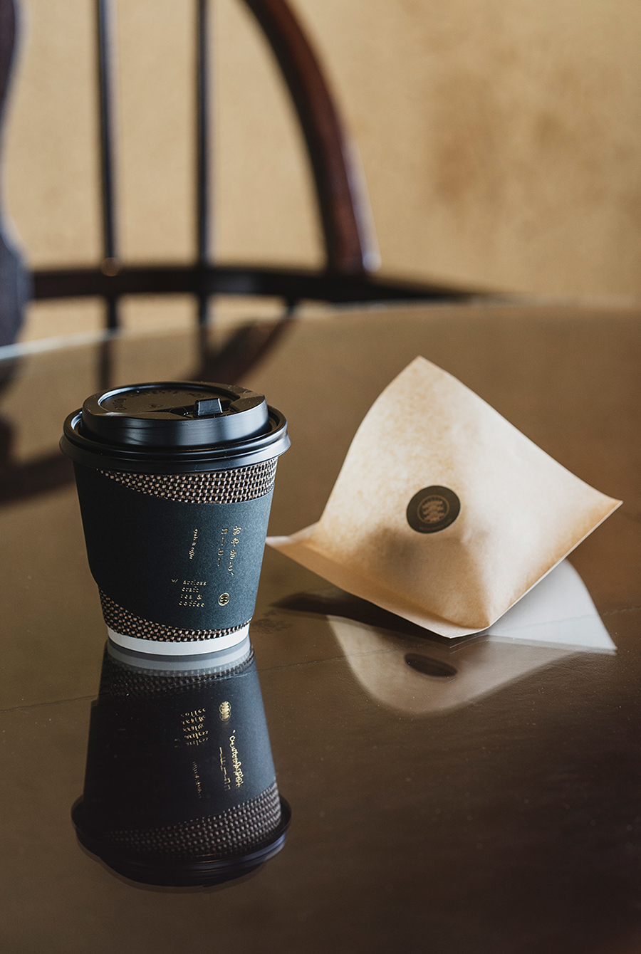
restaurant & cafe item design
goods design
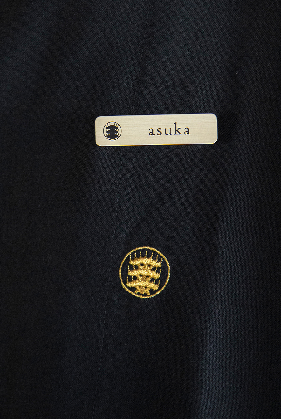
uniform design
branding & management: artless Inc.
creative direction & art direction: shun kawakami
graphic design: ayako shien, kanako ueno, artless Inc.
assistant design: hisako mori + misato taniguchi, ahd osaka
project management: mimaki hata, artless Inc.
signage & item photography: yuu kawakami
client: Jiyujin Inc.
“Matsumoto Jujo” is a community revitalization project produced by Jiyujin Inc.
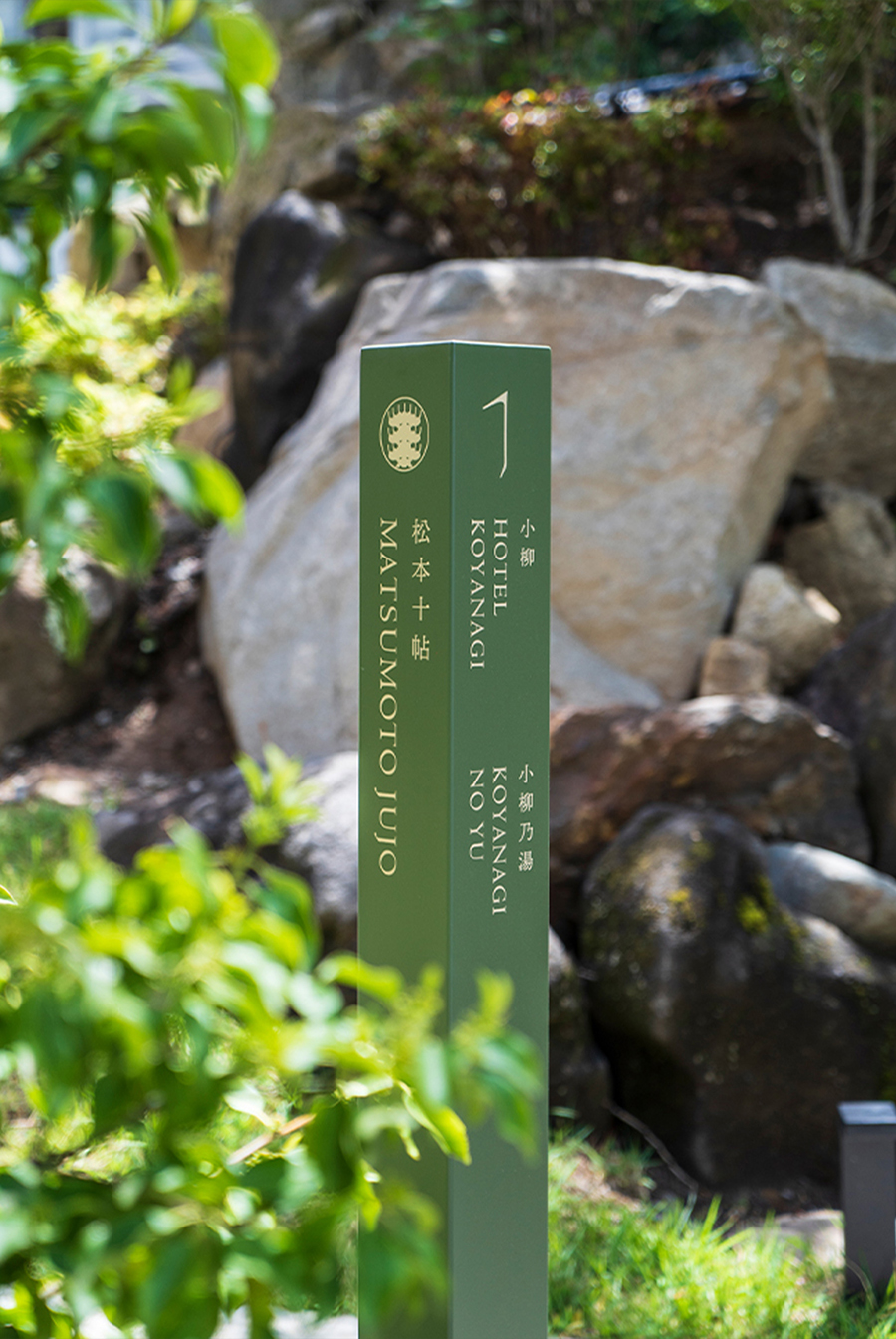
The project aims to revitalize the entire Asama Onsen area, starting with the renovation of Koyanagi, a long-established inn founded in 1686 in Matsumoto, Nagano Prefecture. On the site are two renovated hotels “Matsumoto Honbako” and “Koyanagi”, which include a bookstore, bakery, shop, and restaurant.
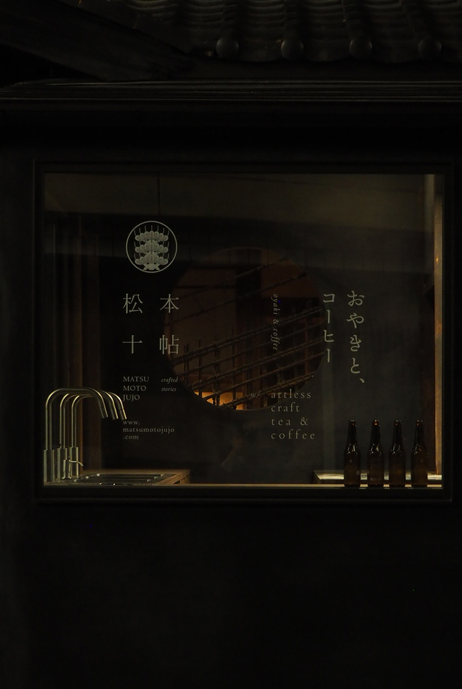
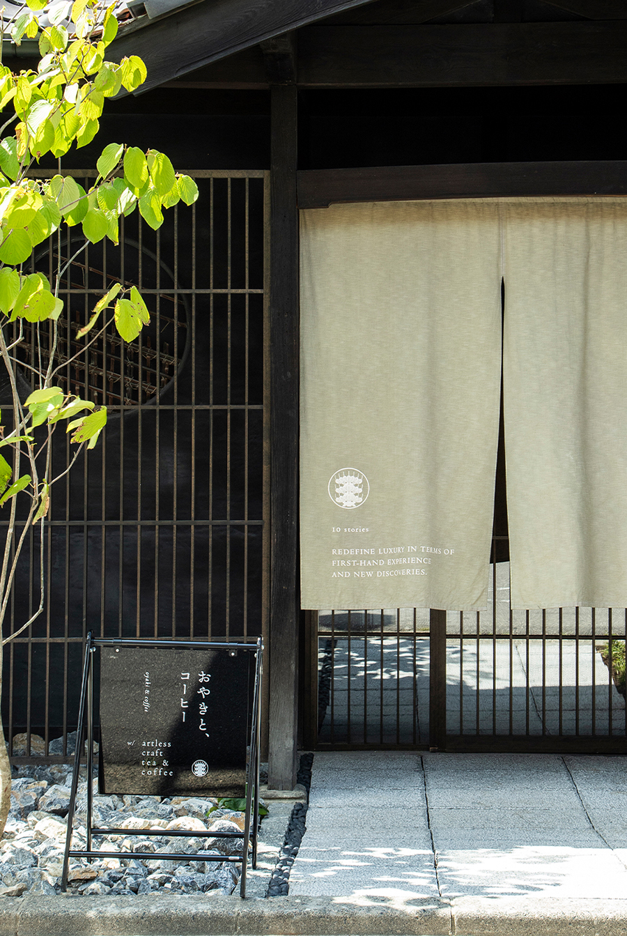
Nestled between the two hotels, the former bathhouse “Koyanagi-no-yu” was recreated. In addition, two cafes, “oyaki & coffee by artless craft tea & coffee” and “Philosophy and Sweets,” are located outside the hotel.
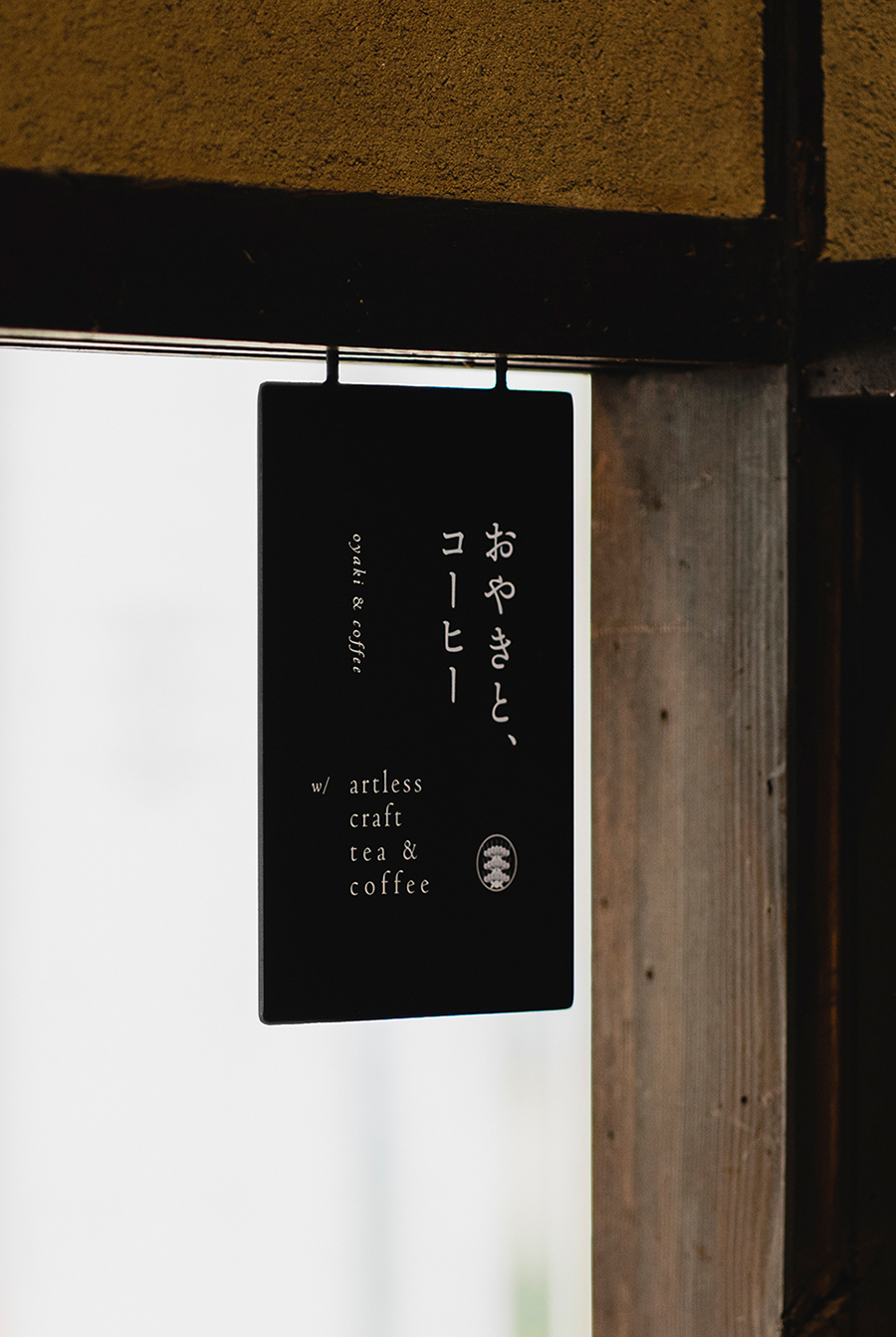
“oyaki & coffee by artless craft tea & coffee” which also functions as the hotel reception is located in a building that was formerly a public bathhouse. The goal is to reinvigorate the town by increasing the circulation of both tourists and locals.
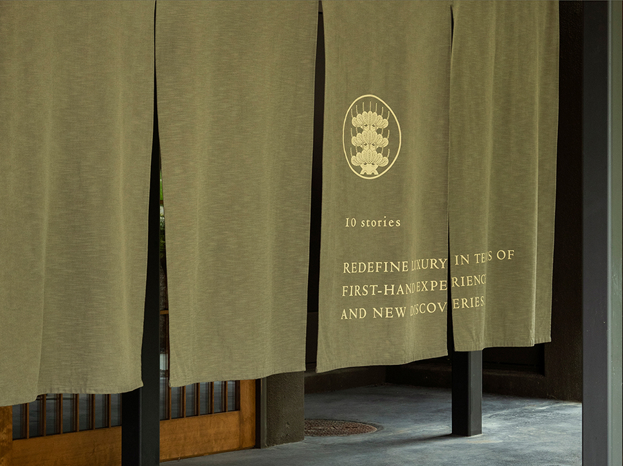
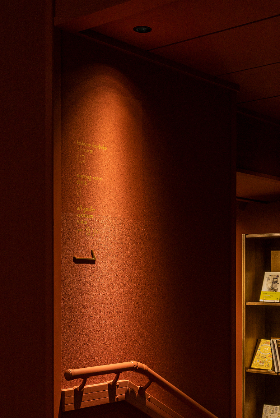
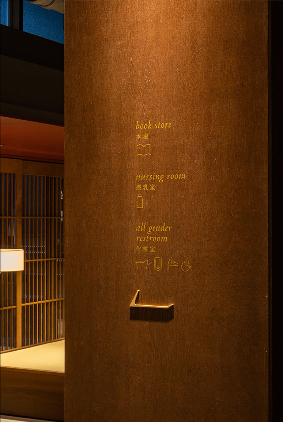
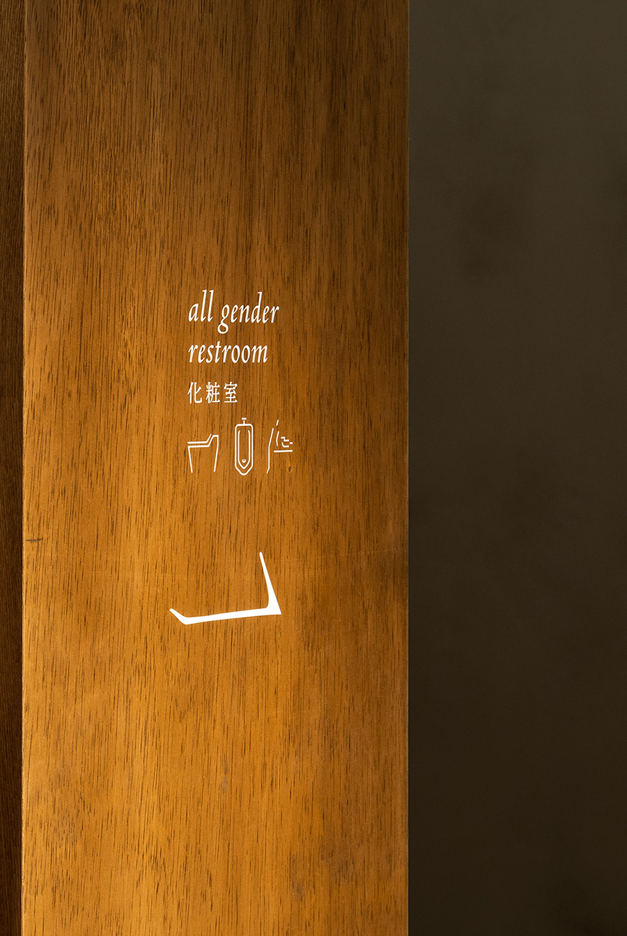
We were in charge of the comprehensive brand design of “Matsumoto Jujo”, including the logo, signage, uniforms, as well as the reception/cafe collaboration.
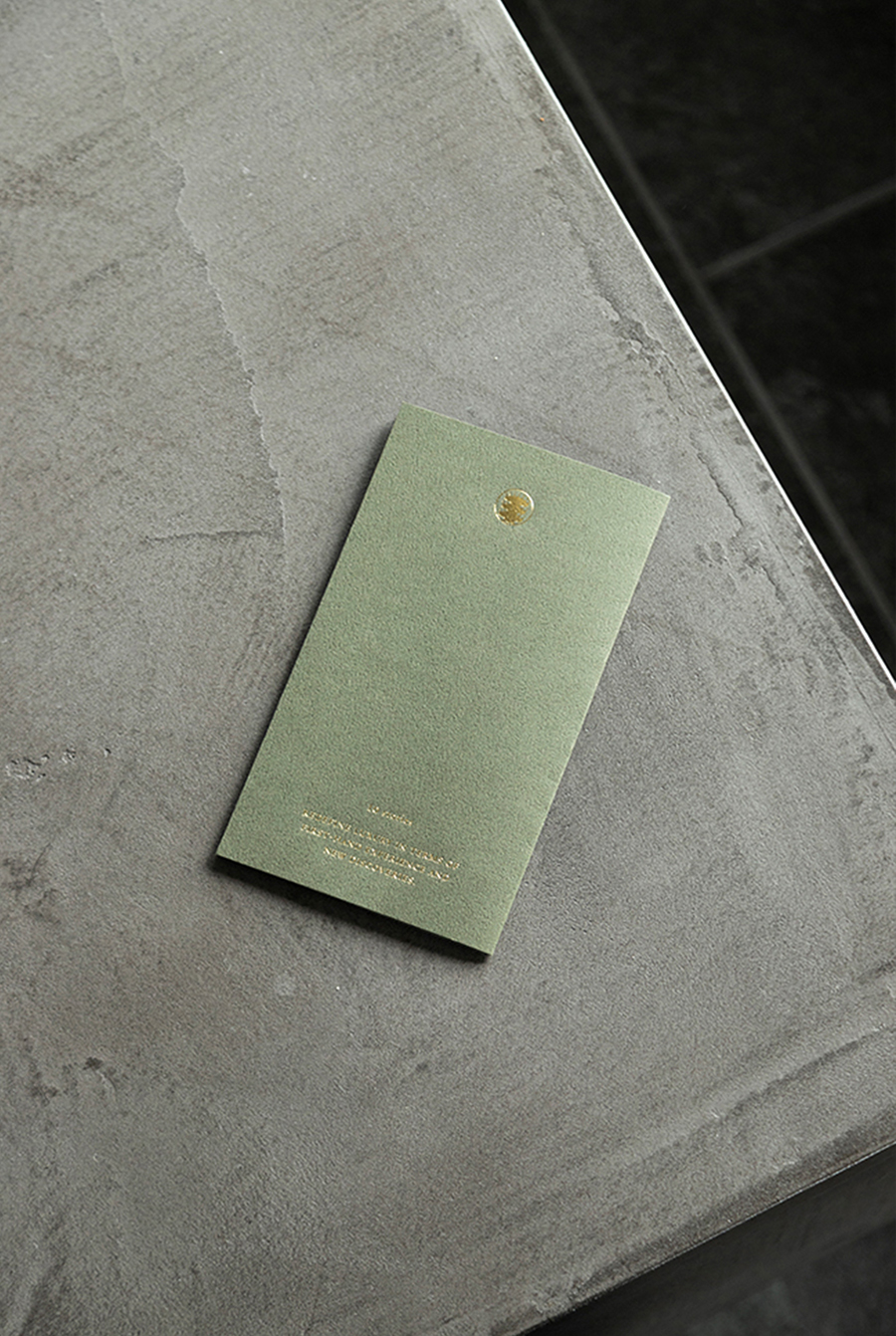
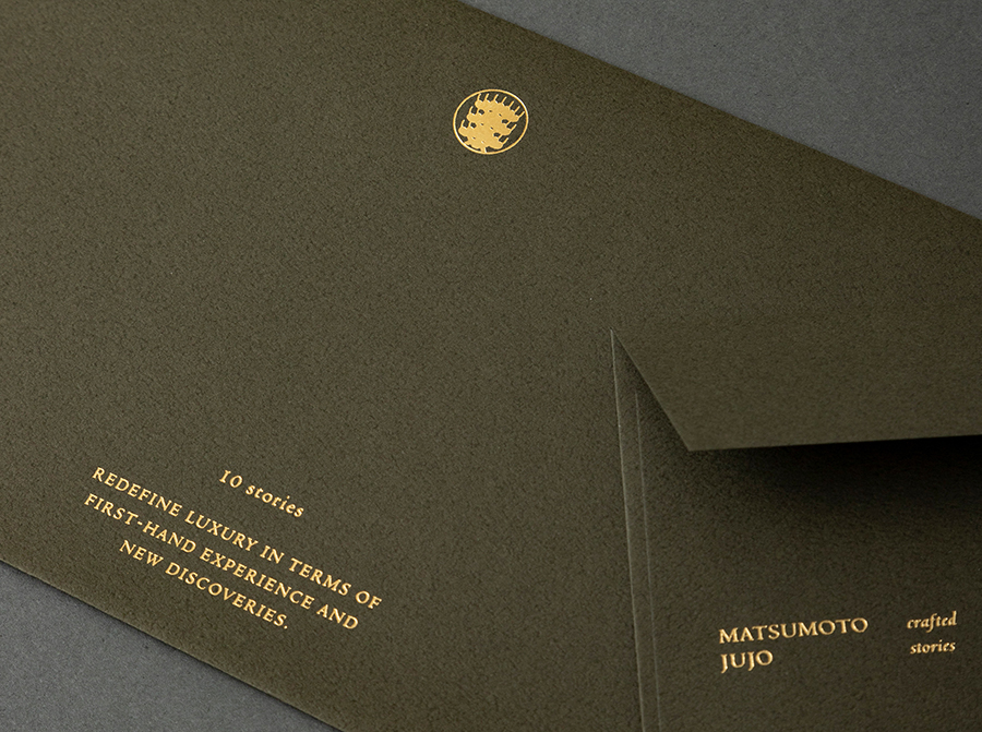
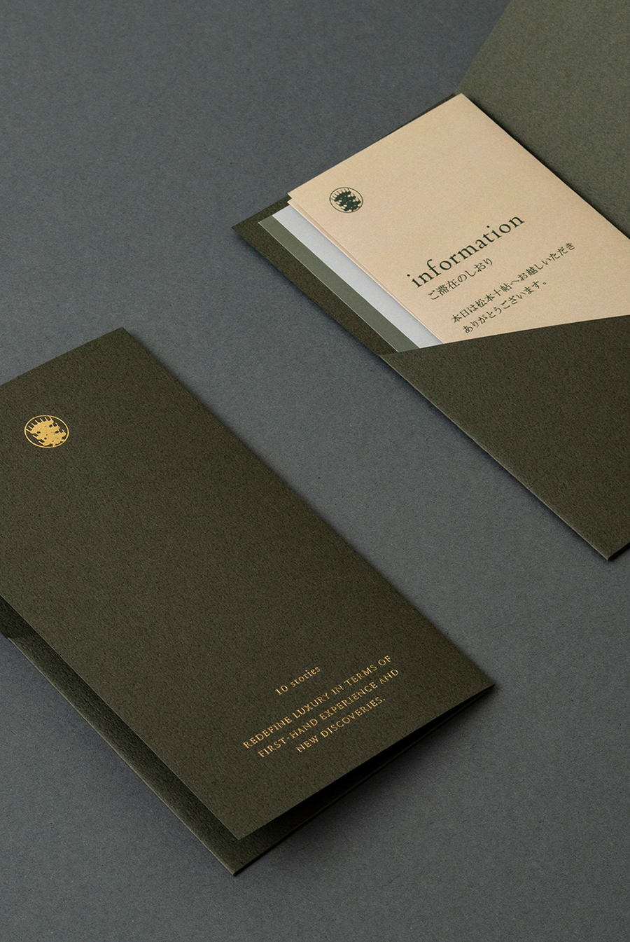
The logo is a combination of sophisticated humanistic letterforms and a pine tree family crest symbolizing Matsumoto. Made in collaboration with crest artist Shoryu Hatoba, the pine tree crest was drawn using a traditional technique and is composed entirely out of circles. It was designed with the idea of building a new culture while inheriting the history of the land.
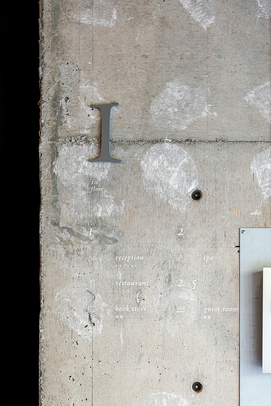
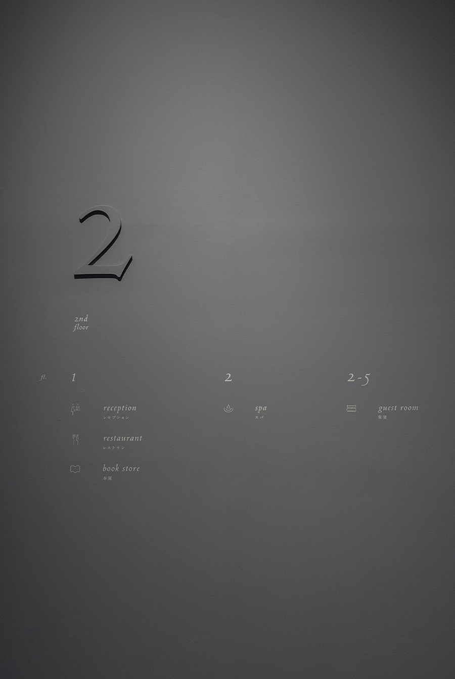
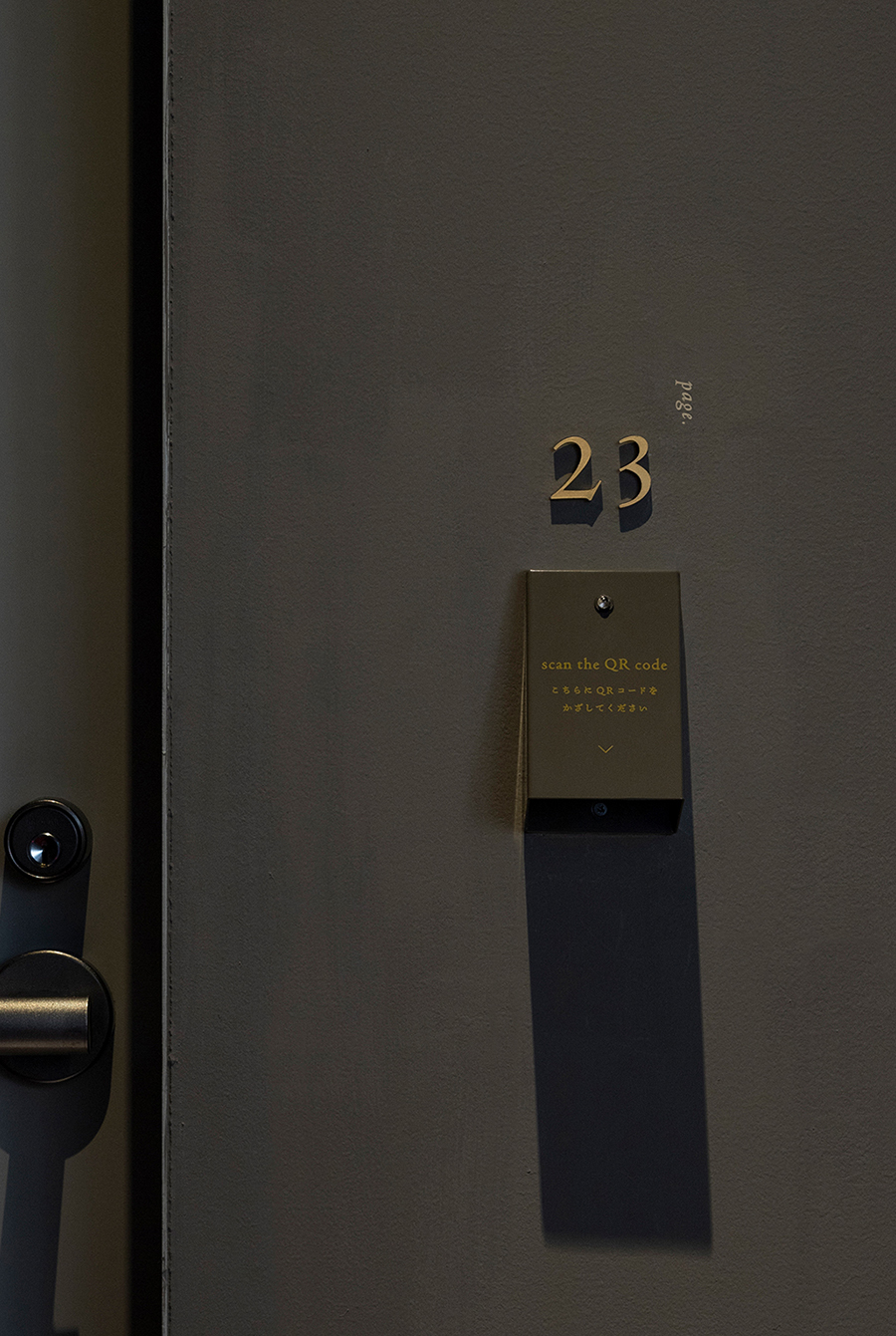
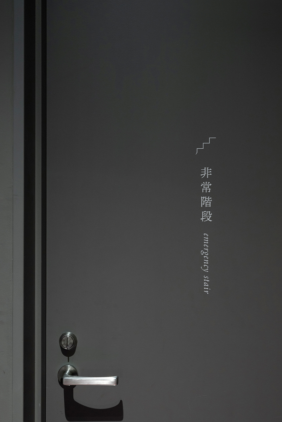
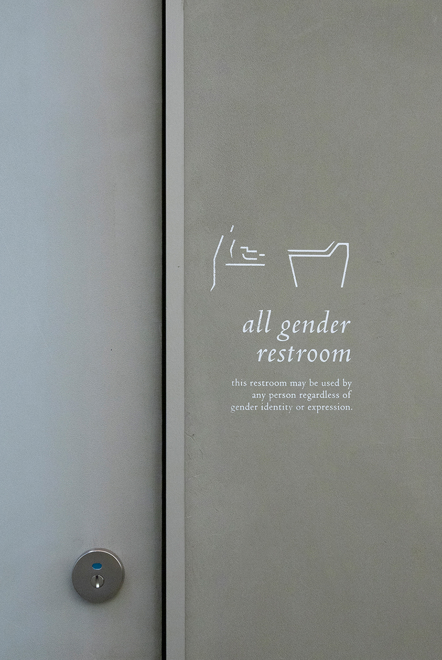
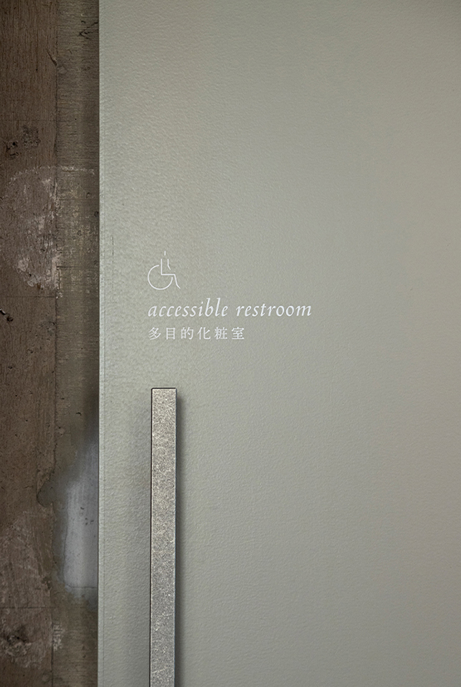
The arrows and icons used in the signage and stationery were inspired by the anatomy of the characters in the typeface. In addition, each facility has a slightly different typographic layout, designed to follow the concept of each space while maintaining a sense of overall unity.
To express the tranquility and refined ambiance found in the Japanese lifestyle; we selected colors with roots in Japan that were inspired by the landscape, culture, climate, and architecture of Matsumoto.
As a brand that synthesizes the history and future of Asama Onsen, we look forward to continuing to engage with and support “Matsumoto Jujo”.
「松本十帖」は、株式会社自遊人がプロデュースする地域活性化プロジェクトです。
長野県松本市・浅間温泉にある貞享3(1686年)創業の歴史を持つ老舗旅館「小柳」の再生を契機に、浅間温泉全体のエリアリノベーションを目指しています。敷地内には、元々の建物を改装した「松本本箱」と「小柳」という2つのホテルがあり、ブックストア、ベーカリー、ショップ、レストラン、などを併設しています。
その2つのホテルの間にはかつての湯小屋「小柳之湯」が再現されました。また、敷地外にも、空き家を活かした「おやきとコーヒー by artless craft tea & coffee」「哲学と甘いもの。」という2つのカフェを展開しています。
「おやきとコーヒー by artless craft tea & coffee」は、共同浴場の建物の中にあり、ホテルのレセプションとしての機能も果たしています。観光客と地域住民、双方の回遊性を高めることで、温泉街全体が活性化していくことが考えられています。
artlessは、「松本十帖」のロゴをはじめ、グラフィック、サイネージ、ユニホーム、レセプションカフェのコラボレーションなど包括的なブランドデザインを担当しました。
ロゴは、松をモチーフとした家紋をシンボルに、繊細でモダンな書体を組み合わせてデザインしています。
家紋は、紋章上繪師の波戸場承龍氏とartlessで共作。全て曲線で構成するという手法で描かれています。
古くからの歴史継承しつつ、新たな文化を生み出していく、そんな思いを込めてロゴデザインしました。
サインやステーショナリーの中で使われている様々なデザインの形は、ロゴの中で使用している書体のディテールからインスパイアを受け、
1つ1つ丁寧に作っています。
また、各施設によってレイアウトや表現の仕方を少しずつ変え、全体の統一感を図りつつも、それぞれの建築や空間のコンセプトに沿ってデザインしています。
ブランドカラーには、松本の景観や、建築のマテリアルから連想される「利休鼠」「生成」「石版」「真鍮」など日本の伝統色を選定し、
和の落ち着きと上質な佇まいを表現しました。
浅間温泉の持つ歴史とこれからの未来を掛け合わせるようなブランドとして、新しい時代の風を吹かし、新たな流れを生み出す存在になることを願い、今後も並走していきたいと考えています。