nol kyoto sanjo
brand visual design :
concept making & naming, logo + visual identity, brand guide, graphic & signage design, hotel item design.
branding & brand design: artless inc.
concept design: tokyu agency Inc.
creative direction & logo design: shun kawakami
art direction & design: kazuki kaneko & shinsaku iwatachi
project management: mimaki hata
signage & item photography: yuu kawakami
client: tokyu resorts & stays co.,ltd
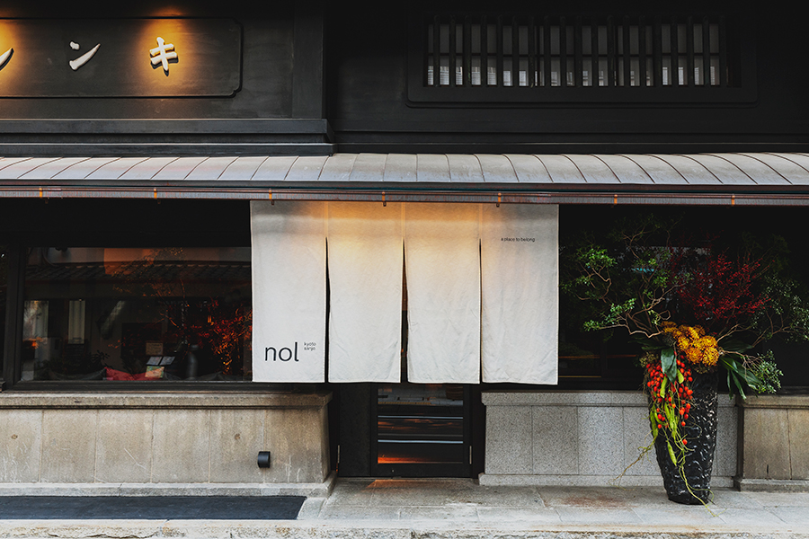
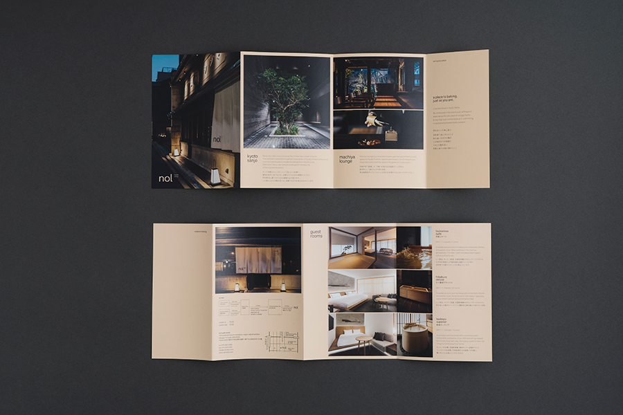
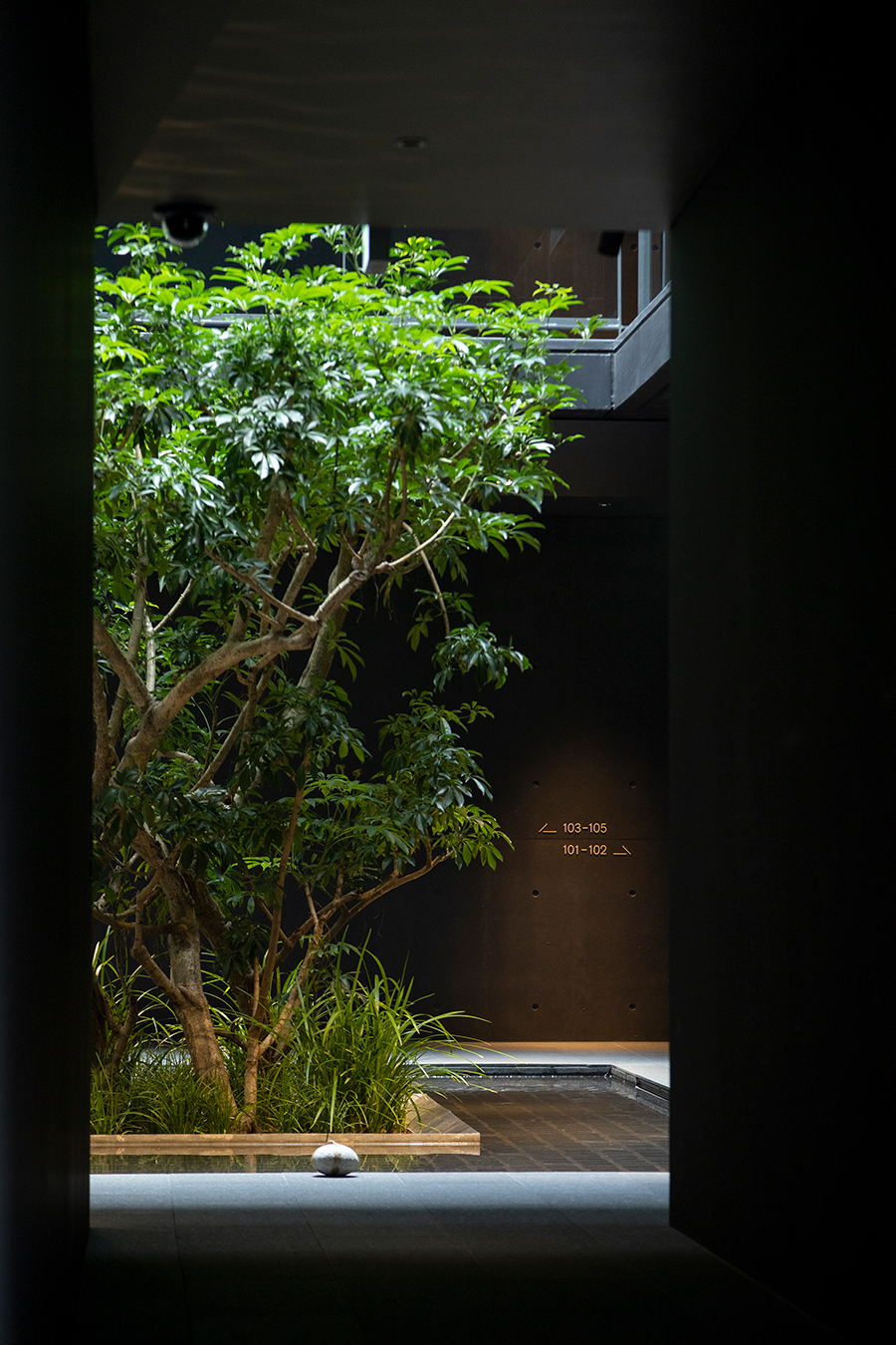
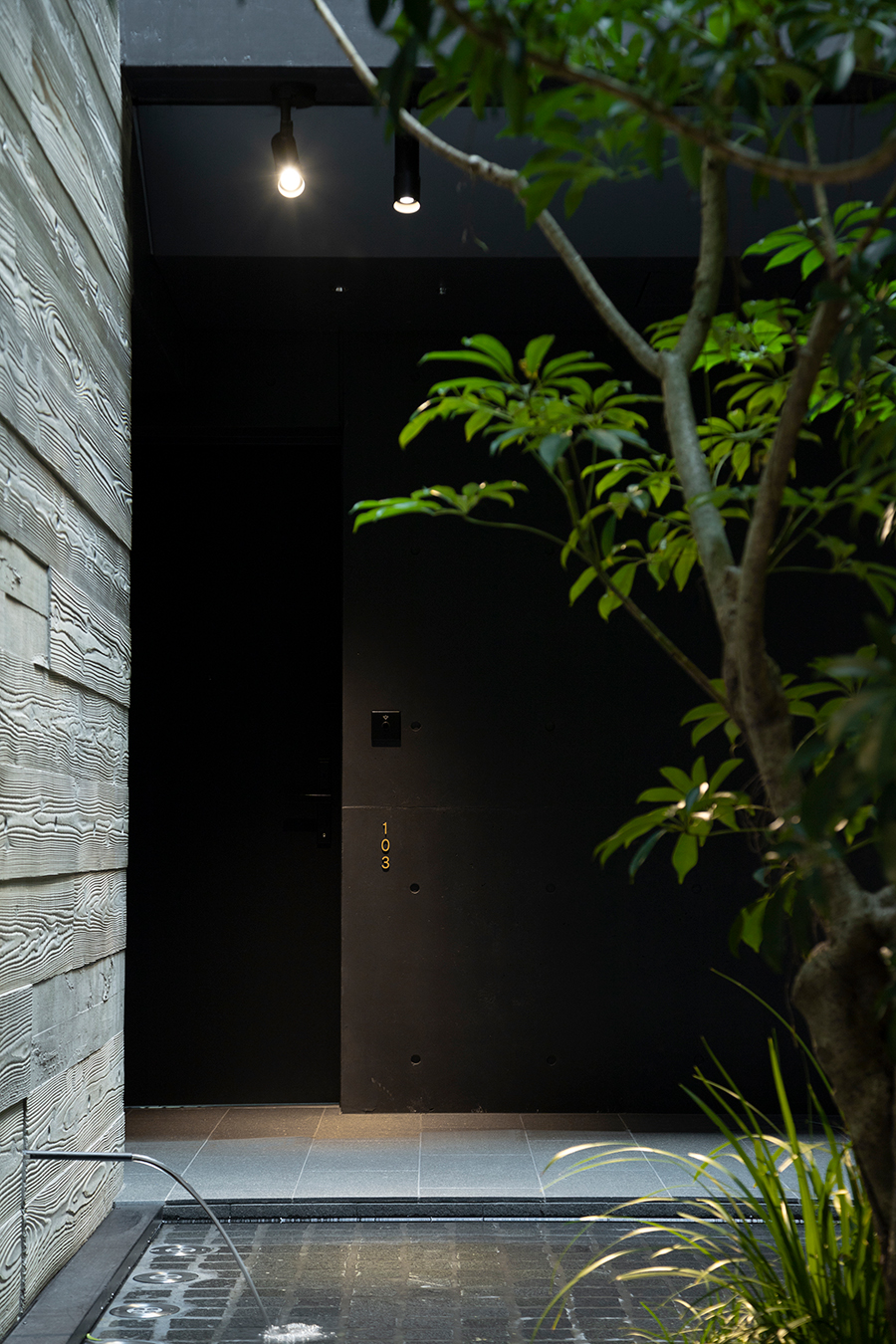
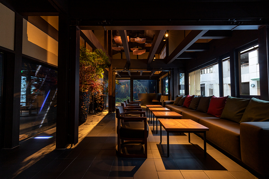
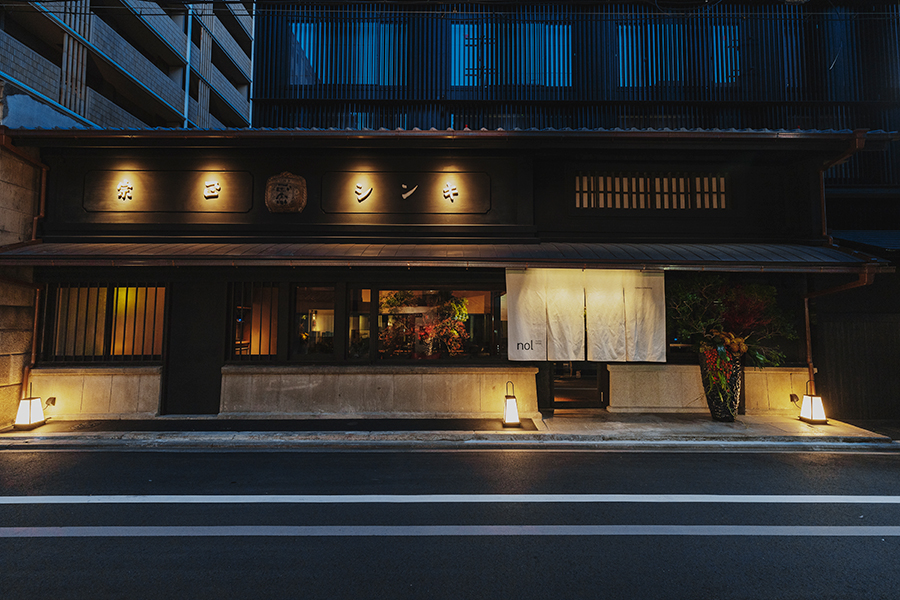
Hotel “nol kyoto sanjo” located in Sanjo, Kyoto, was originally a traditional townhouse used as the sales store for Japanese sake brewery “Kinshi Masamune”. The old architecture is preserved to the full extent, inheriting the townhouse culture and full of a quaint atmosphere.
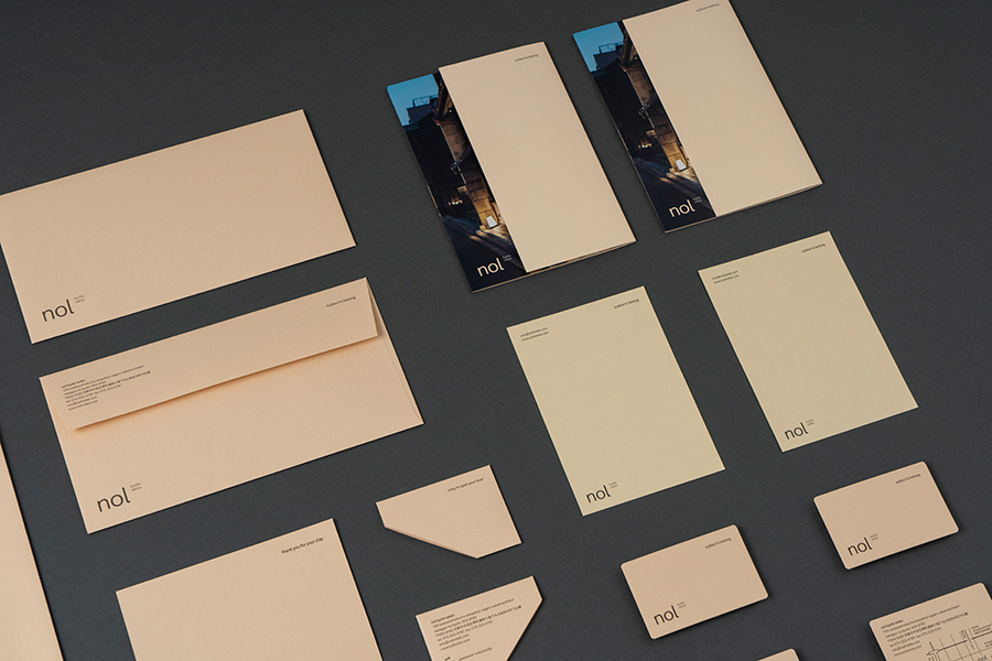
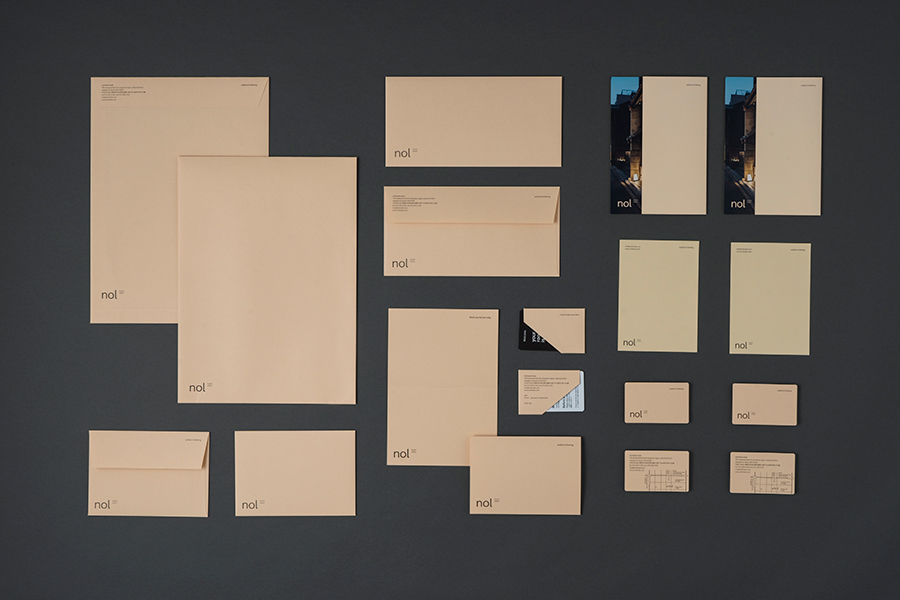
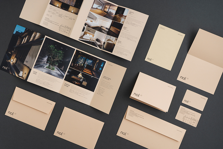
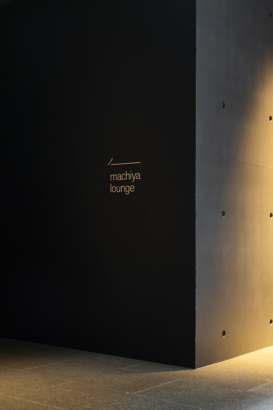
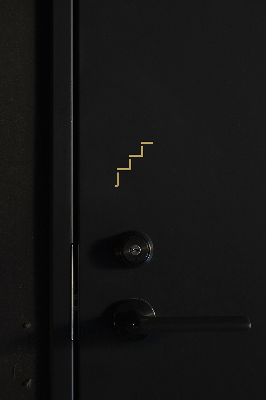
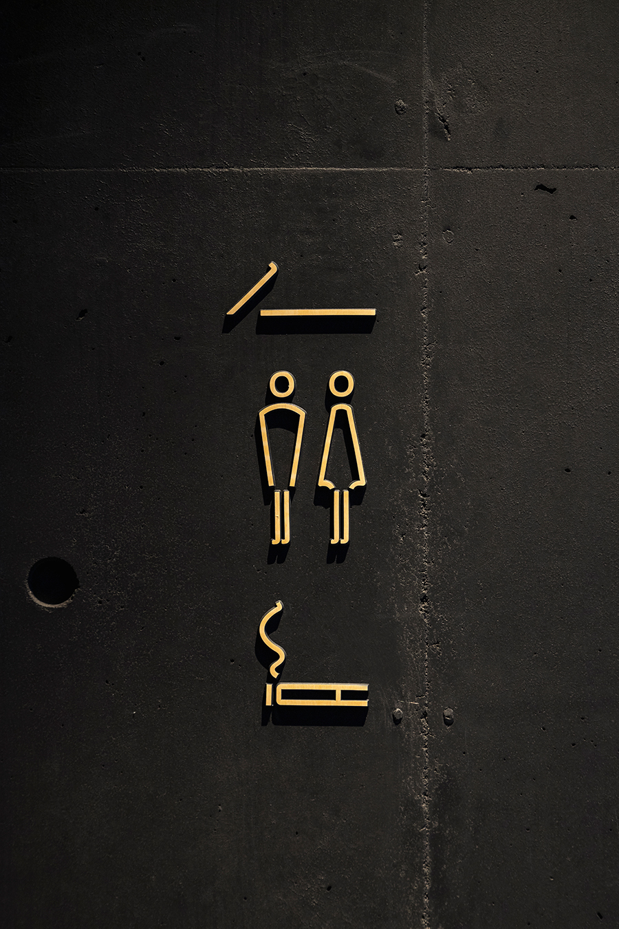
artless created a design system for the Visual Identity, including brand name, logo, typeface, and brand colors. We also designed the overall brand collateral that covers graphics, signage, and items.
The name “nol” means ”naturally, ordinarily, and locally”. The branding is based on the concept of the hotel, where you can be the true you and the ordinary you, where you can enjoy the local charms, and a place that inherits the good old Japanese tradition while evolving into a new, modern form.
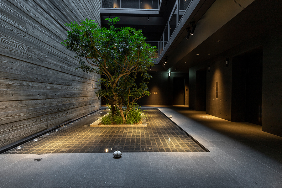
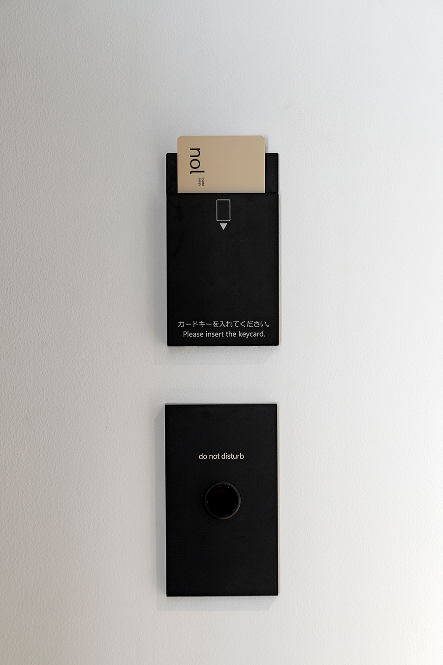
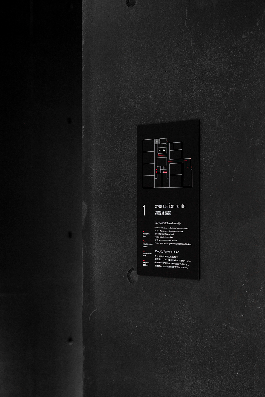
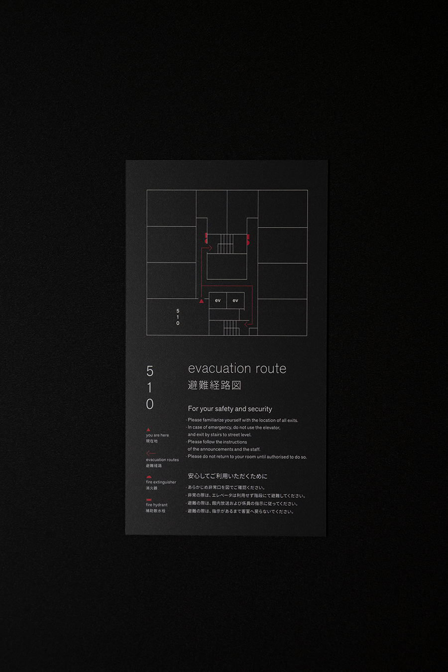
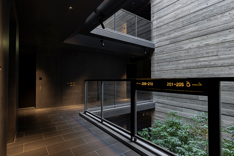
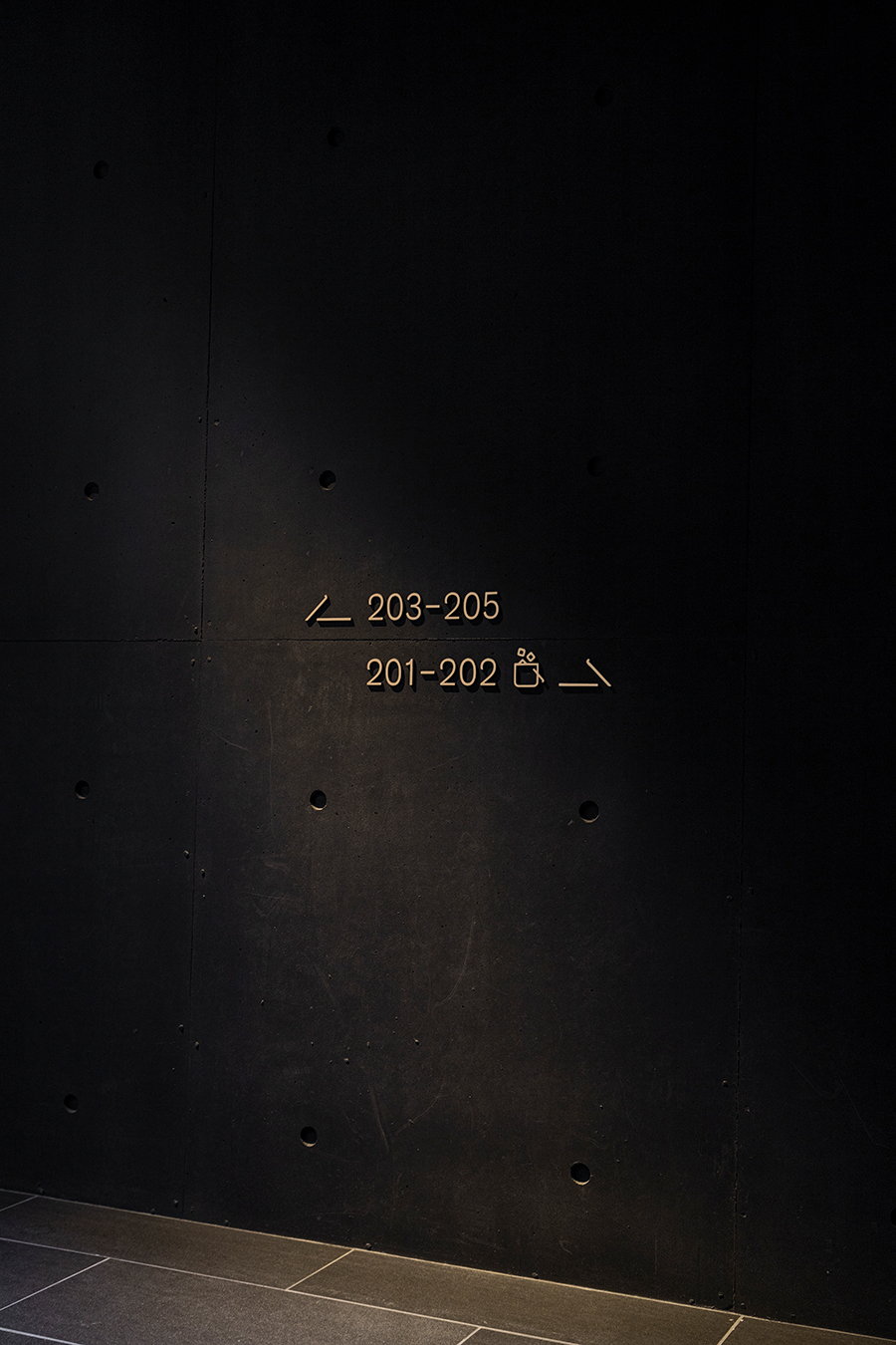
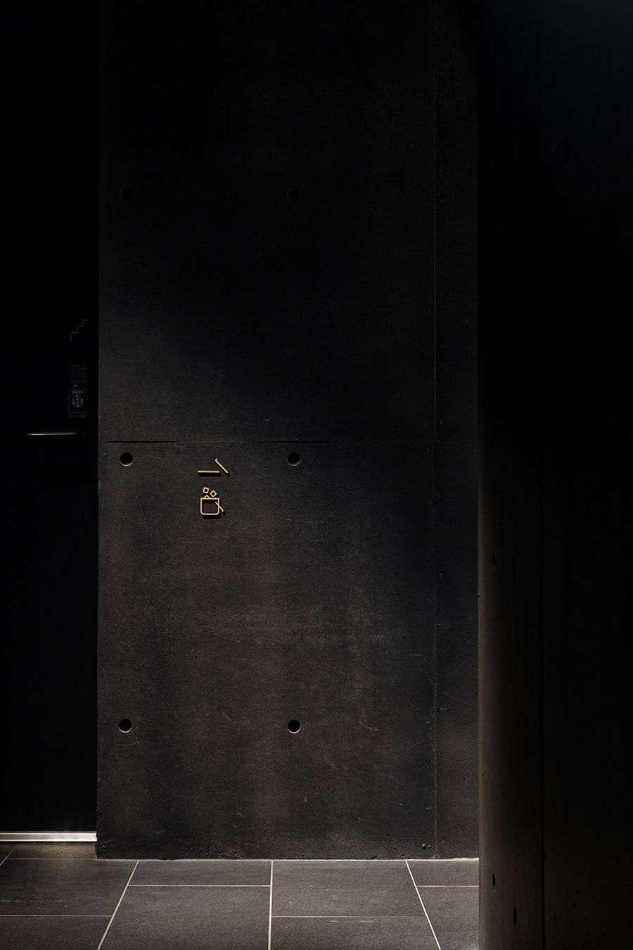
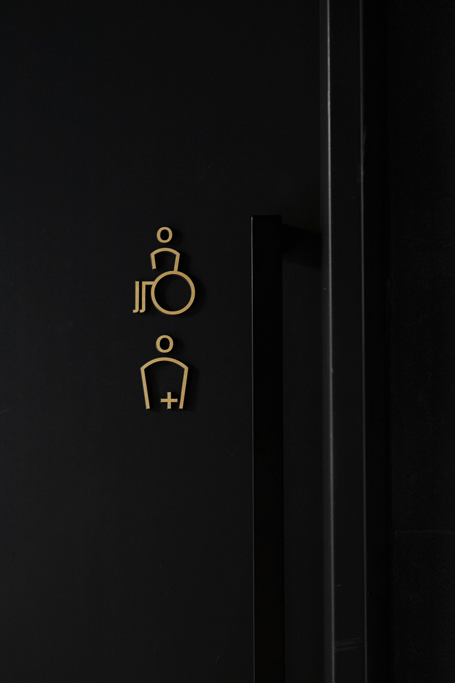
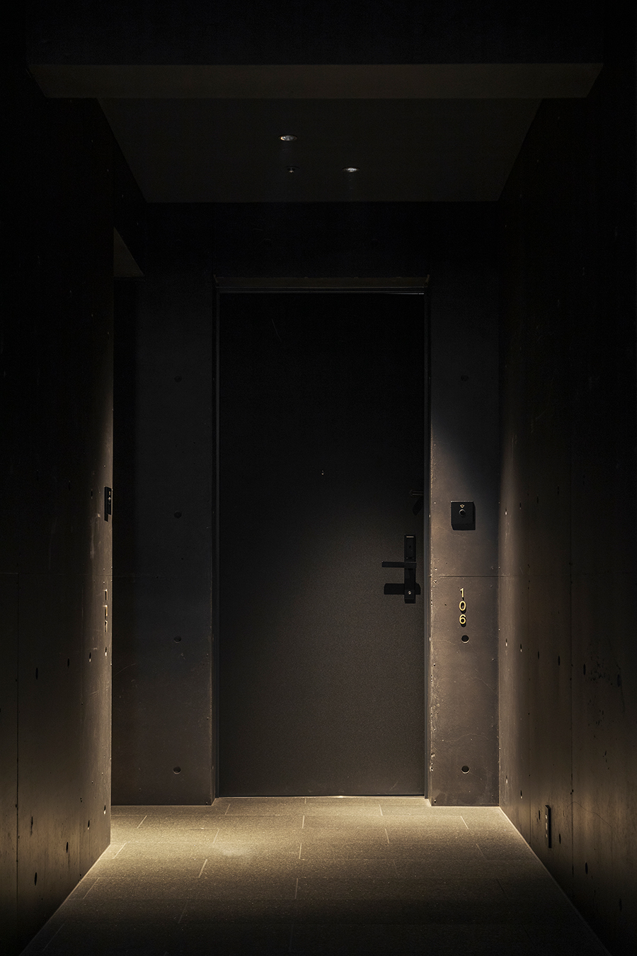
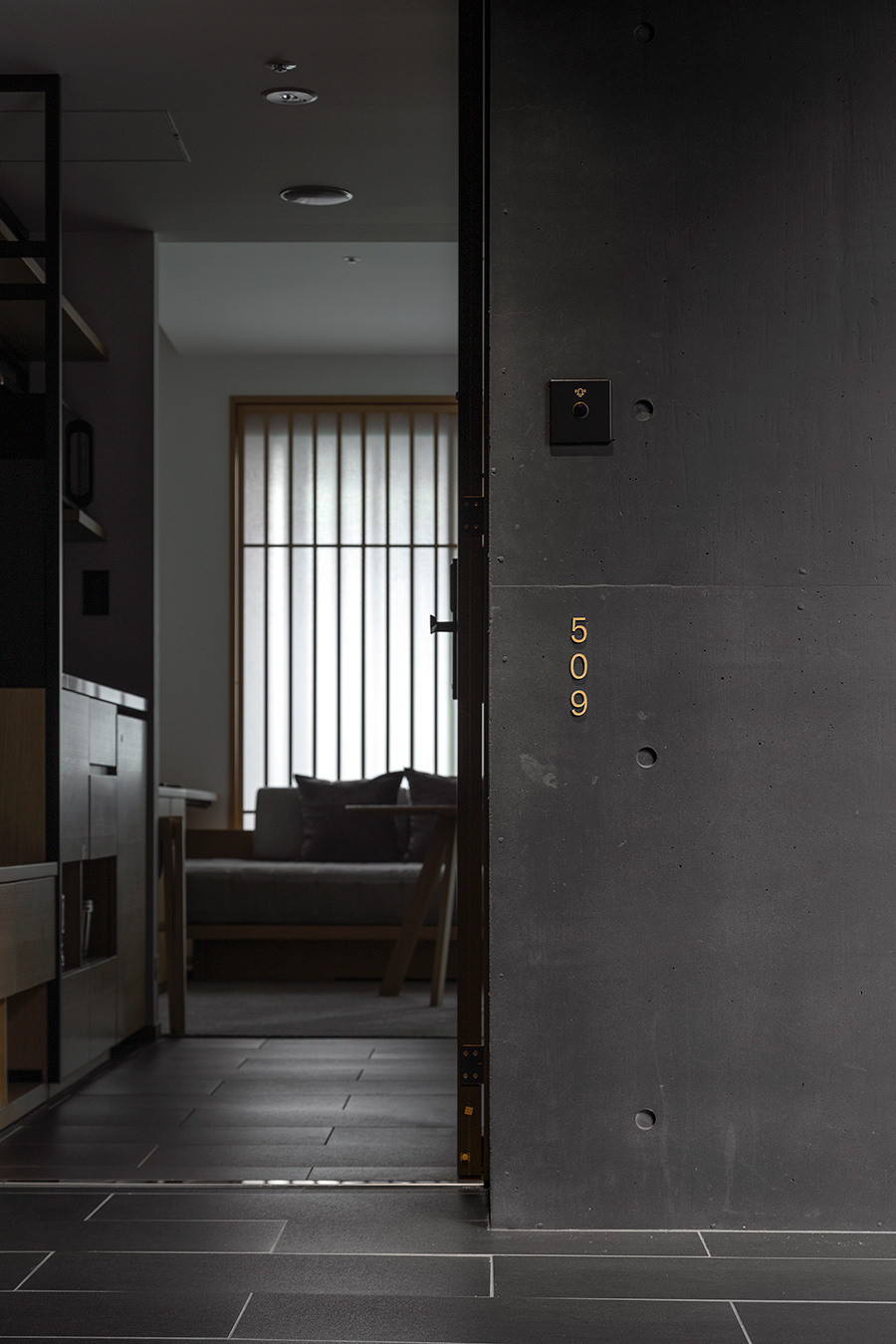
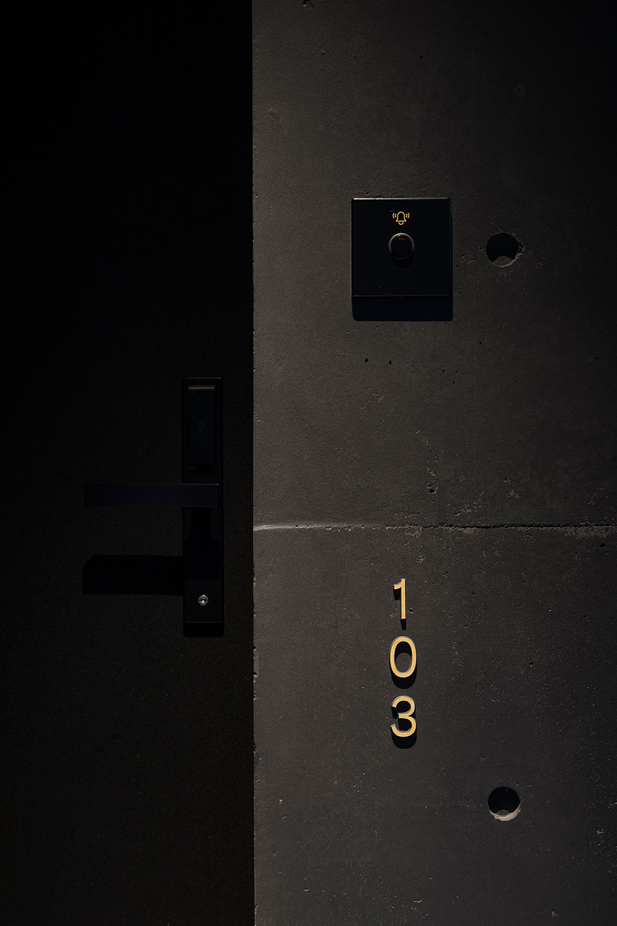
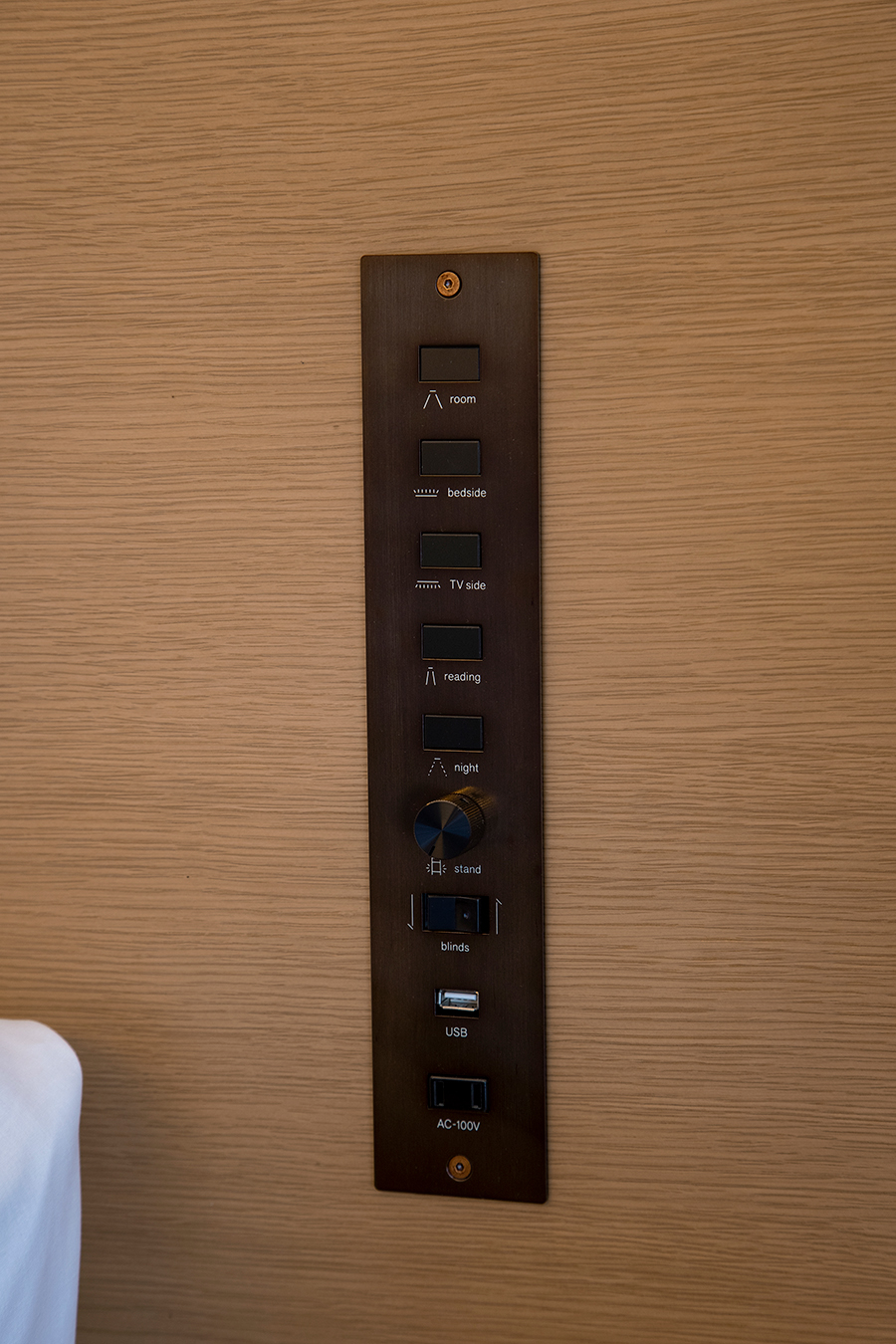
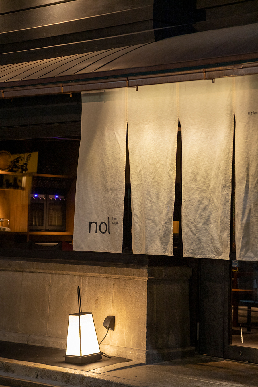
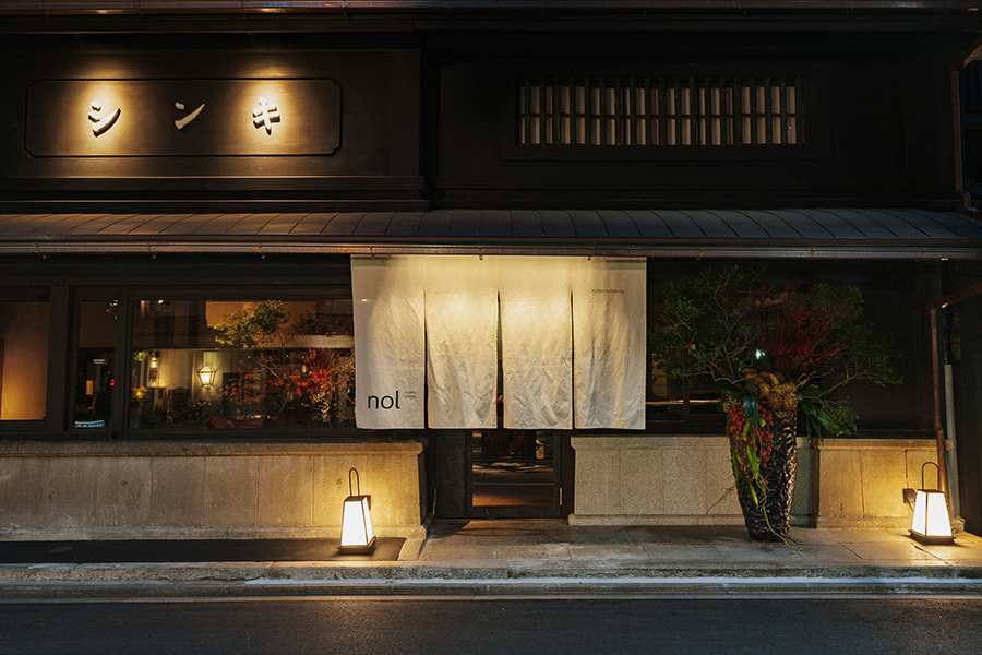
The architectural design was delivered by Shigenori Uoyam, and the lighting was designed by Keigo Tanaka from Lightmoment Inc. The relatively dark lighting creates beautiful shadings and expresses the tranquil comfort. We selected soft-luminous signage and light-reflecting copper material to match the spatial design while assuring the visibility, and embodied the brand experience of both tradition and modernity in the signage design.
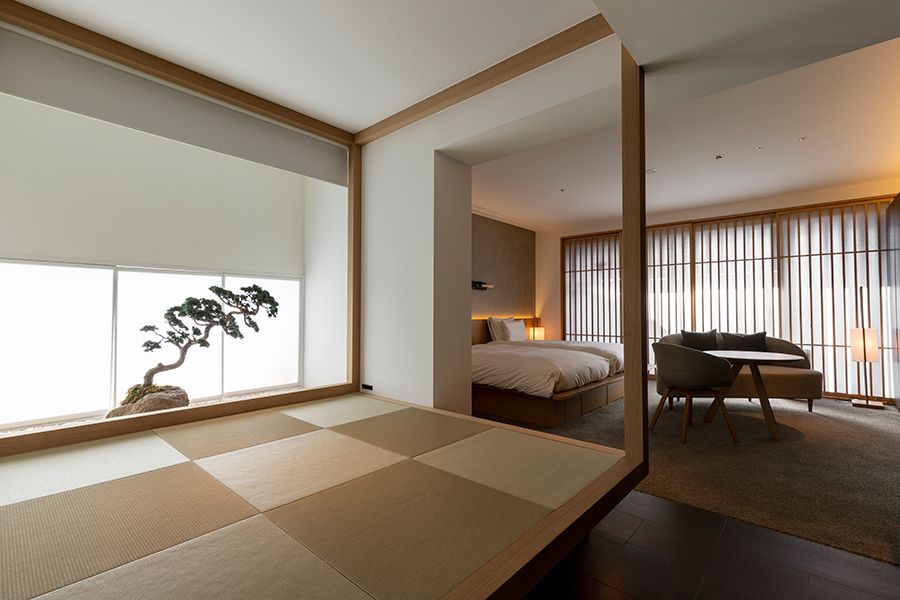
The guest room interior was designed by Yukio Hashimoto. The spatial design is functional and elegant whilst emphasizing on the Japanese sense of beauty and materials, creating a new yet nostalgic atmosphere.
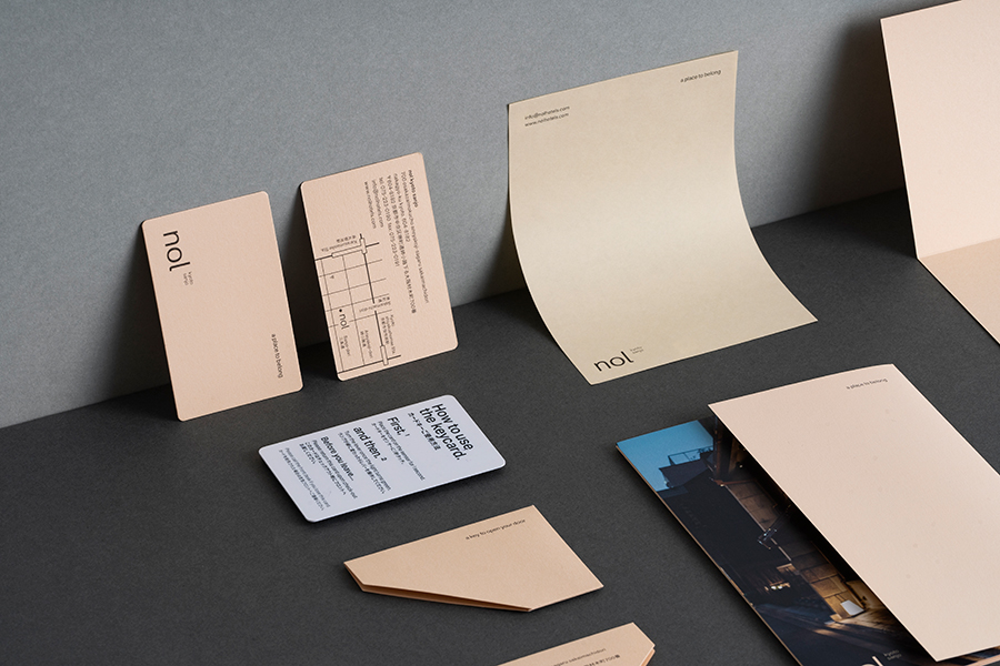
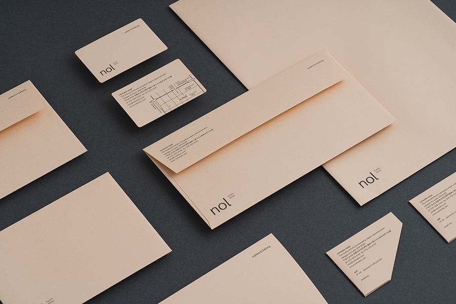
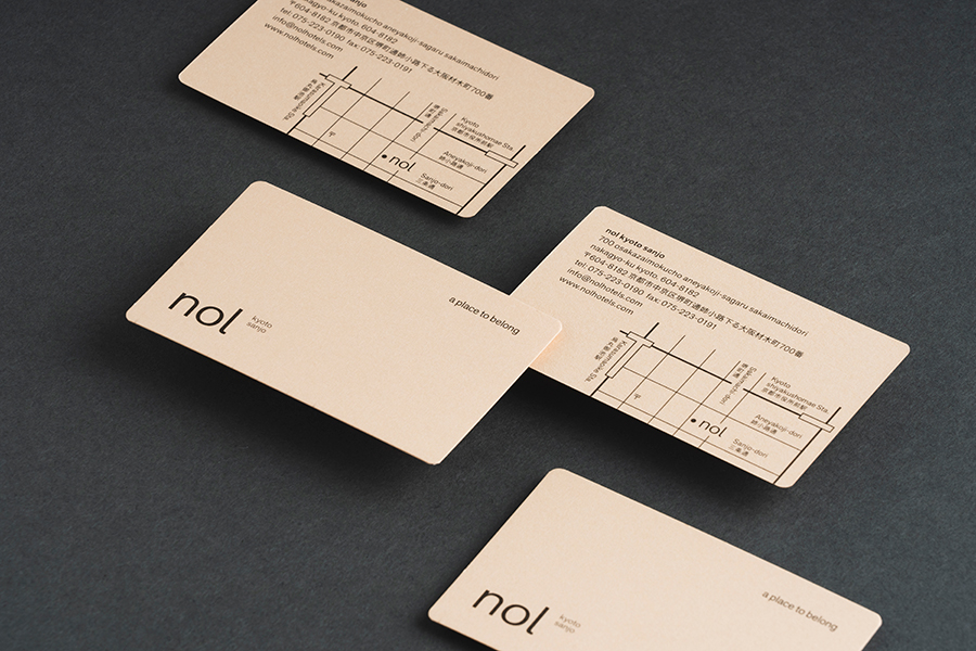
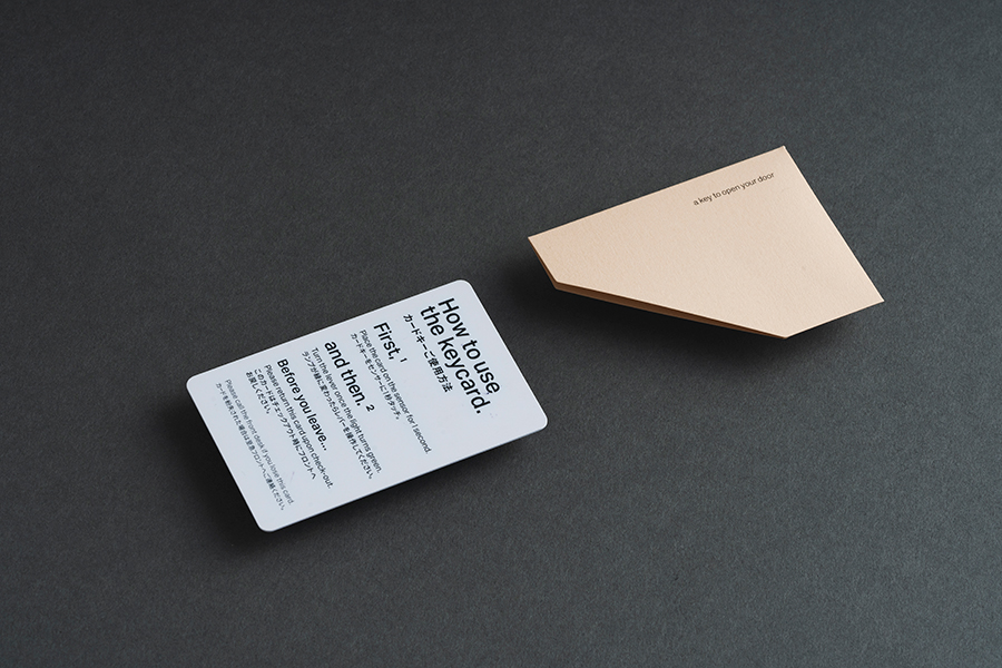
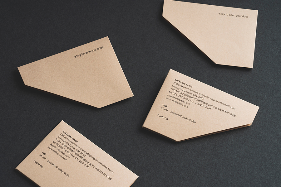
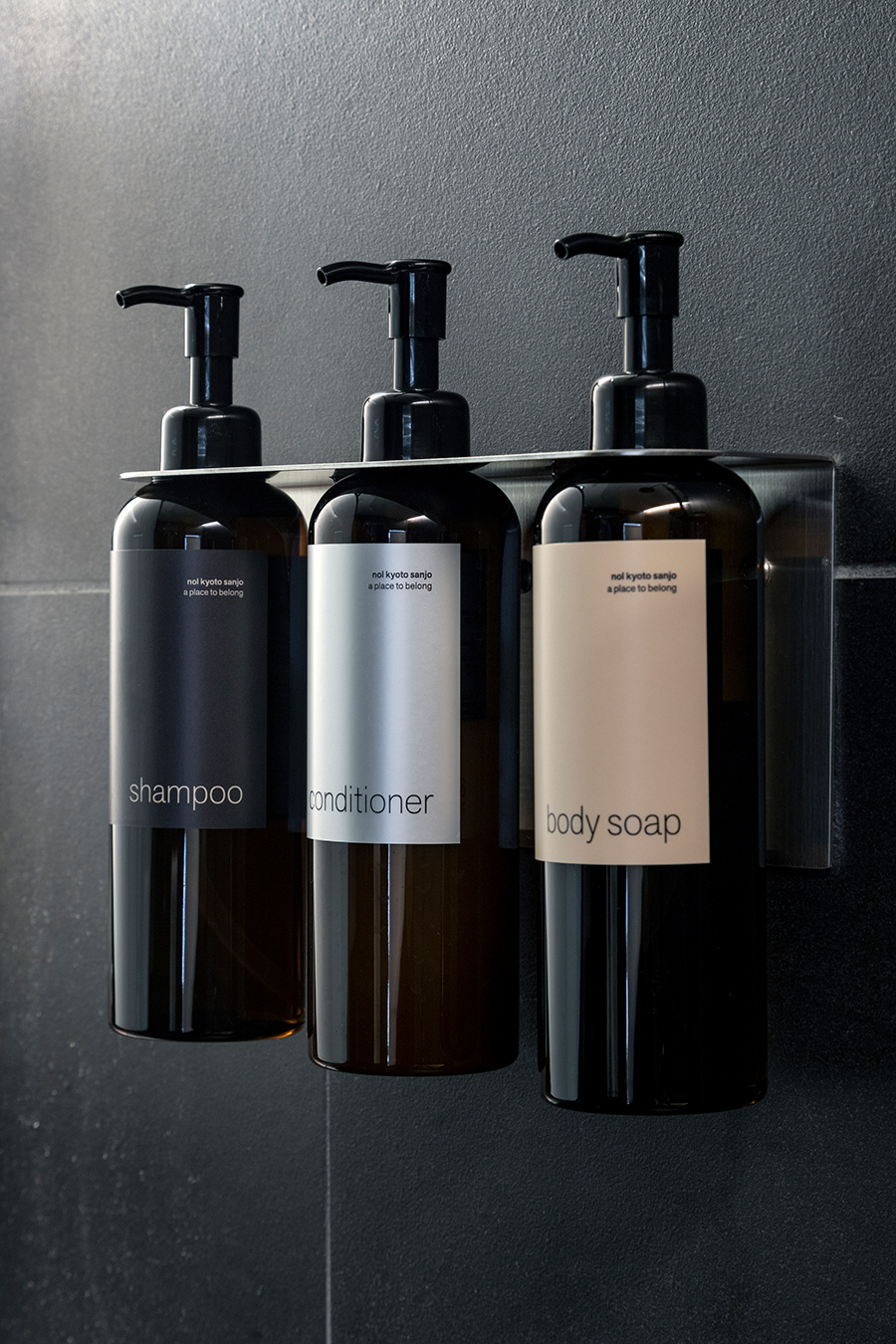
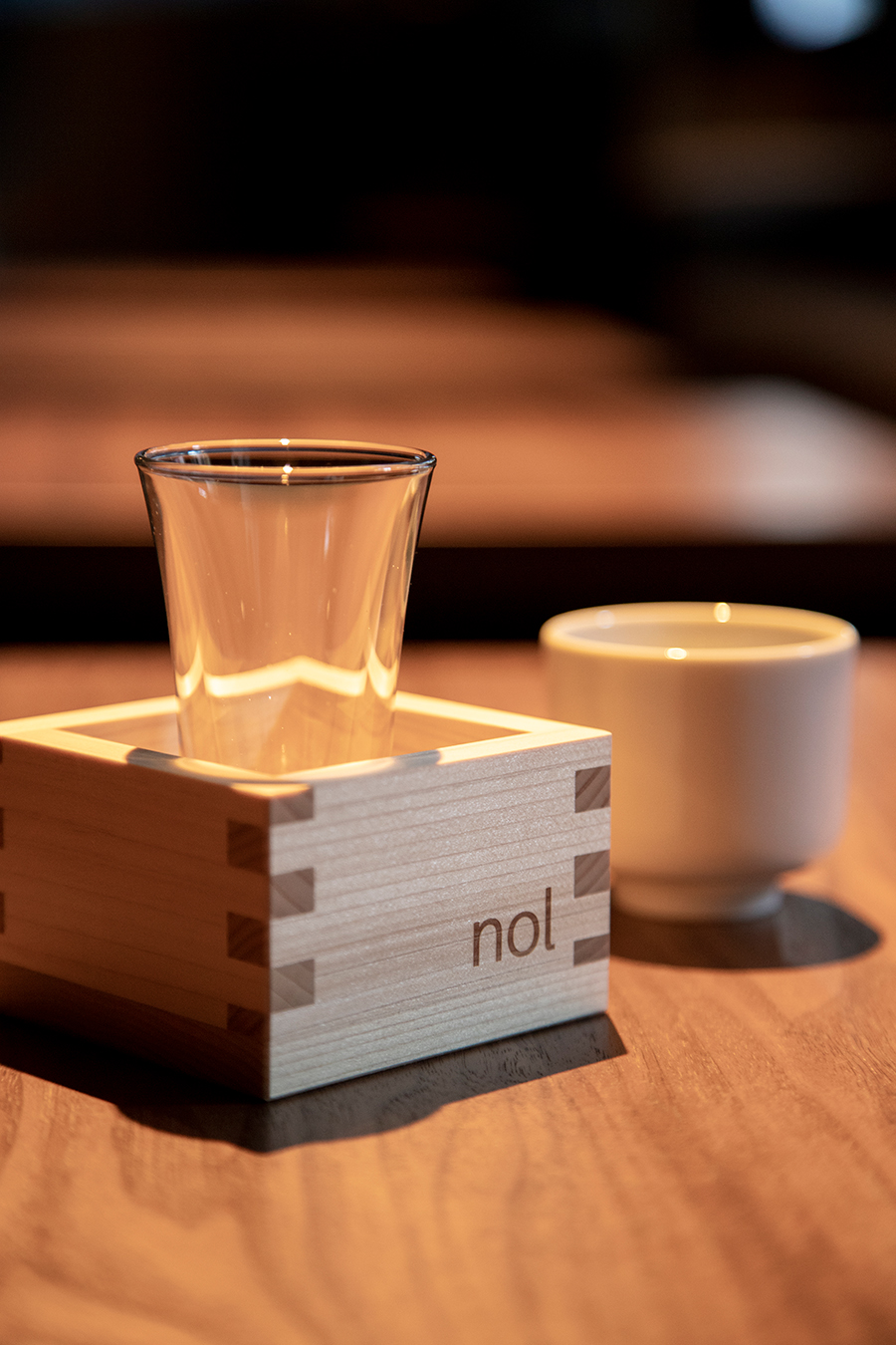
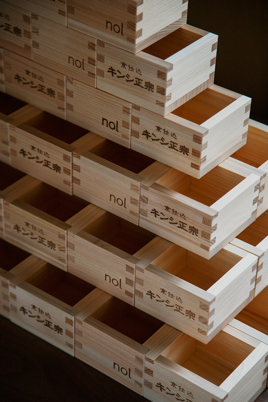
The graphic design of hotel items such as key cards is based on monotone, modern typography, combined with the warmth of brand color beige to create something that is both new and warm.
For this project, artless aimed to create a brand design that embodies the new yet nostalgic atmosphere of “nol “ by delivering graphic and sign design including the logo and typeface, expressing the neutral time between the everyday and the extraordinary.
京都の三条に位置する nol kyoto sanjo。⽇本酒造「キンシ正宗」の販売所としてかつて使われていた京町家を取り壊さずに改修し、ロビーとして保全活用するなど、町家文化を継承した情緒あふれる建築となっています。
artlessは、nol というブランドネーミングの選定から、ロゴやタイプフェイス、ブランドカラーなど v.i. (visual identity)に関わるデザインシステムを構築。そして、グラフィック、サイネージ、アイテムなど、ブランドコラテラル全般に関わるデザインを手がけました。
ネーミングの nol には、Naturally(自分らしく、自然体で)、Ordinarily(普段通り、暮らすように過ごし)、Locally(その土地の日常に触れる)という意味があります。自分らしく、普段通りに、地域を楽しめるホテルとして、古き良き日本文化を継承し、現代的な新しいカタチに変えていく。そんなコンセプトのもとにブランディングを進めました。
客室インテリアデザインは、橋本夕紀夫。時の移ろいとともに熟成し、深みを増していく客室をめざし、機能的で洗練されたホテルでありながら、日本的な美意識や素材感を大切にすることで、 新しい中にもどこか懐かしい記憶や気配を感じる空間をデザインしています。
滞在中に客室などで使われるホテルカードやアイテムデザインにおいても、モノトーンでモダンなタイポグラフィをベースに、ブランドカラーのベージュで温かみを融合させ、 新しい中にもあたたかな気配を感じさせるグラフィックデザインを行なっています。
nol kyoto sanjo では、ニュートラル、日常と非日常の中間、無理のない自然な時間ーそんな言葉を表現するようにロゴからタイプフェイスの選定、グラフィックやサインデザインなどを行い、nol という新しい空気感や温度をブランドデザインとして表現しています。
–